
Bundle Builder
Bundle Builder
The Bundle Builder is the most versatile bundle option, letting you create custom "Build-a-Box" or "Mix & Match" experiences. The entire setup flows across three tabs: Add product, Discount & Pricing, and Settings.
Step 1 — Create a New Bundle
Navigate to Bundles and click Create bundle.
Select Bundle Builder as your bundle type.
Enter an internal name for your bundle (e.g., "Sizzling Summer Essentials") — editable later via the pencil icon.
Click Create to open the configuration screen.
Your Bundle ID is displayed in the top-right of the preview panel. Keep this handy if you plan to embed the bundle as a Section.
Step 2 — Select Layout & Page Width
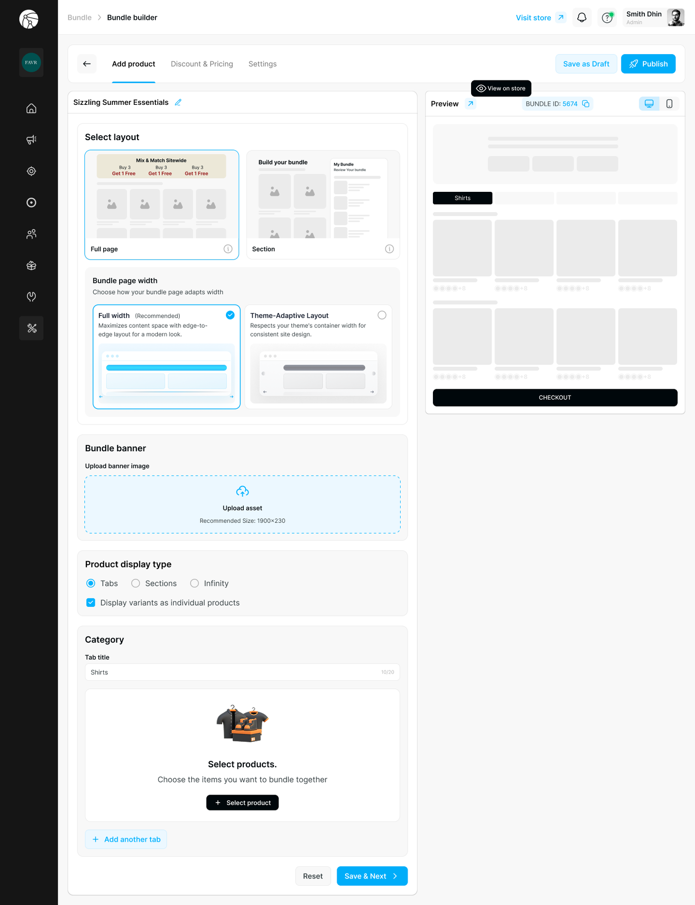
Layout Type
Choose how the bundle is presented to customers:
Layout | Best Use Case | How to Implement |
Full Page | Large bundles that need a dedicated shopping experience (e.g., "Mix & Match Sitewide") | After saving, click View on store — the app automatically generates a standalone landing page you can link to in your store navigation |
Section | Embedding the bundle onto an existing page (e.g., Homepage, Product Page) | Copy the Bundle ID from the preview panel. Go to Theme Editor > Add Block > Dynamatics Bundle Kit > Section Bundle and paste the ID |
Bundle Page Width
Choose how the bundle fills the screen on the Full Page layout:
Option | Description |
Full width (Recommended) | Maximizes content space with an edge-to-edge layout for a modern look |
Theme-Adaptive Layout | Respects your theme's container width for a consistent site design |
Bundle Banner
Upload a banner image to display at the top of your bundle page. Recommended size: 1900 × 230px.
Step 3 — Add Products & Organize Categories
Product Display Type
Select how products are visually arranged on the storefront:
Option | Best For |
Tabs | Bundles with multiple distinct categories — each appears as a clickable tab at the top |
Sections | Categories stacked vertically with visible headers |
Infinity | A single continuous grid with no category separation — best for simple product lists |
Display variants as individual products — Enable this to show each product variant (e.g., color, size) as its own selectable item in the grid.
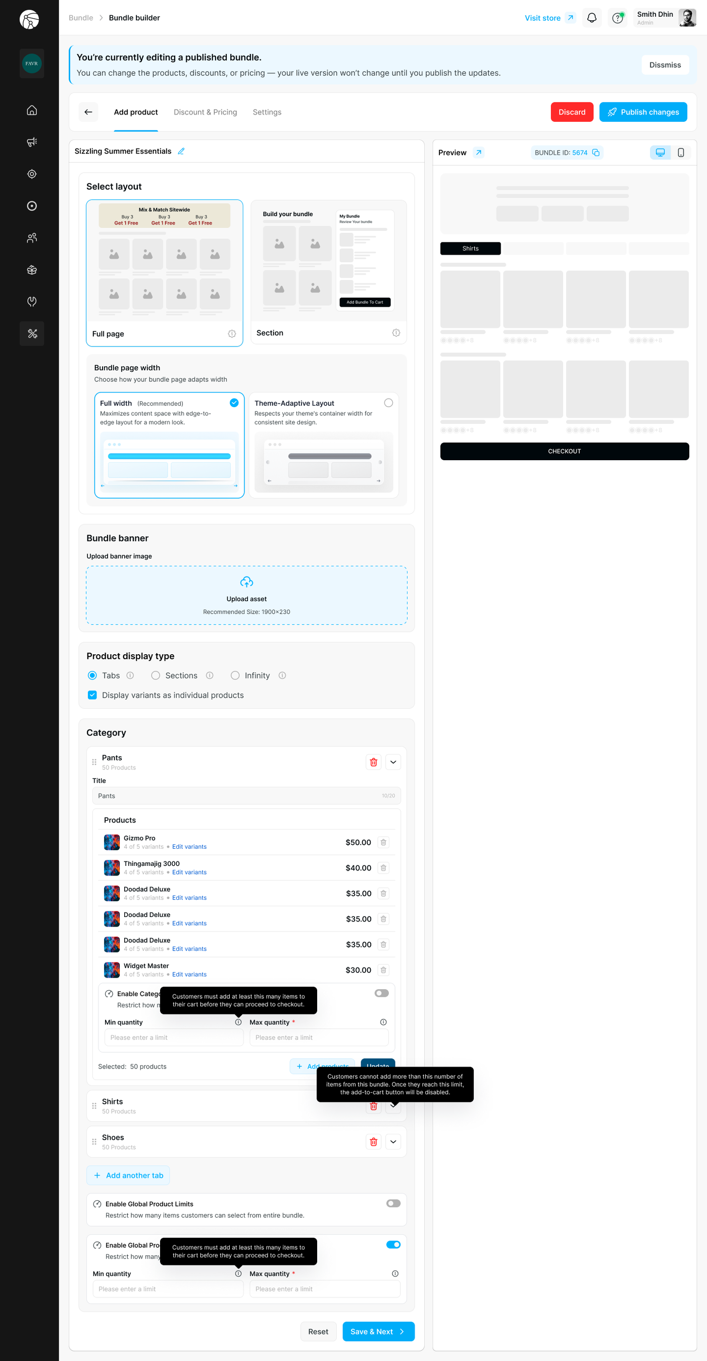
Categories
Categories organize your bundle into logical steps or groups (e.g., "Shirts", "Step 1: Choose Base", "Free Gift").
For each category:
Enter a Tab title (max 20 characters) to label the category.
Click + Select product to add items to that category.
Click + Add another tab to create additional categories.
Tip: Use clear, action-oriented tab titles like "Pick Your Flavors" or "Choose a Base" to guide customers through the bundle step by step.
Pre-Added Required Items in Bundle Builder
The Bundle Builder supports required, pre-populated items — products that are automatically included in every bundle and cannot be removed by the customer, but may allow variant selection.
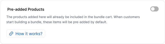
This is useful when your bundle has fixed components that every order must include, while still giving customers freedom to customize the rest of the bundle themselves.
How it works: When configuring your bundle, you can designate specific products as required. These items appear in the customer's bundle from the start and are locked in place. Customers can still select a variant of that item (e.g., color, size, spec), but they cannot remove it or swap it for a different product entirely.
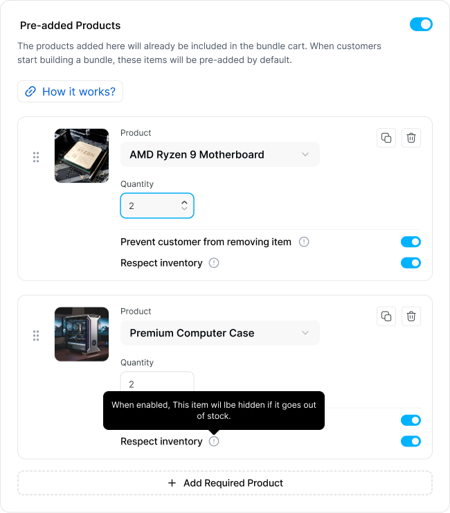
Example: Build Your Own PC:
Item | Required? | Customer Control |
Motherboard | Yes | Can choose variant: AMD or Intel |
Enclosure | Yes | Can choose variant: Black, White, or Silver |
Processor | ➕ Customer adds | Full product selection |
CPU Fan | ➕ Customer adds | Full product selection |
Hard Drive | ➕ Customer adds | Full product selection |
In this example, the motherboard and enclosure are pre-added and priced into the bundle automatically. The customer completes the build by adding their own components — and everything gets added to the cart as a single bundle.
Key behaviors to note:
Required items are included in the bundle's total price calculation from the start
Customers can still select variants on required items (e.g., size, color, spec tier)
Required items appear visually distinct in the bundle UI so customers understand they are fixed inclusions
The customer's "progress" toward completing the bundle counts required items toward any minimum quantity thresholds you've set
Click Save & Next to proceed to Discount & Pricing.
Step 4 — Discount & Pricing
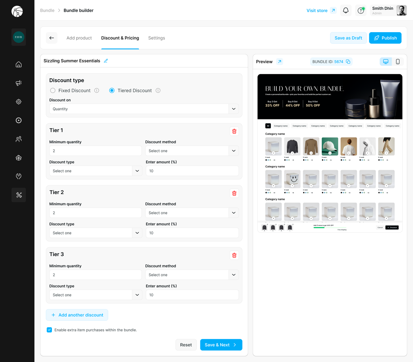
Define how pricing changes as customers build their bundle.
Discount Type
Fixed Discount — A single discount rule that applies regardless of how many items are selected.
Tiered Discount — Progressive savings that increase as customers add more items (e.g., "Buy more, save more"). Set Discount on to Quantity to activate tier logic.
Discount Method (per tier)
Each tier requires the following fields:
Field | Description |
Minimum quantity | The item count at which this tier activates |
Discount method | How the discount is applied (per item or on the total) |
Discount type | Percentage or fixed amount |
Enter amount | The discount value |
Click + Add another discount to add more tiers as needed.
Example: Tiered Discount Setup
Tier 1: Buy 3+ items → 33% OFF
Tier 2: Buy 6+ items → 44% OFF
Tier 3: Buy 9+ items → 50% OFF
Additional Option
Enable extra item purchases within the bundle — Check this to allow customers to add quantities beyond the defined bundle structure.
Click Save & Next to proceed.
Step 5 — Customization
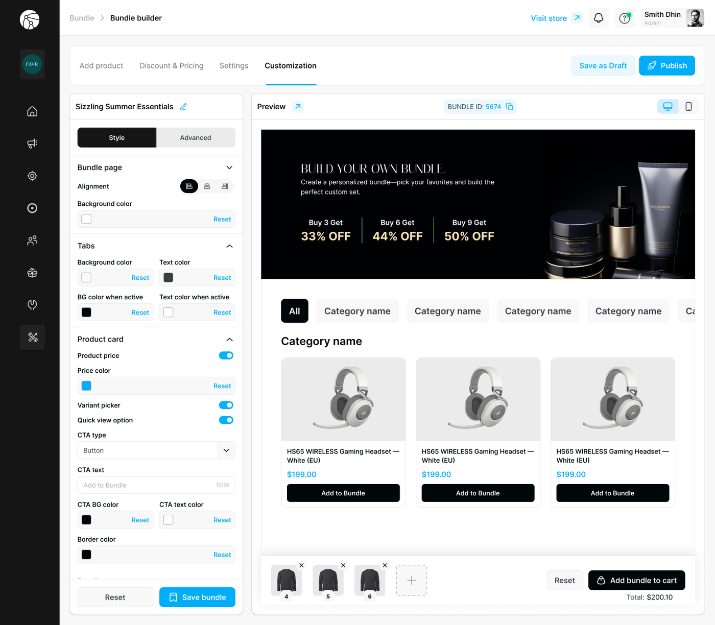
The Customization tab gives you full control over the visual appearance of your bundle page, split across two sub-tabs: Style and Advanced.
Bundle Page
Setting | Description |
Alignment | Set the content alignment (left, center, or right) |
Background color | Set the page background color |
Tabs
Customize the appearance of your category tab navigation:
Setting | Description |
Background color | Default tab background |
Text color | Default tab label color |
BG color when active | Background of the currently selected tab |
Text color when active | Label color of the currently selected tab |
Product Card
Control how individual products appear within the bundle grid:
Setting | Description |
Product price | Toggle to show or hide the price on each product card |
Price color | Set the color of the displayed price |
Variant picker | Toggle to show variant selectors directly on the card |
Quick view option | Toggle to enable a quick-view detail panel |
CTA type | Choose the call-to-action style (e.g., Button) |
CTA text | Customize the button label (e.g., "Add to Bundle") — max 20 characters |
CTA BG color | Background color of the CTA button |
CTA text color | Text color of the CTA button |
Border color | Color of the product card border |
Tip: Use the live Preview panel on the right to see your styling changes reflected in real time before saving.
Click Save bundle to apply all customization changes.
Step 6 — Save & Publish
At any point during setup, click Save as Draft to preserve your progress without going live.
Once all three tabs — Add product, Discount & Pricing, and Customization — are configured, click Publish.
Your bundle is now active and visible to customers on your storefront.
Before You Publish
Ensure the Dynamatic Bundles app embed is toggled ON in your Shopify Theme Editor, or the bundle will not appear on your storefront.
If you switch themes, you must re-enable the app embed on the new theme.
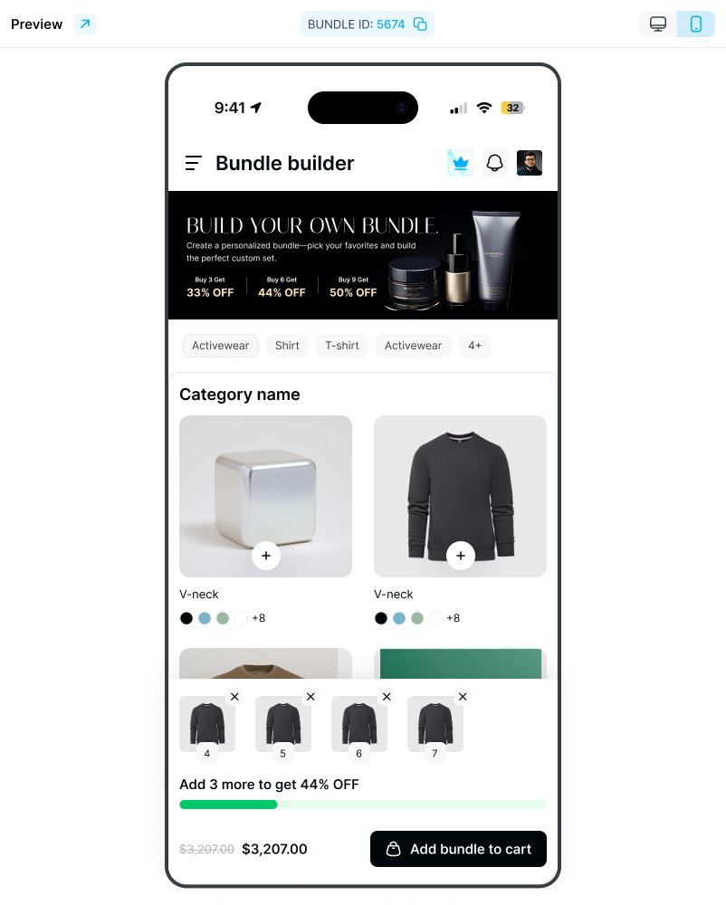
Use View on store (available throughout the setup flow) to preview the bundle on your live storefront before publishing.
Appendix — Embedding a Section Bundle on a Page
If you selected Section layout in Step 2, follow these steps to embed it into your storefront:
Copy the Bundle ID from the preview panel (e.g.,
5674).Go to Shopify Admin > Online Store > Themes > Customize.
Navigate to the page template where you want the bundle to appear (e.g., Product Page or Homepage).
Click Add section or Add block depending on your theme structure.
Select Apps > Dynamatics Bundle Kit.
In the block settings panel on the right:
Set Bundle Type to Section Bundle.
Paste your Bundle ID.
Click Save. Customers can now build the bundle directly on that page.
Note: The URL handle for a Full Page bundle cannot be changed after creation. Plan your bundle's URL structure before publishing.