

Dynamatic Deals
Dynamatic Deals lets you build offers that appear on your product pages as selectable bars, and get the right price at checkout: quantity breaks, buy X get Y, bundles, subscriptions, free gifts, mix & match and alternative products. This guide covers every setting in the editor, in the order you meet it.
How Deals Work
A deal is a small block of bars that sits above the Add to cart button on a product page. Each bar is one offer, for example "Buy 2, save 10%". The shopper picks a bar, and Add to cart puts exactly that offer into the cart.
Prices are never changed on your products. Each published deal gets its own Shopify automatic discount, and checkout works out the discount from the cart itself. If a shopper edits the cart so it no longer matches a bar, the discount goes away by itself.
The widget: Shows the bars, pickers, gifts and modules on the product page. It needs the Dynamatic Bundle app embed turned on in your theme.
The Shopify discount: Created, updated or removed every time you save the deal. You can see it in Settings › Discount & stacking and in Shopify admin under Discounts, named
Dynamatic Bundle · Deals #<id>.The deal type is only a starting point: It picks a template and the matching module. After that you can mix any bar kind into any deal, for example a quantity break next to an alternative product.
Each deal supports up to 5 bars and creates one Shopify discount.
The 7 Deal Types
Type | Best for | Default template gives you |
|---|---|---|
Quantity breaks | More of the same product, more off each. The most popular type. | Single (full price), Duo 10% off, Trio 15% off with a "Most popular" badge and free shipping |
Buy X, get Y | Buy some, get more of the same product free or discounted. | Buy 1 get 1, Buy 2 get 2 (Best value), Buy 3 get 3 with free shipping |
Complete the bundle | A set of different products at a bundle price. | "Just this one", then "Complete the look": this product plus two others at 20% off |
Subscription | Bars plus a Subscribe or One-time choice. Needs a subscription app. | Quantity bars plus the Subscribe / One-time block |
Progressive gifts | Higher bars unlock free gifts and free shipping. | Quantity bars; free shipping unlocks at bar 2, a free gift at bar 3 |
Mix & match | Slots shoppers fill: a fixed product they can swap, the page's product, or anything from a collection or with a tag. | "Just this one", then a set of this product plus a fixed product at 15% off |
Alternative product | Offer another product as a bar, such as an upgrade or a cheaper option. | Two quantity bars plus a bar for another product, labelled "PREMIUM" |
Each type starts from a template. You can change the template any time from the Template row on the Offer tab. This replaces the bars and their texts but keeps your settings, modules and style.
Type | Templates (default in bold) |
|---|---|
Quantity breaks | Blank · Highlight deals · Quick picks · Visual offer |
Buy X, get Y | Blank · Buy 1, get 1 free · Buy 2, get 1 free |
Complete the bundle | Blank · Product + 1 · Product + 2 |
Subscription | Blank · Subscribe & save 10% |
Progressive gifts | Blank · Free gift deal |
Mix & match | Blank · Bundle & save 15% · Pick any 2 or 3 |
Alternative product | Blank · Upgrade option |
Note: Changing the deal type on the Offer tab restarts the bars from the new type's template. Settings, Style and badges stay as they are.
Create Your First Deal
Step 1: Create the Bundle
Go to Dynamatic Bundle › All Bundles and click Create.
Enter a Bundle title. Only you see this name.
Choose the Deals card and click Continue.
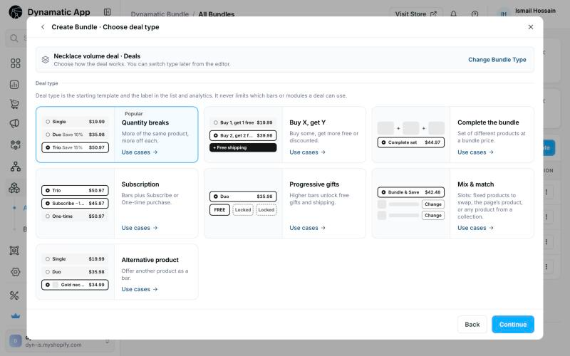
On the Choose deal type screen, pick one of the 7 deal types and click Continue. Each type shows a small preview of its bars and a Use cases → link. You can change the type later from the editor (Change type).
The editor opens with the type's default template.

The Create Bundle window lists five bundle types: Deals (marked New), Pre-built, Add-ons, Bundle Builder and Bundle Builder Lite. This guide covers Deals only; the other types have their own articles under Dynamatic Bundles. The Deals card shows a small preview of the bars you'll build (for example Single, Duo and Trio) and the line "Pick one. Deals has 7 deal types on the next step."
Use cases: Click Use cases → on any type to browse ready-made setups for it. Each use case shows the goal, a bar-by-bar table with what the shopper pays and saves, the default bar, the settings to change, and why it works. Click Use this setup to start from it, or Start from scratch to start from the type's default template. Back to deal types returns to the list.
Step 2: Build the Deal in the Editor
The editor has four tabs:
Tab | What it controls |
|---|---|
Offer | The bars shoppers see |
Settings | Who sees the deal and how it's charged |
Modules | Extras around the bars |
Style | How the deal looks |
Set your bars in Offer, pick your products in Settings › Products, and turn on any extras in Modules.
The preview updates as you type and follows the storefront. It shows variant pickers and swatches, sold-out bars and the Sold out button, the subscription plan choice, the badge ring animation, bars opening and closing, and your custom CSS. You can switch between desktop, tablet and mobile, and pick a market to see its prices. Picking a market other than your store's also lets you set that market's own price (see Prices per Market in the Offer tab section).
Tip: The preview doesn't know which collections or tags a product has, so in mix & match the product on the page always fills the first "Shopper chooses" slot, and a slot never shows "Not available" there. It also doesn't know stock counts, only whether a variant is in stock.
Step 3: Publish
Click Publish, or Save as Draft to keep working on it. After you save, publish or unpublish, a window confirms it and says whether the deal is live. Create another opens Create Bundle; Keep editing stays in the deal.
Before You Publish
Turn on the Dynamatic Bundle app embed in your theme editor (App embeds).
Use the eye button in the editor header to open the product on your store.
To try a draft on your real store before customers see it, use its test link (see Test Link below).
The Bundles List
All your bundles are listed in Dynamatic Bundle › Bundles. Each row has a status chip: Draft, Active, Scheduled or Ended. There are no status tabs, so the chip is how you tell them apart.
Row ⋯ menu: Edit, View analytics, Duplicate and Delete. A draft deal also has Copy test link.
Toolbar: Search, Type, the Created date filter, Sort by priority, Translations, Configuration and Create Bundle, all in one row. When the window is narrower, the less-used ones move into a ⋯ menu: Type, Sort by priority, Translations and Configuration first, then the date filter too.
On a phone: Each bundle is a card with its name, type and date, its on/off switch, the status chip and the ⋯ menu. Search is a magnifier icon and Create is a + button. To select bundles, press and hold a card, or use ⋯ › Select.
On your dashboard home, the new features carousel opens on the Dynamatic Bundle and Deals slide ("Meet Dynamatic Deals"). Its Create a deal button starts a new deal.
Offer Tab: Bars
A deal has 1 to 5 bars. Click Add Bar to add one of five kinds. Drag a bar to reorder it. The ⋯ menu on a bar has Duplicate, Move up, Move down, Make default bar and Delete.
Click Add Bar to choose a bar kind:
Bar Kinds
Bar kind | What the shopper buys | How the discount works |
|---|---|---|
Quantity break | N units of the page's product | % off, amount off each item, or a fixed total for the bar |
Buy X, get Y | X + Y units of the page's product | The cheapest Y units get the "get" price, the rest get the "buy" price |
Product bundle | This product plus other set products | Each item has its own price rule |
Mix & Match | One product per slot | % off, amount off the set, fixed set price, or cheapest item free |
Alternative product | A different product instead of this one | No discount: it sells at its own price. Its extras still apply. |
Text on Every Bar
Field | What it does |
|---|---|
Title | The main line, for example "Duo". A quantity bar with "or more" shows "2+". |
Subtitle | The line under the title, for example "You save {{saved_percentage}}". |
Label | A small pill next to the price, for example "SAVE {{saved_total}}". |
Badge | Attach one badge from Modules › Badges. A badge belongs to one bar at a time. |
All text fields accept variables: type {{ to pick one (see Text Variables). Fields with the translate icon can be translated once the deal is saved.
Price Types
Price type | Quantity break | Bundle item | Mix & match set |
|---|---|---|---|
Full price | No discount | No discount | No discount |
% off | Off every item | Off this item | Off the whole set |
Amount off | Off each item ($5 off × 3 items = $15) | Off each unit of this item | Off the whole set, once |
Fixed price | The bar total ($45 for 3) | Price for each unit of this item | The set total |
Cheapest item free | n/a | n/a | The cheapest slot is free (needs 2+ slots) |
Note: A discount can only lower a price. If a fixed price is above the regular price, checkout charges the regular price and the widget shows that too. The bar card warns you: "The fixed price is above the regular price of …".
Prices per Market
Product prices already follow each market's own prices in Shopify. A Fixed price or an Amount off you type is in your store currency and, by default, converted at Shopify's exchange rate in every other market: $50 becomes about €46 in Europe. You can give a market its own value instead, in its own currency, for example €45.
Where: Bars, Buy X get Y (buy and get), bundle items, and upsells. Percentages and "cheapest item free" have one value, because they already apply to each market's own prices.
Per market: Under the field, the Market prices box lists the markets with their own value. Per market opens a window with every market, what the shopper pays there and saves, and a warning if a price saves nothing. Leave a market empty to keep the converted amount. Use converted clears a market's own value.
From the preview: Pick a market in the preview's market menu. The price field then edits that market's own value, shown with its currency, a blue market tag and a tinted field. Edit the store price switches back. The menu tags each market Store, Own price, Converted or Excluded.
At checkout: A shopper in that market, paying in its currency, gets your price exactly. Round prices to doesn't change it. A shopper paying in another currency gets the converted store amount.
Markets you exclude in Settings › Visibility & markets aren't in the window. A value saved before you excluded a market is kept for when you include it again.
Switching a bar to % off or Full price hides its market values, and they're removed when you save.
Quantity Break Bar
Quantity: How many units this bar is.
Discount / Price: The value for the price type you picked.
{qty} or more (last bar only): The same price also applies to larger quantities. With a fixed price, extra units are charged at the same per-item rate.
Show quantity selector: Lets shoppers buy the bar more than once, for example 2 × "Trio".
Apply selling plan (subscriptions only): This bar always subscribes, and One-time is turned off for it.
Buy X, Get Y Bar
Buy: Quantity and price (Full, % off or Amount off each). Leave it at Full price for a classic "buy 2, get 1 free".
Get: Quantity and price (% off, Amount off or Fixed price each). The default is 100% off, which means free.
Buy X, get Y works on units of the same product, and the cheapest units become the "get" units. To give a different product free, use a Product bundle bar or a Free gift extra.
Note: If the cart holds more units than the bar, the extra units pay full price. If it holds a quantity between two bars, the smaller bar applies and the rest pay full price.
Product Bundle Bar
Items in the bundle: The first item is the page's product. Add Product adds more. Each item has a Qty, a Price type and a Discount.
Hide this item's price: Hides the price on that row.
Layout: List or Cards.
Show products only when selected: Collapses the item list until the shopper picks the bar.
Show quantity selector: Lets shoppers buy the bundle more than once.
Mix & Match Bar
Each slot holds one product and gets a Fills with setting:
Fills with | Meaning |
|---|---|
A fixed product | You pick the product. With Select Changeable Products, shoppers can swap it for others you allow (up to 200). |
The page's product | The product being viewed fills this slot. |
Shopper chooses | The shopper picks from a collection, or from every product with one of the tags you list (Choose from: Collection | Tags), minus the slot's exceptions. It can show "from $X" under the slot's name: the cheapest product a shopper can actually pick (excluded, unpublished and sold-out products don't count), worked out each time you save. If the price looks wrong, save the deal again. |
Choose from: Collection picks one collection. Tags takes any product with at least one of the tags you add with Add Tags (any case: "summer" matches "Summer"). Use tags when the products you want aren't all in one collection.
Exceptions (on a "Shopper chooses" slot): The Exclude menu has Products, Collections and Tags, and leaves products out of this slot only. Everything you exclude shows as one list of chips, each with a small icon for its kind; with more than 8, the rest open from "+N more". A product that's in an excluded collection or has an excluded tag never shows in the slot's Choose window and never fills the slot at checkout. You can also exclude Shopify bundle products, for example a multipack in the same collection.
How an empty slot shows: One line with the slot's title. Left empty, it shows the collection's name, or for tags the first two tags and how many more ("Summer, Beach +3"), or "Choose a product" while the slot has no tags. The helper under Slot title shows exactly what it will be. With prices on, "from $X" shows under it.
Not available: When the page opens, the widget checks each tags slot. If no product with those tags is in stock and sold in the shopper's country (after the slot's exceptions), the slot reads "Not available" and its Choose button is off. Add more tags, or restock, and it comes back by itself.
Swap button text: The button that opens the swap window, "Change" by default.
Show product prices: Prints each slot's price.
Page product takes its own slot: The page's product fills the first slot whose collection or tags contain it, unless that slot excludes it.
Require every item to be chosen: Add to cart stays disabled until every slot is filled. When off, a partly filled set still gets its share of the discount.
Alternative Product Bar
Choose another product. When the shopper picks this bar, Add to cart adds that product instead of the page's product, at its own price. Use it to show an upgrade or a cheaper option next to your other bars.
Behaviour Switches
Switch | What it does |
|---|---|
Always show as sold out | Manual override. Bars also go sold out on their own when stock runs out. Sold-out bars stay visible, faded, with your sold-out label in place of the bar's label (and a dashed outline in Stacked rows), and can't be picked. |
Hide behind scratch-off | Shoppers can't see or pick this bar until they scratch it. Needs the Scratch-off module. |
Require variant selection | No variant is pre-picked. Shoppers must choose before Add to cart. If they don't, the empty options turn red with a line such as "Choose a colour and size for #2." |
Apply selling plan | Quantity and Buy X, get Y bars, with subscriptions on: picking this bar always subscribes. |
Default Bar and Block Title
Block title is shown above the bars, for example "Bundle & save". Default bar is the bar shoppers land on.
Shopify policy: If the default bar costs more than Bar 1, the editor warns you. Pre-selecting a more expensive option can go against Shopify's rule on optional charges.
Bar Extras, Subscriptions and Gifts
Each bar has an Extras grid. A configured extra shows as a row you can edit or remove.
Free Shipping
Picking this bar unlocks a shipping discount at checkout. Under Provide shipping discount for, choose:
Option | What's free |
|---|---|
All delivery options | Every rate |
Specific delivery options | Rates whose name matches one you list exactly, as shoppers see it at checkout (any case) |
Cheapest delivery option | Only the cheapest rate |
Delivery option name | Rates whose name contains (or doesn't contain) words you list |
Delivery option cost | Rates under or over an amount (store currency, the amount itself included) |
Free Gift
Free gift (single): One product, with a text such as "+ FREE special gift!".
Multiple gifts picker: You choose several products. The shopper picks up to Max gifts in a window. Fields: Text before choosing, Text after choosing ("{{free_gifts}} FREE gifts selected"), Show product photos, and Show gift summary when the bar is not selected.
Common options: Image size, Show original price, Include in compare-at price, Apply only to subscriptions.
Checkout makes gift units 100% off, up to the number the bar allows. Extra units of the gift product are charged normally. With Keep free gifts in step with the cart on, a single gift is added to and removed from the cart as the shopper changes it.
Upsell
A checkbox under the bar that adds a complementary product at a discount. You set the product, the price (Percentage off or Amount off), the discount per item (20 by default), and the text ("+ Add at {{saved_percentage}} discount"). Other options: Image size, Visible only when the bar is selected, and Follow deal subscription.
Bar Image and Featured Image
Bar image: One image on the bar, 16 to 96 px with 0 to 24 px corners. Upload PNG, JPG, SVG or WebP, up to 2 MB.
Featured image: A different image per product, shown inside this bar at 56 px. On quantity and Buy X, get Y bars it shows the page product's image. On bundle and mix & match items each item shows its own. Filter the table by All, Configured or Not configured, and use Add Products for products not listed.
Note: If a bar image is set, it takes priority over the featured image.
Highlights
Short perk lines under the bar, for example "Free shipping" or "Best price per item". Options: Layout (List or Inline), Icon (Checkmark, Dot, Star or None), Text size, Text colour, Icon colour, and Show only when the bar is selected.
Personalisation
Adds an "Add personalisation" entry. The text the shopper types is saved on the cart line as a line item property, at no charge. Fields: Title, Subtitle, Require personalisation, and Image size. In the window you set the character limit (30 by default) and whether letters and numbers are allowed.
Subscription Block
Shown when the deal type is Subscription, or when Modules › Subscriptions is on. It needs a selling plan from a subscription app on the product. Products without a plan show the bars only.
Setting | Options and defaults |
|---|---|
Layout | Checkbox (default) · One-time · Toggle · Grouped |
Position | Below the bars (default) · Above the bars |
Heading | "Purchase options" |
Subscribe option | "Subscribe & Save {{selling_plan_discount}}" / "Delivered every month · cancel anytime" |
One-time option | "One-time purchase" / "Pay once, no subscription" |
Subscription selected by default | Off. Shopify policy needs the shopper's explicit choice for a recurring charge. |
Show subscription and one-time prices | On, so the saving is clear |
Add highlights | Two perks: "Free shipping" and "Skip or cancel anytime" |
The plan's own discount applies on top of the bar price. For example, a $300 bar on a 10% plan costs $270. Checkout reads each plan's discount when you save, so if you change a plan in Shopify, save the deal again.
Progressive Gifts
Shown when the deal type is Progressive gifts, or when Modules › Progressive gifts is on. Each gift unlocks at a bar "and higher".
Layout: Rows, Tiles or Banner. Title "Unlock free gifts", subtitle "Choose a bigger bundle to unlock more".
Each gift: Type (Free gift or Free shipping), product, Unlock at (Bar #N and higher), title, label ("FREE"), crossed-out label (for example the gift's price,
{{original_total}}), locked title ("Unlocks with {{unlock_bar}}"), and Apply only to subscriptions. A free shipping gift has the same delivery option rules as the free shipping extra.Locked gifts: Hide gifts until unlocked, Show labels for locked gifts, and Show product image for locked gifts (a dimmed photo instead of a lock).
Storefront Windows
Pop-up windows shoppers open from the widget. Each one has its own colours, sizes and texts:
Choose product (mix & match "Shopper chooses" slots, from a collection or tags): Heading, subtitle, button text ("Choose"), Selected text, Confirm text, photo size, the search field and sort (on together), default sort (Relevance, Price low to high, Price high to low, Name A–Z), and whether to show the variant image. For a slot that chooses from tags, the window's heading is the slot's title (or "Choose a product") unless you changed the heading from "Choose product", and its subtitle reads "Tagged Summer or Beach" unless you set one.
Select product (swap window for mix & match fixed slots): Heading, subtitle, button text ("Choose"), Selected text and Swap text.
Choose FREE gifts (multiple free gifts): Heading, subtitle, footer text, and button texts before and after choosing ("Choose", "Remove").
Personalisation: Field height, corners, image size, text size, placeholder, character limit, letters or numbers allowed, and the text, secondary (placeholder, counter, subtitle) and error colours. On phones the field is always at least 44 px tall with 16 px text, so the phone doesn't zoom in while the shopper types.
With Desktop picked in the editor's preview, the Choose product and Select product settings show the desktop product grid; on tablet and mobile they show the list. Photo size only changes the list (phones and smaller screens).
How Shoppers Use the Windows
On a computer (screens 900 px wide or more): Choose product and Select product open as a large window with a grid of product cards, 4 across: a square photo, the title, the price (and compare-at price), colour dots and a summary of the options ("3 colours · 4 sizes"). In Choose product, search and sort sit in the header. Choose on a product without options puts it in the slot straight away, and the window stays open. A product with options shows Choose options ›, which opens an options panel on the right (the grid narrows to 3 across) with ‹ All products to go back, colour swatches and size pills (sold-out options struck through), and a line under them: "Your choice: Navy / M", or "Sold out: …". The product already in the slot shows "✓ In your bundle" and "Selected". Sold-out products are faded and can't be picked.
One button at the bottom (computer): The footer shows what will be added, with "1 of 1 chosen", "Replaces …" or "Your current one is marked" under it. With an options panel open the button reads your Confirm text (your Swap text in the swap window), or "Sold out" (greyed out) when that choice is sold out. Otherwise it reads "Done" and closes the window. Esc closes the options panel first, then the window.
On phones and smaller screens: Each product is one short row: photo, title, price and a summary of its options. Tapping Choose on a product without options picks it. On a product with options, Choose opens them under the row, and the button becomes Confirm (Swap in the swap window). The product already in the slot shows "✓ Selected".
When the shopper reopens the window for a product they already chose, its options start on the colour and size they picked.
Select product shows each product's real options (Colour, Size) and swatches from Shopify. If you saved only some of a product's variants, only those choices are offered. If Shopify can't be reached, the options show as the variant names instead.
Choose product has search and sort, and loads more products as the shopper scrolls. It doesn't list the slot's exceptions, or the product the shopper is already looking at when the bar includes it ("pick another hat"). For a slot that chooses from tags, search looks through every product with those tags. If none is available, the window says "Nothing available right now" with a Back to offers button.
Free gifts: Confirm turns on once the shopper has picked the number of gifts allowed.
Personalisation: One field per item. Text with characters you don't allow shows an error under the field.
There are no Cancel buttons: ×, Esc or tapping outside closes a window. On phones every window is a sheet from the bottom of the screen that stays above the keyboard.
All window texts can be translated. The desktop grid's own texts are general texts under Product picker on the Translations page.
Settings Tab
The Settings tab controls who sees the deal and how it's charged.
Products
Choose where the deal appears: All products, Selected products (default), Selected collections or Selected tags.
Selected tags: The deal shows on every product with at least one of the tags you add (any case). Add tags with Add Tags: pick from your store's tags (search to narrow the list), or type one that isn't listed yet and choose Add “…” or press Enter. Until you add one, a box explains what tags do; if you try to publish without a tag, it turns red with "Add at least one tag to publish." New products get the deal as soon as you tag them.
Exceptions: Products that never get the deal, whichever option you chose. Click Exclude and pick Products, Collections or Tags (each shows how many you've excluded; on a phone this opens as a sheet from the bottom). Products picks single products (Shopify bundle products can be excluded here too), Collections leaves out every product in a collection, and Tags every product with a tag. Everything excluded shows as one list of chips; with more than 8, "+N more" shows the rest. Remove one with its ×. On an excluded product the deal doesn't show, and checkout doesn't discount it.
If another live deal shares products and dates with this one, a notice tells you which deal leads on those pages and whether this deal joins as extra bars or is hidden there (see Several Deals on One Product). A deal on tags counts as sharing products with any deal on products or collections, since which products have a tag can change; exceptions don't remove a notice.
Show as extra bars in other deals (on by default): Where another deal leads, this deal's bars are added to that widget. Off: this deal is hidden there.
Visibility & Markets
Markets: All markets, or All except the markets you tick. Shoppers in ticked markets don't see the deal and don't get its discount.
Remove free gifts when the shopper's market is excluded (on by default; shown when the deal excludes a market and has a free gift): A shopper who added the deal in another market and then switched to an excluded one would pay full price for its items and its free gifts. With this on, the cart removes the gifts and shows a note on the deal's items, for example "Bundle & save isn't available in Mexico. These items are full price, and we removed the free Silver Stud Earrings." With it off, the gifts stay and the note says they're charged at full price. A market switched only at checkout can't be seen by the cart, so there the gift is charged.
Exclude B2B customers: Company buyers pay the normal price.
Discount & Stacking
Setting | Default | What it does |
|---|---|---|
Discount name at checkout | "Bundle & save" | Shown in the cart and at checkout. If you leave it empty, checkout shows a name such as "Deal: Buy X, get Y". |
Combines with: other product discounts | Off | When two product discounts can't combine, Shopify applies the one that saves the shopper more. |
Combines with: order discounts | On | |
Combines with: shipping discounts | On | |
Apply only through this widget | On | On: adding the same items another way pays full price. Off: the theme's own Add to cart also gets quantity breaks and Buy X, get Y. Bundles, mix and match, gifts and upsells still need the widget. |
The Shopify discount card shows the discount's status (Active, Scheduled, Expired, None or Not created), its dates, what it applies to, and what it combines with. If Shopify rejected it, you'll see why and a Try again button. A common reason is that Shopify allows 25 active automatic discounts per store.
Watch for stacking: If this deal applies outside the widget and combines with other product discounts, and another deal on the same products does too, shoppers could get both. The editor warns you and offers a one-click fix.
Schedule
Set the start date and time, and optionally an end date and time. Before the start, the deal shows as Scheduled. After the end, it keeps its Active status but shows as Ended: shoppers no longer see it, and its Shopify discount expires. Timezone defaults to your store's timezone. Start, end and the countdown timer all use it.
Variants
Setting | Default |
|---|---|
Let shoppers pick a different variant for each item (one picker row per unit) | Off |
Show the variant picker on the single-item bar (the theme's own picker usually covers it; the bar shows its own when the theme's is hidden) | Off for new deals |
Hide the theme's own variant picker | Off |
Hide unavailable variant options | Off |
Don't update other products when a variant changes | Off |
Swatches: For each product option (for example Color or Size), choose how it shows: Default dropdown, Colour swatches, Colour swatch dropdown, Image swatches, Image swatch dropdown, Product images, Product image dropdown, or Pill buttons. You also set the swatch shape and size, or the pill text size and corners, and whether to show the selected option name.
Default variants: For each bar, choose which variant each item starts on.
On the storefront: A bar shows one picker per option (for example Colour and Size side by side). Swatches take a full row; dropdowns read "Size: M" on a computer and "M" on phones, where they're taller and easier to tap. With Require variant selection, an option nobody has picked yet reads "Choose size". Rows for separate items are numbered, for example "#2".
Price Display
Setting | What it does |
|---|---|
Show price per item | Adds "$X each" (or your unit label, for example "per piece"). Show both prices adds the struck-through regular price. |
Use the product's compare-at price | Uses compare-at as the "was" price. |
Show prices without decimals | $45 instead of $45.00. |
Round prices to | Rounds a discounted bar total down to .99, .95, .90 or .00. Checkout charges the rounded price too, for example $50.40 becomes $49.99. It doesn't apply to subscription lines. |
Update the theme's product price | Writes the per-item price or the bar total into your theme's price. |
Show the total in the add to cart button | "Add to cart · $45.90". When the regular price is higher, it shows first, struck through. The total includes the plan's discount when Subscribe is picked. |
Cart
Setting | What it does |
|---|---|
Skip the cart | Sends shoppers straight to checkout. The button reads "Buy it now" (with the total when "Show the total in the add to cart button" is on). |
Count separate adds together | Quantity and Buy X, get Y bars: adding 1 Red, then 1 Blue counts as 2 of the product. Off: each add to cart is priced on its own. On by default for new deals. |
Keep free gifts in step with the cart | When the cart reaches a gift's bar, the gift is added; when it drops below, the gift is removed, so no one pays for a gift. Covers single gifts on quantity and Buy X, get Y bars and progressive gifts. A multiple-gift choice is never added for the shopper. On by default for new deals. |
In the cart | Separate line items (one cart line per item, all carrying this deal's id) or Bundle splits into items. |
Modules Tab and Style TabModules
Modules are extras that sit around the bars. Each has a switch and shows in the preview as soon as you turn it on. Subscriptions and Progressive gifts are always on for their own deal types.
Module | What it shows | Key settings |
|---|---|---|
Badges | "Most popular" and "Best value" tags on bars | Style: Simple, Most popular sticker, or Border ring (animated, repeating text). Text, colours and size. Attached to one bar each. |
Savings summary | "You're saving {{saved_total}} on this order" | Icon, hide when there are no savings, count free gifts and shipping in the savings, colours and border |
Checkbox upsell | Extra products under the bars or in a pop-up after Add to cart | Selected or complementary product (complementary products come from Shopify Search & Discovery), % or amount off, title and subtitle, any number or only one, match quantity with the bar. They are never pre-ticked while they have a price (Shopify policy). |
Countdown timer | "Sale ends in {{timer}}" | End date and time in the deal's timezone. The timer hides when it ends; the deal keeps running until its schedule ends. |
Low stock alert | "Only {{stock}} left in stock" | Shows when tracked stock is below the threshold (5 by default) |
Sticky add to cart | A bar at the bottom of the screen | Title, button text ("Choose bundle"), mobile only or desktop too, colours and sizes. It shows the selected bar's total; with Show both prices, the struck-through regular total follows it. |
Subscriptions | The Subscribe / One-time block | Texts are in Offer › Subscription block; colours and sizes here |
Progressive gifts | The gift block | Gifts are in Offer › Progressive gifts; inherit bar style, or set the image size and corners |
Scratch-off | A foil card hiding one or more bars | Banner text and foil (Gold, Silver, Rose gold or custom). Turn on Hide behind scratch-off on the bars to hide. The foil never shows the discount in advance. |
Style
Layout: Stacked rows (best with variant pickers), Side-by-side cards (short names, 2 to 3 bars), Two-column grid (an odd last bar spans the row), or Plain list. On phones, cards fall back to stacked rows.
Theme colours: Your saved colours are the brand colours every new deal starts from. Edit them once, store-wide. Or start from one of 8 presets: Classic ink, Ocean, Sunset, Forest, Berry, Lavender, Sand & gold, Midnight.
Colour overrides: 24 colours for this deal only, in these groups: General, Bar text, Label, Reward rows, Pill swatches, and Upsells.
Corners & spacing: Corner radius (10 px) and space between bars (12 px).
Sold-out bars: Pill label, bar opacity (10 to 100%), and pill colours. In Stacked rows and Plain list, the label replaces the bar's own label and the bar's content fades to your opacity; Stacked rows also get a dashed outline. Sold-out bars can't be picked. If the bar a shopper picked sells out, the widget moves to another bar and says so for a few seconds, for example "Trio just sold out. We picked Duo." When every bar is sold out, a note says "Sorry, this is not currently available." and the widget's own button reads "Sold out".
Animation: Bars open and close smoothly when the shopper picks one. It's automatic, there's nothing to set, and it's off for shoppers who turned on reduced motion on their device.
Typography: Size and weight for block title, title, subtitle, label, price, reward rows, upsells and unit label. Also block title alignment, and the font (your theme font or Inter).
Custom CSS: Applies to this deal only. Unsafe content such as imports and outside URLs is removed when you save.
Compact Display
Keeps a long deal short so Add to cart stays near the top of the page. It's off until you change one of these settings:
Bars that aren't selected: Show everything, Title + description, or Title only. Collapsed bars keep their price and, with Product photos › In collapsed bars, a small row of images. The selected bar always shows everything.
Collapse when the deal has: 2 to 8 bars or more (3 by default).
Product photos: In collapsed bars, and in the open bar's product rows.
Hide the "This item" row: Leaves the product on the page out of each bar's list; its variant pickers stay.
Bars shown at first: All, 2, 3 or 4. The rest open from a link under the bars, "See {count} more offers" by default (translatable).
Open slots: A row per slot, or One Choose button that walks the shopper through every "Shopper chooses" slot in the bar: a tab per slot (no tab row when the bar has only one slot), a product grid, and the product's options.
Use on: All devices, phone only or desktop only.
Collapsing and the one Choose button apply to Stacked rows and Plain list. With compact display on, the open bar's product rows are tighter too: smaller photos and buttons, less space between rows, and on phones a little less space at the bar's sides.
In the bar, the box changes as the shopper chooses:
Nothing chosen: "Choose 3 items", "From Hats, Sunglasses" (the slots' collections or tags) and a Choose items button.
Some chosen: "2 of 3 chosen", "Still to choose: Sunglasses" and a Choose 1 more button. The window opens on the first slot still to choose.
All chosen: A check, "3 items chosen", the chosen products' names and a Change button.
Photos of the chosen products replace the empty tiles as the shopper picks. Where the bar is wide enough (most desktop pages) it's one short line: a small square with the number of items (or the chosen photos, overlapping), the text, and a small button. In a narrow bar (most phones) it's a box, dashed until something is chosen, with a tile per slot and a full-width button. The tiles, photos and the number square show only with Product photos › In the open bar's product rows (on by default).
On a computer (900 px wide or more) the window opens as the same large window as Choose product: a tab per slot across the top showing the chosen product, or "Not chosen"; product cards 4 across (3 while a product's options panel is open); more products loading as the shopper scrolls. The footer shows the pick and, for example, "Hat · 2 of 3 chosen", with one button: Confirm & next (Confirm & finish on the last slot) while an options panel is open, otherwise Next (Finish on the last slot), or "Sold out" when the chosen options are sold out. If you set your own Confirm text, it replaces "Confirm & next" and "Confirm & finish". Esc closes the options panel first, then the window. On phones the window is unchanged: "1 of 3 chosen" with Next or Done.
Text Variables and Translations Text Variables
Type {{ in any text field to insert a variable. Values are worked out per bar, live, in the shopper's currency.
Variable | Shows |
|---|---|
| Saving as a percent, for example "15%" |
| Money saved on the bar |
| Saving per item |
| Bar price and regular price |
| Per-item price, discounted and regular (also |
| Bar price ÷ 30, for "less than $1 a day" lines |
| Number of items (buy + get for Buy X, get Y) |
| Buy X, get Y numbers |
| Product and variant name |
| Number of free gifts on the bar |
| Subscription plan name and its discount |
| In a gift's locked title: the bar that unlocks it |
| In the low stock message: units left |
| In the timer text: time remaining |
Translations
Add languages once in Dynamatic Bundle › Translations. They work in every bundle. Then translate each deal's texts with the translate icon inside each text field in the editor. You can write a text per language or per market.
Which Language a Shopper Sees
The shopper's browser language. You can try every preferred language in order, and match regional codes to their base language (fr-CA uses French). If you switch this off, every shopper sees their market's language.
The market's language.
Your original text.
The first live language that has translations for this deal's own texts wins. General texts (buttons such as "Add to cart") don't decide the language; they follow it. For a partly translated language you choose Fill gaps with original text or Skip to the next language.
General Texts
The storefront has 88 general texts, grouped on the Translations page by where they show (for example Product picker, Compact display, Variant state and Unavailable message). They include the window texts, personalisation, compact display, the tag slot texts ("Choose a product", "Tagged …", "Nothing available right now", "Back to offers", "Not available"), the variant picker prompts ("Choose options", "Choose an option"), the "just sold out" note, and the desktop product grid's "Choose options", "Choosing…", "In your bundle", "All products" and option summary.
Newer texts to translate: under Product picker, "All products", "Your choice: {combo}", "Sold out: {combo}", "Confirm & next", "Confirm & finish", "Finish", "Not chosen", "Nothing chosen yet", "Replaces {product}" and "Your current one is marked"; under Compact display, "{count} items chosen", "Item chosen", "Choose {count} more" and "Still to choose: {list}". Keep the words in braces as they are.
Note: "Back to all products" is now "All products". It's a new text, so a translation you wrote for "Back to all products" isn't used any more. Translate "All products" again in each language; until you do, shoppers see it in English.
Test a Shopper
On the Translations page, pick a browser language and a market. It shows which language that shopper gets, with each step marked Shown, Skipped, Not needed or Off. If a language has general texts but none for this deal, it tells you so.
Priority, Publishing, Testing and AnalyticsSeveral Deals on One Product
Only one deal leads the widget on a product page.
A deal that names the product beats one that matches it by collection, tag or "All products".
After that, the deal higher in Bundles › Sort by priority leads. Drag to reorder, then Save priority.
Other deals with Show as extra bars on add their bars to the lead's widget, up to 5 bars in total. A deal that would go past 5 is left out whole.
The Sort by priority window shows each deal's target under its name, for example "Tags: Summer, Beach, Holiday +2", "Collection: Hats" or "Products: 4" ("No tags", in red, means a tags deal that can't be published yet). The Overlaps tag shows which deals share products and dates. A deal on tags shows a short warning instead (and so does a deal on selected products that overlaps a deal on tags), for example "May overlap “Hat deal”: its products could also be tagged Summer or Beach."
Note: Other bundle types (Add-ons, Pre-built, FBT) have their own places on the page. If one of them shows on a product, no deal shows there.
Status
Status | Meaning |
|---|---|
Draft | Not live. No Shopify discount. |
Scheduled | Published, start time in the future. |
Active | Live on the storefront and at checkout. |
Ended | Published, end time has passed. Hidden, and the discount has expired. |
Publishing Checks
Publishing checks the offer first, for example "Bar 2 (Duo): enter a discount above 0%". If something is missing, a Can't publish yet banner shows the first problem with a Go to … button that takes you straight to it: Settings › Products, or the bar (and the slot) to fix. The banner goes away once the deal is ready.
Drafts only need a name.
A published deal can't be deleted: unpublish it first.
Duplicate makes a draft copy.
Version History
The clock icon keeps the last 20 saved versions with who saved them and what changed. Restoring makes that version current again: the offer, settings, modules and style go back to how they were, and the Shopify discount is updated to match. Restoring never publishes or unpublishes a deal.
Test Link
Try a draft deal on your real store before you publish it. Only pages opened with its test link show it.
In the editor, open the ⋯ menu and click Copy test link. In the Bundles list, a draft's row ⋯ menu has it too. The deal stays a draft.
Open the link. It is the deal's first product page with
?dyna-deals-preview-<deal id>at the end (your home page if the deal isn't on picked products).That page shows the deal exactly as shoppers will see it, and checkout gives its real discount.
Important: An order you place on the test page is a real order.
The deal shows only on a page whose address has that parameter. Other pages, and every other visitor, see nothing. To check another product, add
?dyna-deals-preview-<deal id>to its address.Edit and save the draft, then reload the page to see the change.
Publish the deal when you're happy with it. A published deal is never a test: everyone sees it.
While it can be tested, the draft has its real Shopify discount, so it counts toward Shopify's 25 active automatic discounts. Widget views and add to carts on the test page aren't counted in analytics.
Analytics
Open a deal's analytics from the Bundles list (⋯ › View analytics). You'll see:
Orders, revenue, conversion and buyers against the previous period
A funnel: widget views, add to carts, orders
Per-bar results: add to carts, orders, revenue, share
The discount split between bars and modules, top variants, modules in use, and recent orders
Export everything as CSV.
Note: Views and conversion are tracked for Deals only. Analytics for older bundle types show sales figures without the funnel.
Placement in Your Theme
The widget places itself just above your theme's Add to cart buttons. If your theme is unusual, set Add to cart area selector in Bundles › Configuration › General Settings. It's shared with Pre-built and Add-ons. The target button next to the field (Pick on your storefront) opens your store so you can click the area instead of typing a selector; then save the configuration.
To choose the spot yourself, add a Custom Liquid block with
<div id="dynamatic-deals-mount"></div>where you want it.By default the widget takes over your theme's Add to cart and Buy it now buttons, so the shopper's chosen bar is what gets added.
Ready-Made Use Cases
These 26 examples show how each deal type is used in practice. Each one lists the goal, the bars, and the settings that make it work. Prices are example prices. In the app, the same use cases are on the Choose deal type screen: click Use cases → on a type, then Use this setup.
Quantity Breaks
Code | Use case | Bars and key settings |
|---|---|---|
Q1 | Stock-up tiers for coffee. Coffee at $18 a bag; get regular buyers to stock up for the month. | 1 bag (full price), 2 bags (10% off), 3 bags (15% off, free shipping, "Most popular"), "5 or more" (20% off). Keep Bar 1 as the default. Turn on Show price per item with Show both prices. |
Q2 | "3 for $30" fixed-price packs. Socks at $12 a pair; a round pack price reads better than a percentage. | 1 pair (full price), 3 pairs (fixed price $30 for the bar), 6 or more (fixed price $54, "Best value"). Turn on a different variant for each item. A fixed price is the bar total, not the price per pair. |
Q3 | Weekend sale with a countdown. A $40 serum on a 3-day sale with urgency and prices ending in .99. | 1 bottle (full price), 2 bottles ($5 off), 3 bottles ($8 off, "Most popular"). Set a Friday 00:00 start and Sunday 23:59 end, turn on Countdown timer and Savings summary, and set Round prices to .99. The deal and its Shopify discount switch off on their own. |
Q4 | Mix colours, keep the break. A $25 T-shirt in 5 colours that shoppers add one at a time. | 1 tee (full price), 2 tees (10% off), 3 tees (20% off). Turn on a different variant for each item and Count separate adds together. Adding 2 tees, then 1 more, gets the 3-tee price on all three. |
Q5 | One pack price per market. The Q2 socks sold in the US, Europe and the UK with local price lists. | 1 pair (full price), 3 pairs (fixed price $30). Use Per market under the price to enter €29 and £25, and leave Canada empty to keep the converted price. Check each market in the preview's market menu. |
Buy X, Get Y
Code | Use case | Bars and key settings |
|---|---|---|
B1 | Classic buy one, get one free. A $20 candle; a simple, well-known offer. | Buy 1 get 1 free, Buy 2 get 2 free (free shipping, "Best value"). Checkout makes the cheapest units the free ones. |
B2 | Buy 2, get the 3rd half price. Children's books at $15; a softer offer that protects margin. | 1 book (full price), Buy 2 get 1 at 50% off. Bar 1 is a Quantity break bar added with Add Bar › Quantity break. |
B3 | "Add a 4th for $1". Protein bar boxes at $30. | 3 boxes (full price), Buy 3 and get 1 at a fixed price of $1. Optionally add the Low stock alert module. |
B4 | "Buy a hat, get a cap free". A $35 hat and a $20 cap. | Buy X, get Y only works on the same product, so use a Product bundle bar: "Hat + free cap" with the cap at 100% off. Use a Free gift extra instead when the cap is a bonus for buying more of the main product. |
Complete the Bundle
Code | Use case | Bars and key settings |
|---|---|---|
C1 | Creator kit for a camera. A $500 camera; raise order value with accessories. | Camera only (full price), Creator kit: camera at full price, one accessory free, one at 25% off. Discount the accessories, not the camera. Use the Cards layout and a "Best value" badge. |
C2 | Skincare routine in steps. A $20 cleanser page that also sells a toner and a moisturiser. | Cleanser, Cleanse + tone (10% off), Full routine (15% off, "Most popular"). Turn on Show products only when selected, Savings summary, and Round prices to .99. |
C3 | Gift set with a personal note. A $25 bottle of wine plus two $12 glasses. | Bottle only, Gift set: bottle plus 2 glasses at a fixed price of $6 each. Add the Personalisation extra ("Add a gift message", optional, 30 characters). On a bundle item, a fixed price is per unit. |
C4 | Starter kit with refills. A $30 razor that needs $15 blade packs. | Razor, Starter kit: razor plus 2 blade packs at 20% off. Turn on Modules › Subscriptions so blade packs can be subscribed to. |
Subscription
Code | Use case | Bars and key settings |
|---|---|---|
S1 | Subscribe & save on coffee. The Q1 tiers plus a 10% subscription plan. | 1, 2 and 3 bags. Subscription block: Toggle layout, position Above the bars, highlights "Free shipping" and "Skip or cancel anytime". Leave Subscription selected by default off. |
S2 | Best price for subscribers only. $40 pet food; the deepest bar is for subscribers. | 1 bag, 3 bags (20% off, auto-delivery). Turn on Apply selling plan for bar 2 so it always subscribes and One-time is off for it. |
S3 | A free gift for subscribers. A $50 protein tub on a 15% plan. | 1 tub, 2 tubs + shaker (10% off, free gift). Turn on Keep free gifts in step with the cart. One-time buyers who add the shaker pay for it. |
Progressive Gifts
Code | Use case | Bars and key settings |
|---|---|---|
G1 | Shipping, then a gift. A $24 lipstick; each step up adds a reward. | 1, 2 (10% off) and 3 lipsticks (15% off). Free shipping unlocks at Bar #2 and higher, a free gift at Bar #3 and higher. Use the Tiles layout and Show labels for locked gifts. |
G2 | Perks instead of price cuts. $30 candles where you don't want to discount the price. | 1, 2 and 3 candles, all at full price. Gifts and free shipping give the deal its own Shopify discount. Turn on Count free gifts and shipping in the savings. |
G3 | A hidden best tier (scratch-off). $15 loose-leaf tea; make the best offer feel like a discovery. | 1 to 4 tins (up to 20% off). Turn on Scratch-off with the banner "Scratch for a secret offer" and Gold foil, and Hide behind scratch-off on the bars to hide. |
Mix & Match
Code | Use case | Bars and key settings |
|---|---|---|
M1 | Build a box: any 3 for $30. A sock collection priced $12 to $14. | Just this pair, Any 3 for $30 (fixed set price). Turn on Require every item to be chosen and the "from" price. Choose product window: sort by Price low to high, search on. |
M2 | Buy 2, cheapest free. Novels paired with any other from the Fiction collection. | This book, Pick a 2nd (cheapest item free). Use Exceptions to exclude boxed sets from the collection slot. |
M3 | Complete the outfit, swap the pieces. A $40 top sold with pants and a belt. | Top only, The full look: the page's product plus two fixed products at 15% off. Swap button text "Change", Show product prices on, and hide the theme's own variant picker. |
M4 | Pick-your-own gift box. A $10 gift box plus up to 3 chocolate bars at $8, with 10% off whatever goes in. | One bar with 4 slots at 10% off. Turn Require every item to be chosen off so the discount applies to filled slots. Use a percentage rather than a fixed set price here. |
Alternative Product
Code | Use case | Bars and key settings |
|---|---|---|
A1 | Suggest a cheaper option. $249 headphones; keep price-sensitive shoppers with a $149 model. | Pro, plus an alternative product bar for the cheaper model. Add Highlights such as "20-hour battery" and "No noise cancelling". |
A2 | Upgrade to premium, ship free. A $40 yoga mat page that nudges shoppers toward a $70 Pro mat. | Classic mat, 2 Classic mats (10% off), the Pro mat as an alternative product with free shipping. Add a 48 px bar image so it stands out. |
A3 | Refill instead of a new kit. A $45 cleaning starter kit; returning customers only need a $25 refill. | Starter kit, the refill as an alternative product, 2 kits (10% off). Repeat buyers find the refill without leaving the page. |
TroubleshootingThe Deal Doesn't Show on My Product
Is the deal Active (not Draft, Scheduled or Ended)?
Is the app embed on?
Is the product in Settings › Products (picked, in a picked collection, or with a picked tag)? Is it left out by Exceptions, as a product, through a collection, or by a tag?
Does another bundle type show on that product?
Does a higher-priority deal lead with this deal's Show as extra bars off?
Is the shopper's market excluded?
My Test Deal Doesn't Show
Open the store with the test link itself (Copy test link). The page address must end with
?dyna-deals-preview-<deal id>; other pages don't show it.The deal must still be a draft. Once published, everyone sees it like any deal.
Its schedule must be active (not starting later, not ended).
Look at a product the deal is set to show on. The link opens the deal's first picked product, or your home page when the deal isn't on picked products.
The Widget Shows the Price but Checkout Doesn't
Open Settings › Discount & stacking and check the Shopify discount card. "Not created" lists Shopify's reason; the 25 active automatic discount limit is the usual one. Also check whether the shopper changed the cart so it no longer matches a bar, or added the product another way while Apply only through this widget is on.
Subscribers Don't Get the Plan Discount
Save the deal again after changing selling plans in Shopify. If the card says "Some subscribers may miss their plan discount", the deal has too many fixed-price plan variants. Narrow it to selected products.
A Gift Was Charged
Turn on Keep free gifts in step with the cart. Gift units beyond what the bar allows are always charged. In a market the deal excludes, the deal gives no discount at all, gifts included: turn on Remove free gifts when the shopper's market is excluded so the cart removes them.
A "from $X" Price Looks Too Low
It's worked out when you save: the cheapest product a shopper can pick in that slot's collection or tags. Leave out accessories or multipacks with the slot's Exceptions (products, a collection, or a tag such as "accessory"), then save the deal again. A slot that chooses from tags shows no "from" price when more than 200 products have those tags.
A Mix & Match Slot Says "Not Available"
The slot chooses from tags, and no product with those tags is in stock and sold in the shopper's country (excluded products don't count). Restock, tag more products, or add another tag to the slot. The slot's Choose button comes back on by itself.
Shoppers See a Red Message Under Add to Cart
The add failed: either there isn't enough stock for the chosen bar, or Shopify refused the add (for example a product's purchase limit), and its own message is shown. The message goes when the shopper changes the bar, an option or the quantity.
A Shopper Removed One Item of a Bundle in the Cart
The discount is worked out again at checkout from what's in the cart: if the rest no longer matches a bar, the remaining items are charged full price. Nothing needs setting.
A Bar Costs a Different Amount in Another Market
Fixed prices and amounts off are converted from your store currency unless the market has its own value. Set one with Per market on the bar, and check it by picking the market in the preview.