
Volume Bundles
Volume Bundles boost your Average Order Value (AOV) by offering quantity-based discounts directly on the product page. The more a customer buys, the bigger the discount they unlock — creating a natural incentive to increase their order size.
Where It Works: Product Details Page (PDP), Cart (minified version).
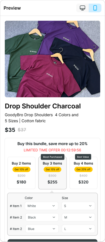
How It Works: The widget displays up to 3 visible bundle tiers side by side (e.g., Buy 2, Buy 3, Buy 4), each with its own discount and price. Additional tiers convert into a scrollable carousel. The widget appears below the Add to Cart button and updates dynamically as customers select different options.
The setup flows across four tabs: Add product, Bundle & Discount, Advanced settings, and Customization.
Step 1 — Add Product
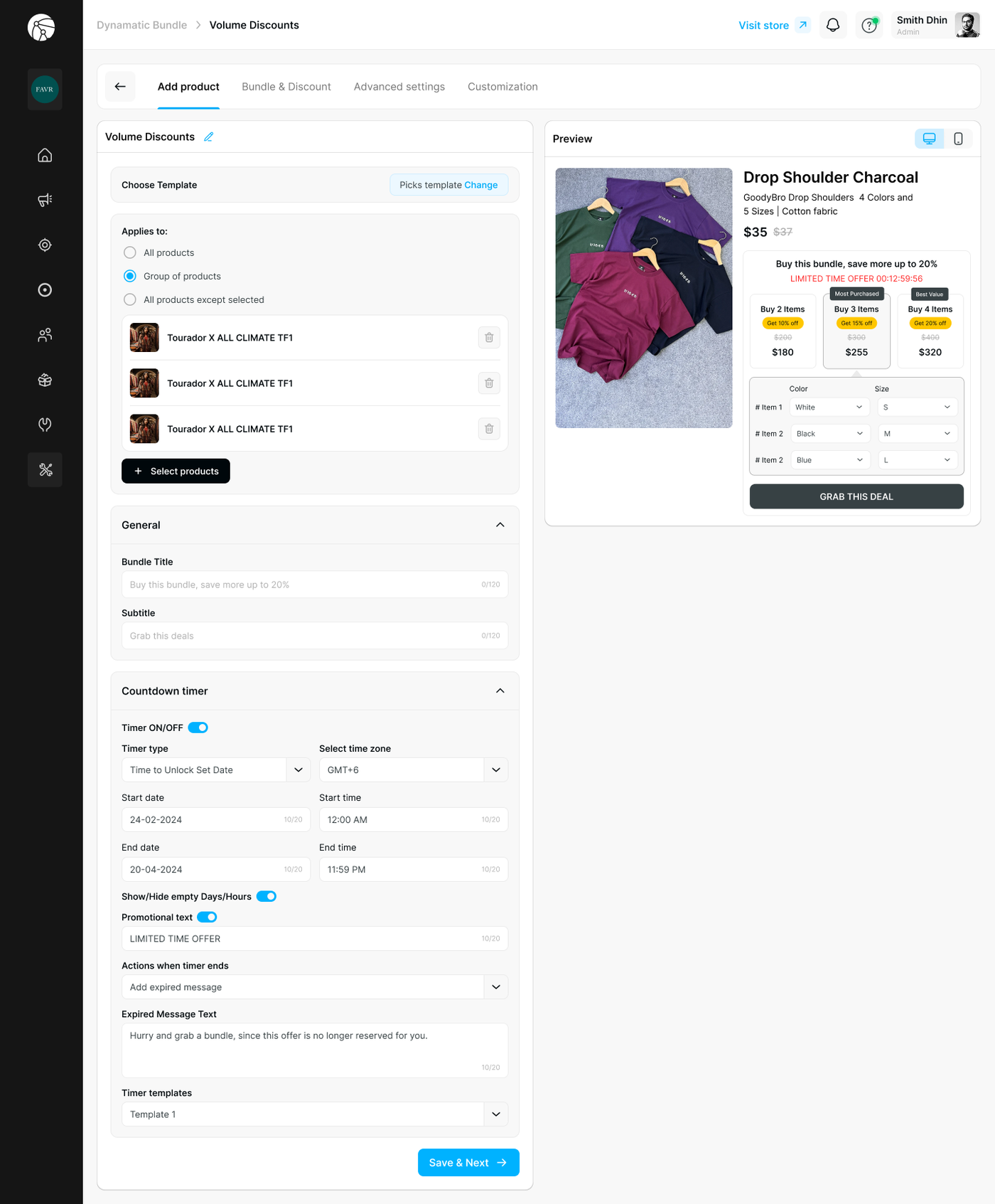
Choose Template
Select a pre-built visual template for your bundle widget by clicking Change next to the Picks template field.
Applies To
Define which products this volume discount applies to:
Option | Description |
All products | Applies the bundle to every product in your store |
Group of products | Select specific products using + Select products |
All products except selected | Applies to everything except the products you exclude |
General
Field | Description |
Bundle Title | The main headline displayed above the widget (e.g., "Buy this bundle, save more up to 20%") — max 120 characters |
Subtitle | Supporting text shown below the title (e.g., "Grab this deal") — max 120 characters |
Countdown Timer
Add urgency to your offer with a live countdown clock:
Setting | Description |
Timer ON/OFF | Toggle the countdown timer on or off |
Timer type | Choose Time to Unlock Set Date (counts to a specific date) or a rolling session timer |
Select time zone | Set the timezone for accurate countdown display |
Start date / time | When the timer begins |
End date / time | When the timer expires |
Show/Hide empty Days/Hours | Hides zero values for a cleaner display |
Promotional text | Toggle and customize the label shown alongside the timer (e.g., "LIMITED TIME OFFER") |
Actions when timer ends | Choose Hide widget (removes the bundle) or Add expired message (keeps the widget but replaces the timer) |
Expired Message Text | The message shown when the timer runs out (e.g., "Hurry and grab a bundle, since this offer is no longer reserved for you.") |
Timer templates | Select a visual style for the countdown display |
Click Save & Next to proceed.
Step 2 — Bundle & Discount
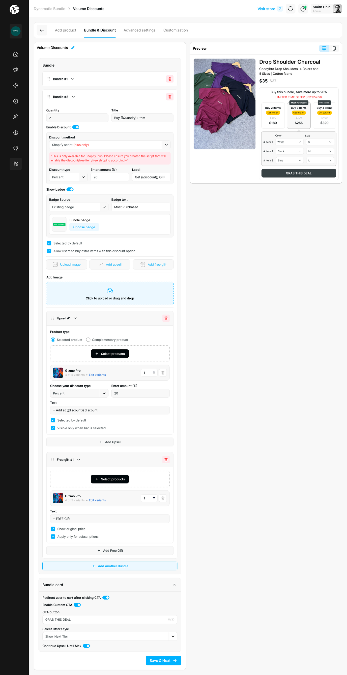
Define your quantity tiers, discounts, upsells, and free gifts.
Bundles
Each bundle tier (Bundle #1, Bundle #2, etc.) represents one quantity option shown in the widget. Click + Add Another Bundle to add more tiers.
For each bundle, configure:
Quantity & Title
Field | Description |
Quantity | Number of items required to unlock this tier (e.g., 2) |
Title | The label shown on the bundle card (e.g., "Buy {{Quantity}} Item") — supports dynamic variables |
Discount
Setting | Description |
Enable Discount | Toggle to activate a discount for this tier |
Discount method | Choose how the discount is applied: Shopify script (Plus only), Manual code, or Auto generated code |
Discount type | Percentage or fixed amount |
Enter amount (%) | The discount value |
Label | The discount label shown on the bundle card (e.g., "Get {{discount}} OFF") |
Badge
Setting | Description |
Show badge | Toggle to display a highlight badge on this tier |
Badge source | Use an Existing badge or create a custom one |
Badge text | The badge label (e.g., "Most Purchased", "Best Value") |
Bundle badge | Click Choose badge to select a visual badge style |
Additional Options
Option | Description |
Selected by default | Pre-selects this tier when the widget loads |
Allow users to buy extra items with this discount option | Lets customers add more than the defined quantity at the same discount rate |
Upload image | Add a custom image to this bundle card |
Upsell
Attach an upsell product to a specific bundle tier:
Setting | Description |
Product type | Selected product (a specific item) or Complementary product |
Select products | Choose the upsell item and set its quantity |
Discount type / amount | Set a discount on the upsell item |
Text | The upsell label shown in the widget (e.g., "+ Add at {{discount}} discount") |
Selected by default | Pre-checks the upsell when the bundle is selected |
Visible only when bar is selected | Hides the upsell unless the customer selects this tier |
Click + Add Upsell to add more upsell items to the same tier.
Free Gift
Attach a free gift to a bundle tier:
Setting | Description |
Select products | Choose the gift item and set its quantity |
Text | The label shown in the widget (e.g., "+ FREE Gift") |
Show original price | Displays the gift's original price (struck through) |
Apply only for subscriptions | Restricts the free gift to subscription purchases only |
Click + Add Free Gift to add more gifts.
Bundle Card
Control the CTA behavior at the bottom of the widget:
Setting | Description |
Redirect user to cart after clicking CTA | Toggle to send customers directly to cart after selecting a bundle |
Enable Custom CTA | Toggle to customize the call-to-action button |
CTA button text | The button label (e.g., "GRAB THIS DEAL") |
Select Offer Style | Choose Show Next Tier (e.g., "Save 20% when you buy 5") or Show Qty Left to Add to next tier (e.g., "Add 2 more to save 20%") |
Continue Upsell Until Max | When enabled, the cart automatically surfaces the next available tier after each upgrade, continuing until the highest tier is reached |
Click Save & Next to proceed.
Step 3 — Advanced Settings
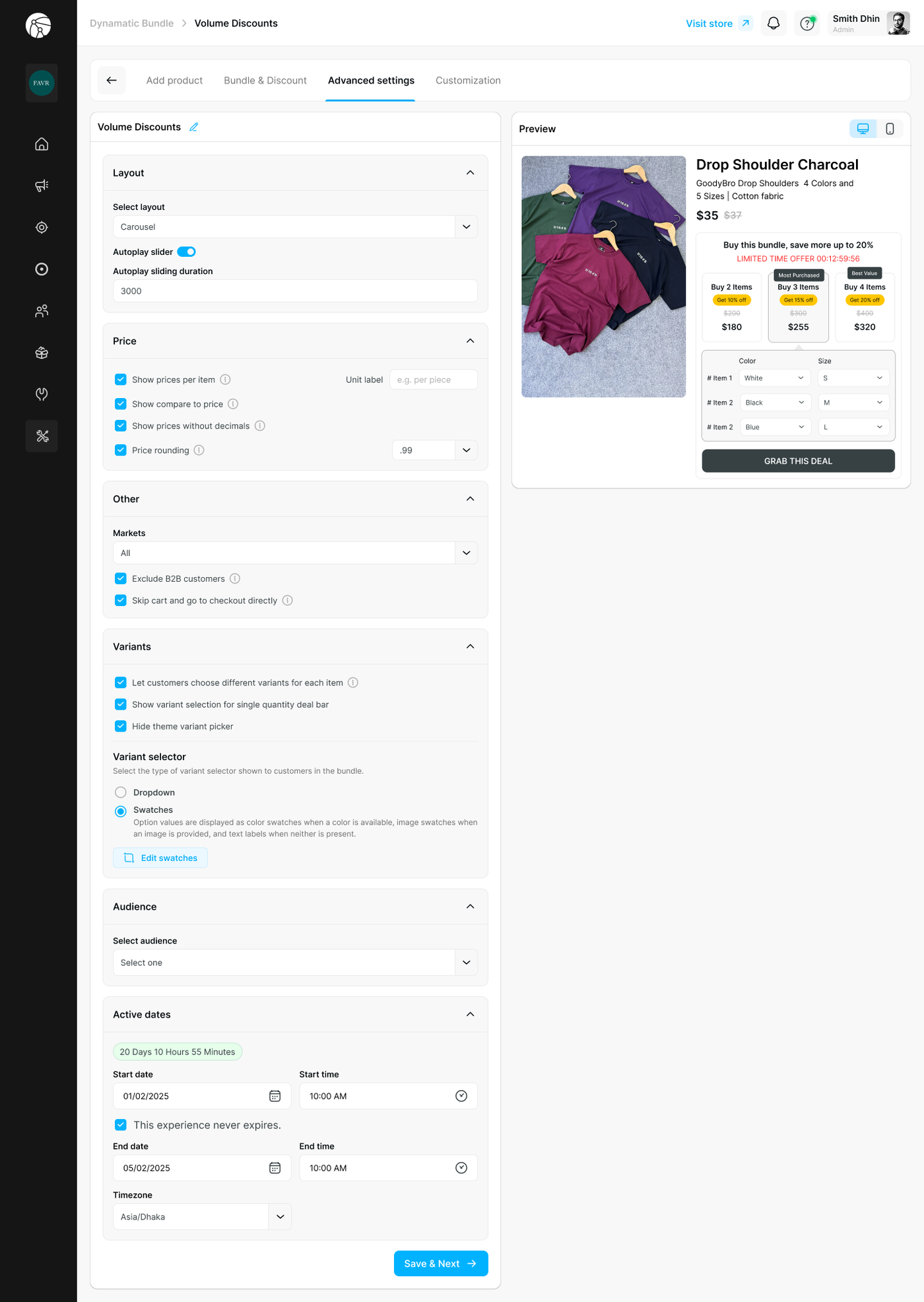
Layout
Setting | Description |
Select layout | Choose Carousel (horizontal scrollable tiers) or List (stacked view) |
Autoplay slider | Toggle to automatically cycle through bundle tiers |
Autoplay sliding duration | Set the interval in milliseconds (e.g., 3000 = 3 seconds) |
Price
Setting | Description |
Show prices per item | Displays the per-item price on each bundle card |
Unit label | Customize the unit label (e.g., "per piece") |
Show compare to price | Shows the original price struck through |
Show prices without decimals | Rounds displayed prices to whole numbers |
Price rounding | Set a rounding rule (e.g., |
Other
Setting | Description |
Markets | Restrict the bundle to specific Shopify Markets or leave as All |
Exclude B2B customers | Hides the bundle from wholesale/B2B accounts |
Skip cart and go to checkout directly | Bypasses the cart and sends customers straight to checkout |
Variants
Setting | Description |
Let customers choose different variants for each item | Shows a variant selector inside the widget for each item in the bundle |
Show variant selection for single quantity deal bar | Displays variant selectors even when only one item is in the bundle |
Hide theme variant picker | Removes the default theme variant picker from the PDP when the bundle widget is active |
Variant selector | Choose between Dropdown or Swatches (color/image swatches when available, text labels otherwise) |
Click Edit swatches to customize swatch appearance.
Audience
Restrict who sees the bundle by selecting a specific customer segment from the Select audience dropdown, or leave open to everyone.
Active Dates
Setting | Description |
Start date / time | When the bundle becomes active on the storefront |
This experience never expires | Check to run the bundle indefinitely |
End date / time | When the bundle automatically deactivates |
Timezone | Set the timezone for accurate scheduling |
Click Save & Next to proceed.
Step 4 — Customization
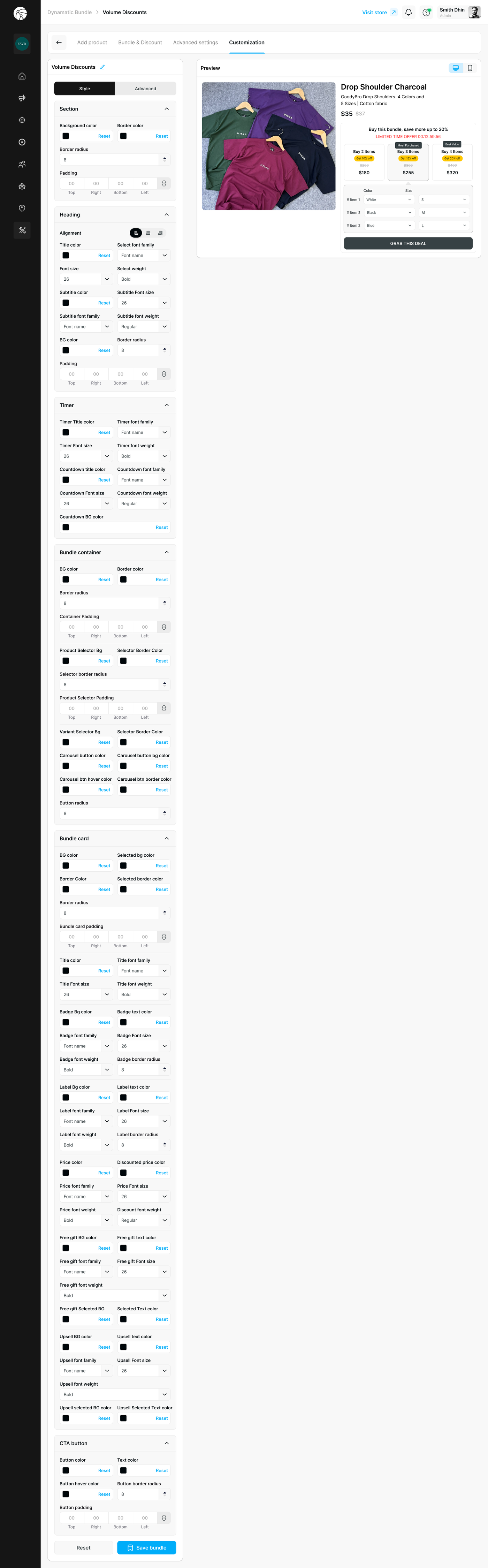
The Customization tab gives you complete control over the visual appearance of the bundle widget, split across Style and Advanced sub-tabs.
Section
Controls the outer container of the widget: background color, border color, border radius, and padding.
Heading
Typography and color controls for the bundle title and subtitle: alignment, font family, font size, font weight, and background color.
Timer
Styling for the countdown clock: timer text color, font family, font size, font weight, countdown label color and size, and countdown background color.
Bundle Container
Controls the inner product grid: background color, border color, border radius, container padding, product selector background and border colors, selector border radius, variant selector colors, carousel button colors, and hover states.
Bundle Card
Detailed styling per bundle tier card, including: background and selected state colors, border, padding, title typography, badge appearance (color, font, size, border radius), label colors, price and discounted price colors, free gift colors, upsell colors, and selected state text colors.
CTA Button
Setting | Description |
Button color | Default background color of the CTA button |
Text color | Label color on the CTA button |
Button hover color | Background color on hover |
Button border radius | Rounds the button corners |
Button padding | Controls spacing inside the button |
Tip: Use the live Preview panel throughout to verify your styling looks correct on both desktop and mobile before saving.
Click Save bundle to apply all changes and publish your Volume Bundle.
Before You Publish
Ensure the Dynamatic Bundles app embed is toggled ON in your Shopify Theme Editor, or the widget will not appear on your storefront.
If you switch themes, you must re-enable the app embed on the new theme.
Use View on store to preview the widget on your live storefront before going live.