
Discount Code Widget
The Discount Code widget allows customers to enter and apply a discount or promo code directly in the cart or checkout. This feature is designed to encourage higher conversion rates and reward specific promotions.
Where It Works: Cart, Checkout
Playbook
Stop losing customers who are hunting for a coupon field. The Discount Code widget reduces friction by allowing shoppers to apply promo codes directly within the cart or checkout. By validating codes instantly and updating prices in real-time, you reward high-intent buyers immediately and secure the sale before they leave to search for a deal elsewhere.
The "Why" & The Metrics
Primary Metric Impact: Conversion Rate (CR), Cart Abandonment Rate.
The Psychological Trigger: Instant Gratification & Reciprocity. When a customer successfully applies a code, they feel rewarded and are psychologically committed to completing the purchase.
Best Fit Industries: Fashion, Beauty, Retail, and High-Volume Promo stores.
Strategic Use Cases (The "Plays")
Play #1: The Quick Win (The "Influencer" Flow)
The Concept: Make it impossible for customers with an influencer or email code to miss the input field.
The Logic: Customers arriving with a code are high-intent. Hiding the input box creates friction. Making it visible validates their intent immediately.
Configuration Strategy:
Trigger/Condition: Show to all users in the Cart Zone.
Key Setting: Set Show Title to "Show" and set Button Text to "Apply" for clear action.
Copy/Creative Idea: Title: "Have a promo code? Enter it here."
Play #2: The Profit Maximizer (Controlled Stacking)
The Concept: Allow discounts but protect your margins by preventing customers from combining specific types of codes.
The Logic: You want to offer discounts to drive sales but need to prevent "double dipping" (e.g., combining a "Welcome" code with a "Black Friday" code).
Configuration Strategy:
Trigger/Condition: Active on Cart.
Key Setting: Enable Limit stacking codes by prefix.
Input: Enter specific prefixes (e.g., "BFCM" or "WELCOME") to restrict usage.
Copy/Creative Idea: Use the Custom Error Text to politely inform users: "Only one promo code allowed per order".
Play #3: The Brand Builder (The "Clean" Cart)
The Concept: Keep the cart design minimal and distraction-free for full-price buyers, while still accessible for those with codes.
The Logic: A large open input box can remind users they don't have a code, causing them to leave and search Google. Collapsing it keeps the UI clean.
Configuration Strategy:
Trigger/Condition: Cart Zone.
Key Setting: Enable Show Discount Box on Title Click.
Result: The input box remains hidden until the customer clicks the title link (e.g., "Have a coupon?"), expanding it only when needed.
Pro-Tips & Constraints
Smart Constraint: The Maximum prefix text for limiting stacking codes is 50 characters.
Integration Note: This widget requires valid discount codes to be set up in your Shopify Admin panel first; it does not create codes itself.
Optimization Tip: Enable Show applied discount codes. This gives customers immediate visual confirmation that their code worked, reducing support tickets and cart abandonment.
Main Features:
An input box for entering a discount or promo code.
An Apply button to validate and apply the discount.
Automatic price adjustment on eligible items.
Configuration Options: You can enable or disable the discount input, restrict it by audience or campaign, and customize error messages for invalid codes.
Limitations:
It only works with active, valid discount codes that have been set up in Shopify.
It may conflict with automatic discounts if not configured properly.
Some discount types may require backend setup beyond just entering the code.
Step-by-Step Creation
Click Create Widgets: From your dashboard, click Create Widgets. A new page titled "Add New Widgets" will appear.
Fill in the Details: Fill in the Widget Title and a Short Description for your widget.
Select a Template: If there are any existing widgets that align with your title, they will appear at the bottom of the page. Select the one you wish to use.
After you have filled in the basic details and selected a template, click Next to be taken to the widget's main configuration page. This page is divided into different sections that control the widget's functionality and appearance.
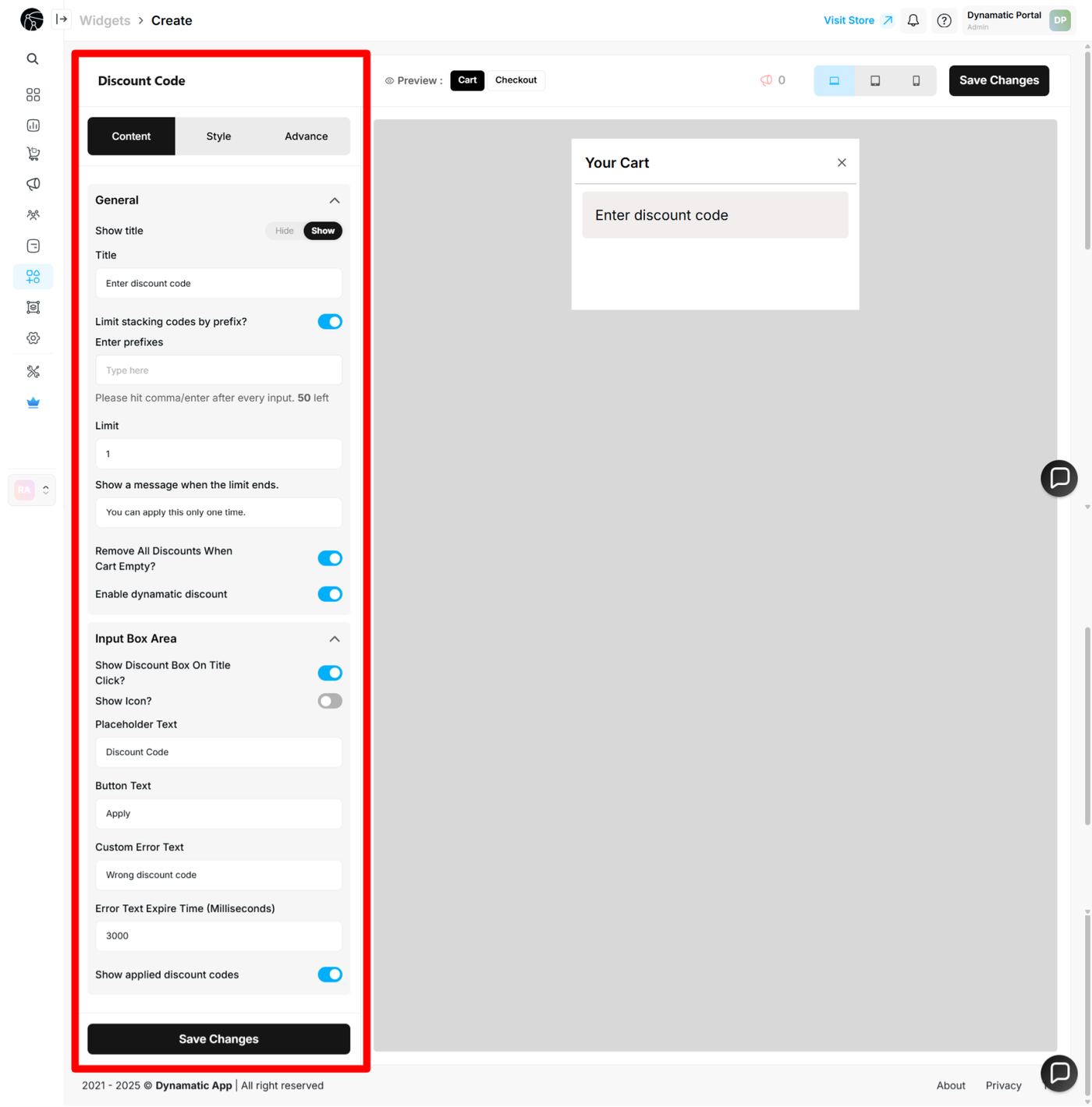
Let's break down the options in the Content part of the widget editor. The
Content tab is where you control the core functionality of the widget.
Title Options
Hide Title: This checkbox controls whether the widget title is displayed. When enabled, the widget will show just the input box. When disabled, the widget's title will be visible above the input box.
Title Text: This field allows you to give the widget a custom title.
Prefix Options
Enter Prefix: You can enable a prefix for your discount codes by checking this box. When enabled, you must also provide a message that will be displayed to the customer. This can be used to limit and show a specific message for certain codes.
Input Box Area
This is the main area where the customer will enter their discount code.
After setting the title and prefix options, you can customize the appearance and behavior of the input box itself.
Show Box on Title
This option controls whether the title is displayed within a box.
If enabled, your widget will appear with the title inside a box.
If disabled, the widget will show the title without a surrounding box.
Customizable Text Fields
You can also customize the text that appears within the widget:
Placeholder Text: Customize the text that appears inside the input box before a user types anything.
Button Text: Change the text on the Apply button.
Custom Error Text: Write your own error messages for invalid codes.
Once you have completed these customizations, click the Save Changes button.
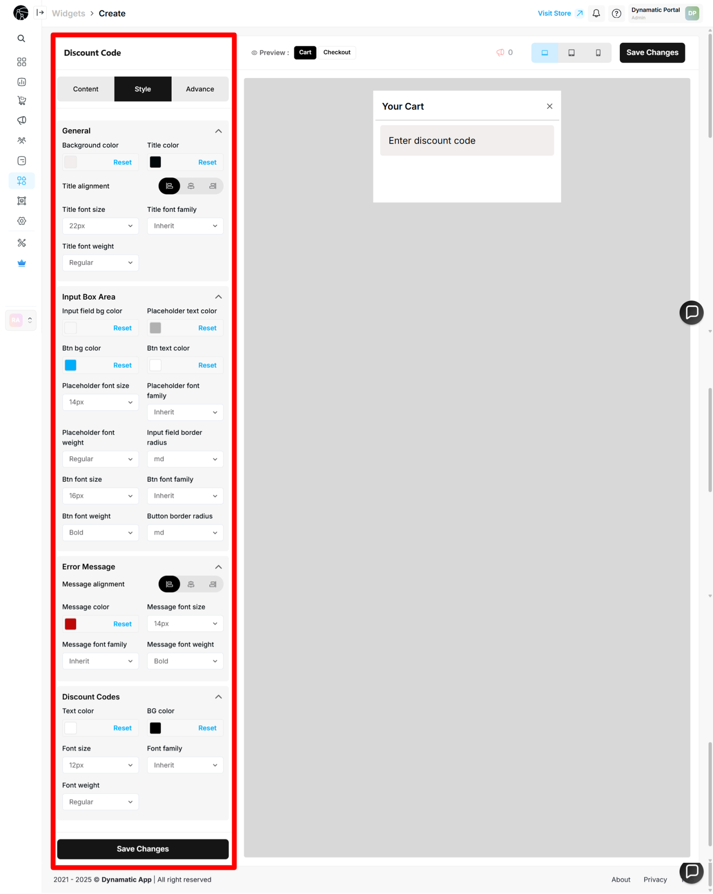
Customizing Widget Style
After configuring the widget's content, the next step is to customize its style to match your store's branding. The Style section is divided into four main parts.
1. General
The General section allows you to customize the overall look of your widget. You can change:
Background color
Title color
Title alignment
Font size
Font family
Font weight
2. Input Box Area
This section controls the styling of the input field and button. Here, you can adjust:
Input field background color
Placeholder text color
Button background color
Button text color
Placeholder font size
Border radius
Button font size
3. Error Message
You can customize the appearance of error messages to ensure they are clear and easy for your customers to read. This section allows you to change the:
Error message alignment
Message color
Font size
Font family
Font weight
4. Discount Codes
This part allows you to customize the styling of the discount code text itself. You can change the:
Text color
Background color
Font size
Font family
Font weight
You have now successfully created and fully customized your discount code widget.
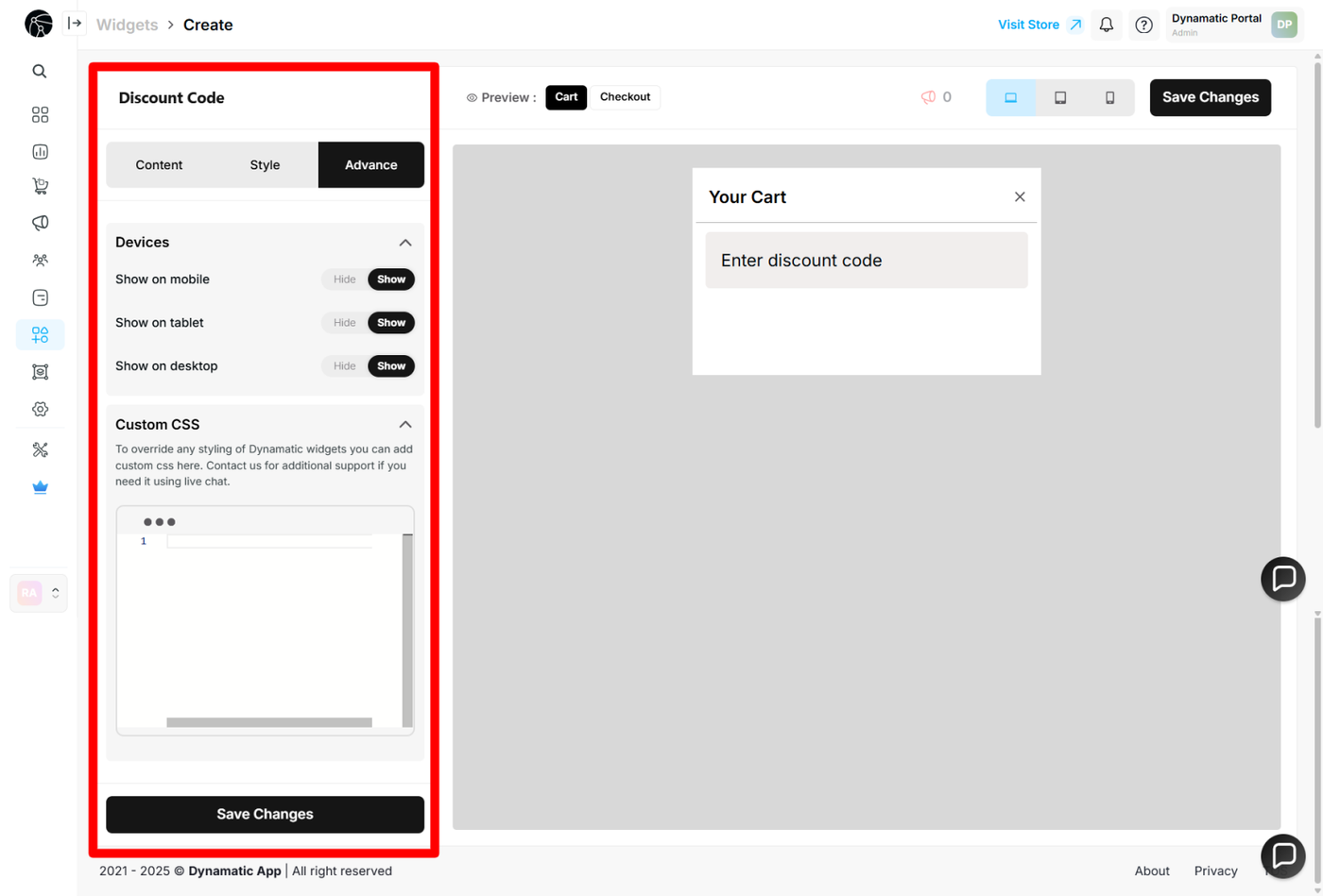
This section provides advanced options for customizing your widget's display.
Device Targeting: Here, you can control where the widget appears based on the user's device (e.g., desktop, mobile, tablet).
Custom CSS: You can write and apply your own custom CSS to the widget. This gives you complete control over the design and allows you to make more specific style changes beyond the standard options.
Publishing Your Configured Widget Live
This following documentation section provides the final, detailed steps required to publish your fully configured widget and make it visible to customers on your live storefront.
01. How to successfully setup a widget
02. Understanding and Creating Audiences