
Frequently Bought Together
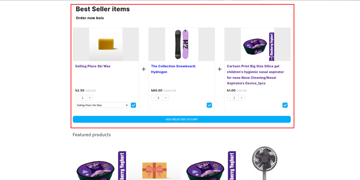
The Frequently Bought Together (FBT) Widget is one of the most effective cross-selling tools available in the Dynamatic App. It leverages social proof by showing customers complementary products that are commonly purchased together, significantly boosting Average Order Value (AOV) by making it easy to purchase a curated bundle.
Attribute | Description |
Widget Name | Frequently Bought Together |
Core Purpose | Increases AOV by displaying smart, data-driven product combinations with a single-click "Add to Cart" function. |
Where It Works | Webpage (Most effective on Product Pages for immediate upsell). |
Playbook
Stop making your customers search for the matching accessory. The FBT widget removes the friction of browsing by presenting the perfect "combo meal" right on the product page. By allowing shoppers to add the main item plus essential add-ons in one click, you turn a single-item transaction into a multi-product order instantly. It’s the easiest way to boost Average Order Value (AOV) without being intrusive.
The "Why" & The Metrics
Primary Metric Impact: Average Order Value (AOV), Items Per Transaction (IPT).
The Psychological Trigger: Social Proof & Cognitive Ease. Seeing "Others bought this" validates the purchase decision, while the one-click bundle reduces the mental effort required to find matching items.
Best Fit Industries: Fashion (Complete the Outfit), Beauty (Full Regimen), Electronics (Device + Case + Cable).
Strategic Use Cases (The "Plays")
Play #1: The Quick Win (The "Smart Algo")
The Concept: Let the data do the work. Automatically show products that previous customers actually bought together.
The Logic: This requires zero maintenance. As your sales data grows, the recommendations get smarter, automatically surfacing your most popular combinations.
Configuration Strategy:
Trigger/Condition: Product Page.
Key Setting: Under Product Sourcing, select Auto.
Copy/Creative Idea: Heading: "Frequently Bought Together."
Play #2: The Profit Maximizer (The "Bundle Deal")
The Concept: Offer a slight discount (e.g., 10%) only if the customer buys the full bundle.
The Logic: The discount acts as the "nudge" to upgrade from a single item to a bundle. You sacrifice a small margin percentage to gain a significantly larger basket size.
Configuration Strategy:
Trigger/Condition: High-margin product pages.
Key Setting: Under Discount Logic, set a percentage off. Ensure "Remove discount if regular product is not in cart" is enabled to protect margins.
Copy/Creative Idea: "Buy the set and save 15%!"
Play #3: The Brand Builder (The "Curated Look")
The Concept: Manually group items to create a specific "vibe" or "look," regardless of historical data.
The Logic: Perfect for new collection launches where historical data doesn't exist yet. You guide the customer toward the aesthetic you want them to buy.
Configuration Strategy:
Trigger/Condition: New Arrival Product Pages.
Key Setting: Under Product Sourcing, select Manual or Feeds.
Copy/Creative Idea: Heading: "Complete the Look."
Pro-Tips & Constraints
Smart Constraint: This widget is most effective on the Product Page. Placing it on the Cart page can sometimes distract users who are already ready to checkout.
Integration Note: If using Auto sourcing, the widget needs transaction history to work effectively. New stores should start with Manual or Feeds.
Optimization Tip: If you are selling a high-ticket item (e.g., a camera), use the Main Product Exclusion setting to show only accessories (lens, bag, card) in the list, making the add-on cost feel small compared to the main purchase.
The Frequently Bought Together Widget helps you increase cart value by presenting customers with natural, data-backed product bundles. It’s designed to make the “add-on” experience effortless, turning a single product view into a multi-item purchase.Use the ideas below to explore creative ways of applying this widget across different parts of your store.
Idea Type | Description | Goal |
|---|---|---|
Complete the Set | Present complementary products that form a full bundle — for example, showing matching accessories, outfit combinations, or items commonly used together. | Boost AOV by encouraging multi-product purchases. |
Auto-Generated Smart Bundles | Use automatic sourcing to display bundles based on real purchase data (“Customers who bought this also bought…”). | Leverage social proof and simplify discovery. |
Custom Curated Combos | Manually group high-performing items or new releases with popular products to guide shoppers toward specific pairings. | Increase visibility for target products or new collections. |
Discounted Bundle Offer | Apply a small bundle discount (e.g., 10% off when all items are added together) to incentivize full-bundle purchases. | Improve bundle conversion and total spend. |
Cross-Category Recommendations | Suggest items from complementary categories (e.g., shoes with socks, phone with case, candle with holder). | Expand customer interest beyond the current category. |
Main Product Exclusion | Display upsell items only — excluding the viewed product — to focus entirely on add-ons or accessories. | Maximize exposure for high-margin or secondary products. |
Theme or Occasion Bundles | Create seasonal or themed recommendations, such as “Holiday Essentials,” “Back-to-School Picks,” or “Summer Favorites.” | Keep recommendations relevant to campaigns and seasons. |
Stock-Aware Offers | Hide out-of-stock items and dynamically show in-stock alternatives or similar bundles. | Maintain a frictionless and reliable shopping experience. |
Subscription or Refill Pairing | Pair a one-time purchase with a subscription-based refill or consumable product. | Drive recurring purchases and customer retention. |
Bundle-as-a-Gift | Present pre-packed gift sets under one click — ideal for occasions like holidays or birthdays. | Simplify gifting and increase bundle conversions. |
Configuration Options
The FBT widget is configured across three distinct sections: Content (logic and sourcing), Style (visuals), and Advanced (technical settings).
1. Content Tab: Logic and Sourcing
This section is vital for defining the product recommendations and the appearance of the bundle itself.
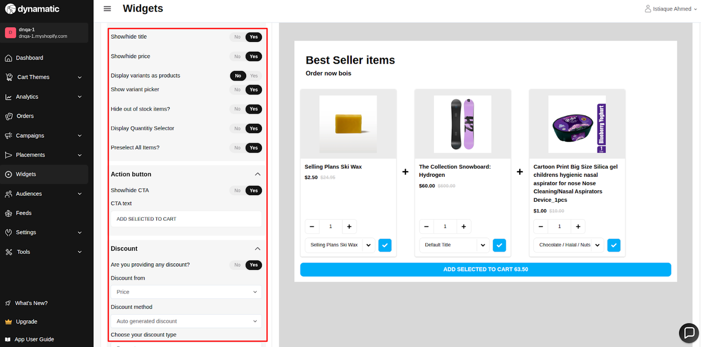
Setting | Functionality | Options/Detail |
Product Sourcing | Defines how the bundle is assembled. | Auto: Uses historical purchase data to generate recommendations. Feeds: Pulls products dynamically from a selected Product Feed (Product Set). Manual: Allows you to hand-select the exact products for the bundle. Trigger/Others: Uses advanced logic based on a specific product to pull recommendations. |
Messaging | Customizes the text the customer sees. | Set the primary Heading and Subtitle (e.g., "Customers Also Bought These"). |
Discount Logic | Manages how savings are applied. | Configure a discount for the entire bundle. Crucially, you can set the system to remove the discount if the regular product is not in the cart, ensuring the full bundle is purchased. |
Bundle Inclusion | Controls which items are displayed. | Choose whether to include the main product (the one the customer is currently viewing) as part of the total bundle or if the widget should only display upsell items. |
Display Controls | Refines how the products look. | Hide out-of-stock products automatically. Enable/disable variant selectors and customize the product titles. |
Call-to-Action (CTA) | Customizes the final button. | Adjust the text and styling for the button that adds all selected items to the cart in a single click. |
2. Style Tab: Visual Customization
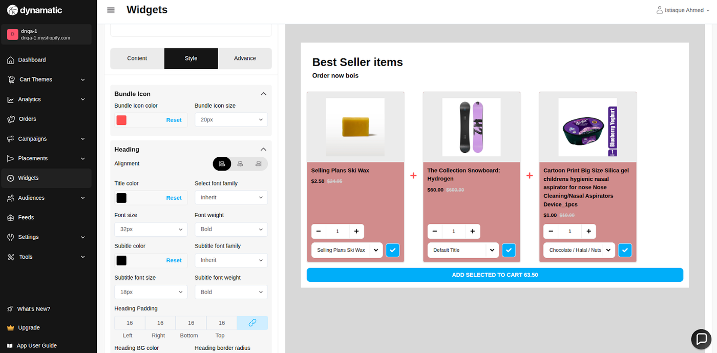
This section ensures the FBT widget integrates seamlessly with your brand:
Color Control: Modify the background color of the widget, along with the font colors and sizes for all text elements.
Design Elements: Customize the look of the CTA button and any discount badges to maximize click-through rates and clarity.
3. Advanced Tab: Technical Refinements
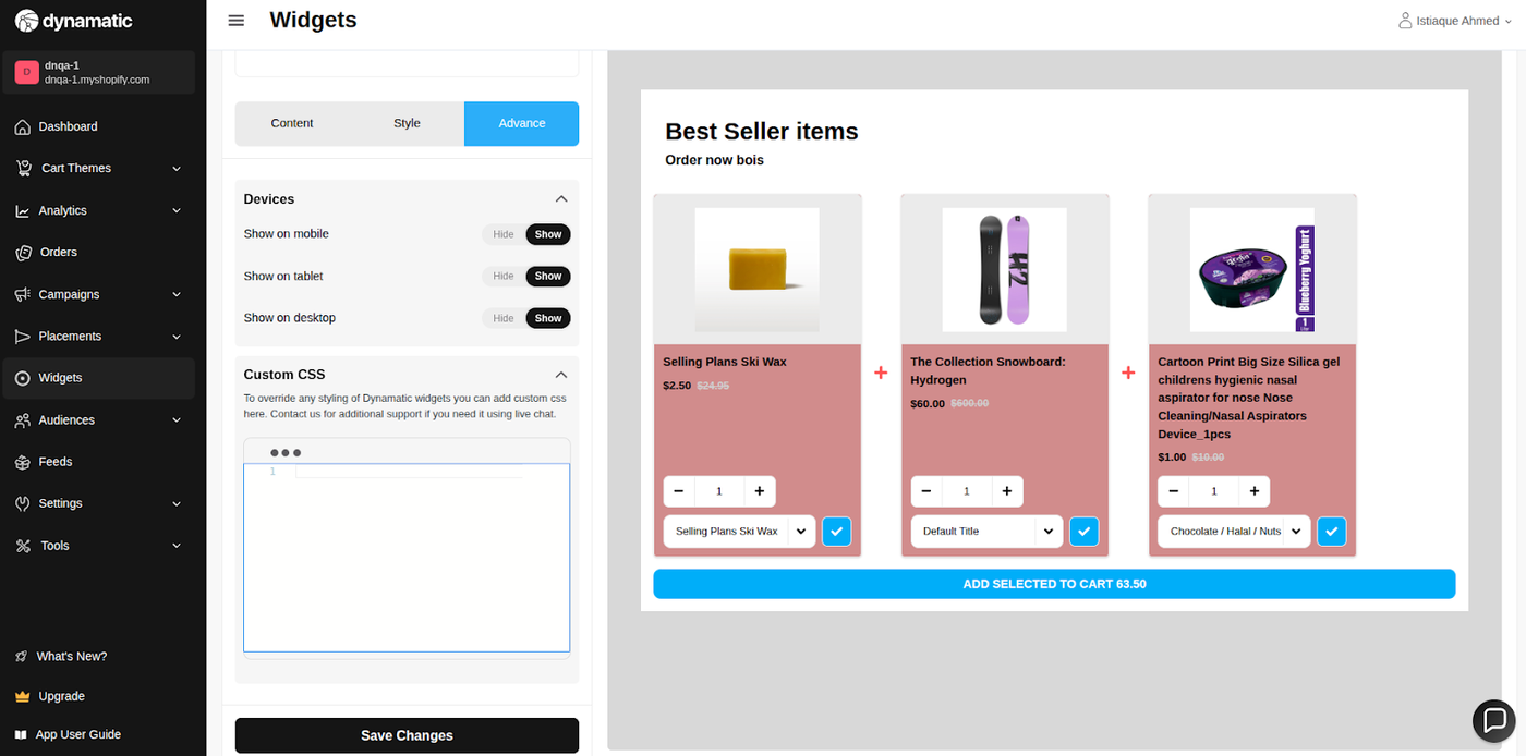
This section is for final display control and custom code implementation:
Device Setting: Restrict the widget's visibility to specific devices (Desktop or Mobile).
Custom CSS: Use this field to input custom CSS code for advanced design customizations that go beyond the standard style options.
Publishing Your Configured Widget Live
This following documentation section provides the final, detailed steps required to publish your fully configured widget and make it visible to customers on your live storefront.
01. How to successfully setup a widget
02. Understanding and Creating Audiences
03. Creating Placements and Zones
05. Displaying Your Widgets on the Storefront
Final Deployment
Once configured, the FBT widget must be connected to a Placement (Zone) via an active Campaign/Experience to begin generating sales on your live storefront.