
Interstitial Upsell Widget
The Interstitial Upsell Widget is a powerful cross-selling tool that presents a modal-style promotion between page transitions (e.g., when a user clicks to navigate from a Collection Page to a Product Page). It encourages users to accept a complementary or higher-value offer before proceeding, boosting Average Order Value (AOV) without disrupting the current page view.
Attribute | Description |
Widget Name | Interstitial Upsell Widget |
Core Purpose | Displays a full-screen, dismissible pop-up promotion during site navigation to offer a high-converting upsell or cross-sell with a time limit. |
Where It Works | Webpage (Activated by user navigation clicks). |
Key Features | Modal-style prompt; configurable skip button; direct "Add to Cart" functionality; optional timer for urgency. |
Limitations | Only works on Webpages; not available on Cart or Checkout pages. Effectiveness can be reduced if the user immediately dismisses the pop-up. |
Playbook
Capture undivided attention without being annoying.
Most upsells get lost in the noise of a busy product page. The Interstitial Upsell works by presenting a high-value offer during natural pause points—like when a customer clicks to view a product. It creates a focused "micro-moment" where the customer must decide to add a relevant item or skip, driving higher engagement and Average Order Value (AOV)3.
The "Why" & The Metrics
Primary Metric Impact: Average Order Value (AOV) and Conversion Rate (CR).
The Psychological Trigger: Pattern Interrupt & Urgency. By pausing the navigation flow, you force the user to focus on the offer. Adding a countdown timer triggers fear of missing out (FOMO).
Best Fit Industries: Fashion (Complete the Look), Electronics (Warranties & Accessories), Beauty (Routine Bundles).
Strategic Use Cases (The "Plays")
Play #1: The Quick Win (The "Complete the Look")
The Concept: When a user navigates to a specific product (e.g., a dress), show them the matching accessory (e.g., a belt) immediately.
The Logic: This leverages Complementary Product Offers. The user has already shown intent by clicking the main product; offering the matching item now saves them from searching for it later.
Configuration Strategy:
Trigger/Condition: Trigger on specific Trigger Products (the main item)6.
Key Setting: Under Product Area, manually select the complementary accessory7.
Copy/Creative Idea: "Wait! This looks better with the matching belt."
Play #2: The Profit Maximizer (The "Flash Deal")
The Concept: Present a time-sensitive discount on a high-margin item to encourage impulse buying.
The Logic: Using the Limited-Time Promotion strategy combined with a timer creates immediate urgency, reducing hesitation.
Configuration Strategy:
Trigger/Condition: Show on Webpage navigation.
Key Setting: Enable the Timer option in the Content tab to display a countdown8.
Copy/Creative Idea: "Flash Offer: Add this Mystery Box for 50% off - Offer expires in 5:00."
Play #3: The Brand Builder (The "Trust Add-On")
The Concept: Offer product protection, shipping insurance, or an extended warranty before the user gets to the cart.
The Logic: This is a Trust-Building Add-On. Presenting protection before the cart reduces anxiety about high-ticket purchases and frames the add-on as a smart decision rather than a hidden cost.
Configuration Strategy:
Trigger/Condition: Trigger when navigating to high-ticket items.
Key Setting: Configure the CTA Button to say "Add Protection" vs "Skip Coverage"9.
Copy/Creative Idea: "Protect your investment for just $5?"
Pro-Tips & Constraints
Smart Constraint: The widget only works on the Webpage zone18. It cannot be used inside the Cart drawer or at Checkout.
Integration Note: Ensure your Trigger Products are correctly mapped. If the trigger product isn't clicked/viewed, the modal won't fire.
Optimization Tip: Always include a clear Skip and Go button. Trapping users without an exit causes frustration; giving them a clear "No" option actually increases trus.
The Interstitial Upsell Widget can serve many purposes beyond a single promotion. It’s designed to help you capture customer attention in between moments of intent — when a shopper is transitioning between pages and is most open to discovering something new.Below are several idea types to help you brainstorm how to best use this widget within your store’s journey.
Idea Type | Description | Goal |
|---|---|---|
Complementary Product Offer | Show a related or matching product when a shopper clicks from a collection to a product page. For example, offer “matching accessories,” “pair-with” items, or “complete the look” suggestions. | Increase AOV and encourage multiple-item purchases. |
Upgrade or Premium Offer | Display a higher-value version of a product or bundle when the user shows intent on a mid-tier item. Highlight what extra value they get for a slightly higher price. | Drive product upgrades and raise order value. |
Limited-Time Promotion | Present time-sensitive deals (e.g., flash sales, seasonal discounts, or limited stock). Combine with a countdown timer to create urgency. | Encourage faster conversions and reduce hesitation. |
Threshold Reminder | Use the pop-up to remind customers how close they are to free shipping or a discount threshold. Offer quick add-ons that help them qualify. | Boost AOV and completion rate for incentive-based promotions. |
Cross-Category Discovery | Introduce shoppers to another product line, such as recommending accessories, new arrivals, or related collections during browsing. | Increase product discovery and cross-category exposure. |
First-Time Visitor Incentive | Detect new visitors and show a one-time welcome offer or discount before they reach a product page. | Improve first-visit conversion rate. |
Subscription or Bulk Upsell | When shoppers view individual or repeat-purchase products, present a subscription or multi-pack alternative with savings. | Build recurring revenue and customer retention. |
Trust-Building Add-On | Display product protection, warranties, or satisfaction guarantees when users view high-value items. | Reduce drop-offs and reinforce purchase confidence. |
Social Proof Highlight | Feature best-sellers, trending products, or “customer favorites” in the interstitial to guide undecided shoppers. | Build trust and speed up purchase decisions. |
Campaign or Collection Promotion | Use the widget to promote special campaigns, collaborations, or seasonal collections during navigation. | Drive engagement with new or limited collections. |
Configuration Options
The widget is configured using the standard three-tab structure: Content (logic and messaging), Style (visuals), and Advanced (technical settings).
1. Step-by-Step Widget Creation
Click Create Widgets in your Dynamatic dashboard.
On the "Add New Widgets" page, fill in the Widget Title and a brief description.
Search for and select the Interstitial Upsell Widget.
Click Next.
Select your preferred visual template from the available options (typically 5 templates) and click Select.
2. Content Tab: Logic and Triggers
 |  |
 |  |
 |  |
The Content section defines the offer, the product set, and the display logic.
Setting | Functionality | Detail |
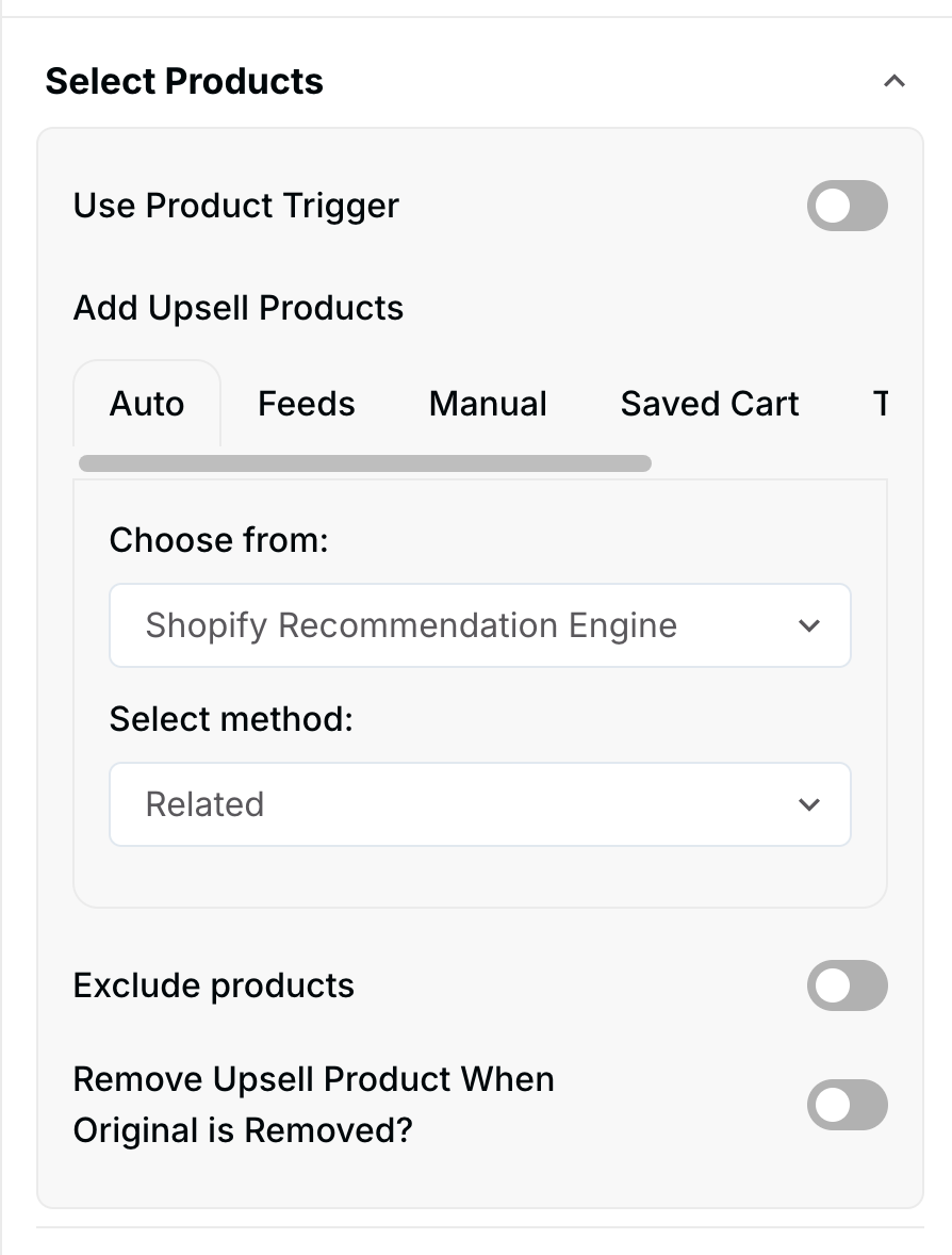
Product Selection | Defines the recommended items presented in the pop-up. | Products can be added Manually (hand-selected), via Feeds (dynamic groups), or through advanced options. |
Trigger Products | Sets the specific products whose presence in the cart (or on the page) triggers the interstitial pop-up. | You can select one or multiple products that must be viewed or added to cart to activate the offer. |
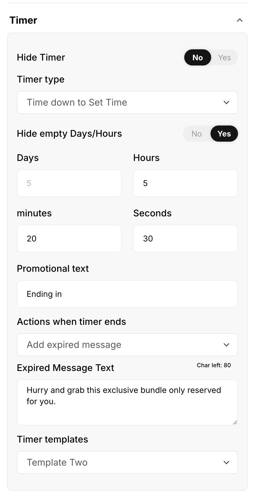
Timer | Creates a sense of urgency for the offer. | Set a countdown timer to display inside the modal. The user must act before the timer expires. |
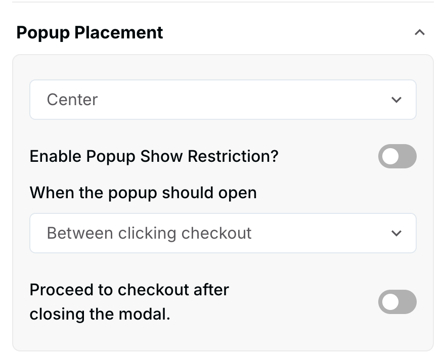
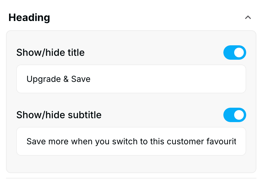
Pop-up Placement | While the widget is full-screen, this may control the internal positioning of the content. | Define the internal title, subtitle, and overall message structure. |
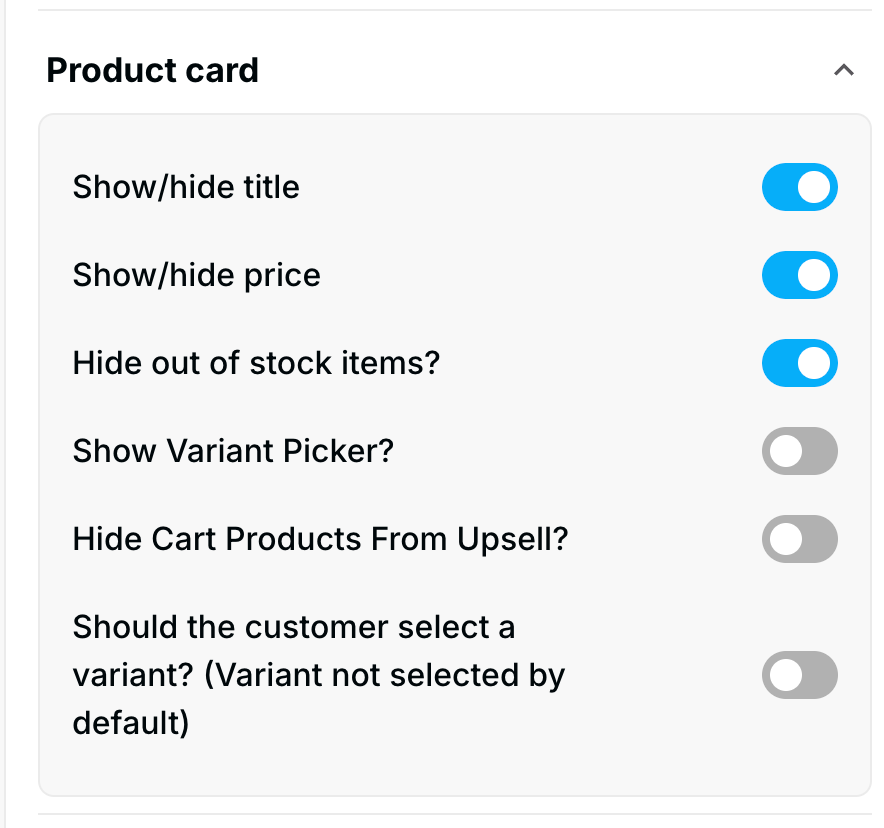
Display Elements | Customizes what the customer sees on the modal. | Configure the visibility of the product card title, price, stock, vendor, and variant picker options. |
CTA Button | Controls the buttons on the pop-up. | Customize the text and appearance of the main CTA (Add to Cart) and the Skip and Go button. |
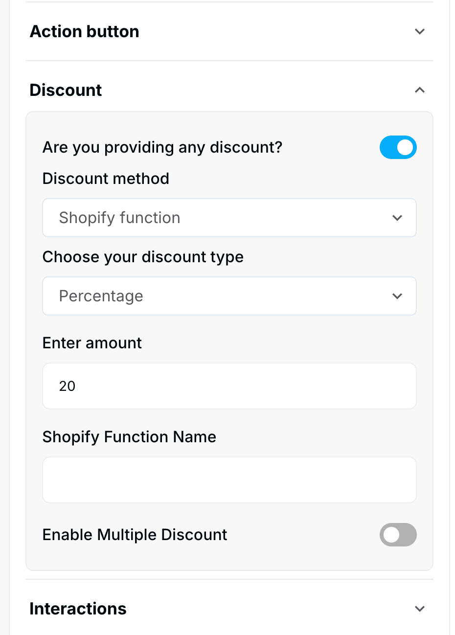
Discount | Applies savings to the upsell item. | Configure the discount offered on the product(s) presented in the interstitial. |
3. Style Tab: Visual Customization
The Style section allows you to customize the widget's aesthetic features:
Layout Options: Customize the overall modal background, colors, and layout structure.
CTA Button: Control the background color, text color, font size, and font weight for the action buttons.
Product Card: Customize the appearance of the product information, including card borders and text colors.
4. Advanced Tab: Final Refinements
The Advanced tab is for final display control and custom code implementation:
Device Setting: Select the specific devices (Desktop or Mobile) where the widget should be visible.
Custom CSS: Input custom CSS code for advanced styling not covered by the standard options.
Publishing Your Configured Widget Live
This following documentation section provides the final, detailed steps required to publish your fully configured widget and make it visible to customers on your live storefront.
01. How to successfully setup a widget
02. Understanding and Creating Audiences
03. Creating Placements and Zones
05. Displaying Your Widgets on the Storefront