
List Widget
This section will guide you through creating a List Widget, a powerful tool for enhancing product discovery and engagement by displaying curated product lists to your customers.
Widget Overview
Widget Name: List Widget
Purpose: The List widget allows you to display a list of products, either similar to related products or curated according to your preference. This widget enables you to strategically showcase items where customers are most engaged, enhancing product discovery and engagement.
Where It Works: Cart, Checkout, Webpage, Thank You, Order Status
Playbook
Stop letting customers leave with just one item. The List Widget transforms passive browsing into active discovery by placing curated product recommendations or key value propositions exactly where your customers are most engaged. Whether you want to automate cross-sells or manually curate a "Staff Picks" collection, this widget drives higher basket sizes without cluttering your design.
The "Why" & The Metrics
Primary Metric Impact: Average Order Value (AOV), Product Discovery Rate, Engagement.
The Psychological Trigger: Social Proof & Authority. By curating lists (e.g., "Best Sellers" or "Staff Favorites"), you reduce decision fatigue and guide the customer toward a confident purchase.
Best Fit Industries: Fashion (Complete the Look), Beauty (Routine Steps), Electronics (Accessories), and Wholesale (Bulk options).
Strategic Use Cases (The "Plays")
Play #1: The Quick Win (The "Auto-Suggest")
The Concept: Automatically show products related to what is currently in the cart to capture low-hanging fruit.
The Logic: Customers are already in a buying mood. Showing "Auto" related items leverages Shopify's native data to present the most relevant add-ons without manual upkeep.
Configuration Strategy:
Trigger/Condition: Active on Cart or Checkout.
Key Setting: Under Products, choose Select Method: Auto.
Copy/Creative Idea: Title: "You might also like..."
Play #2: The Profit Maximizer (The "Inventory Mover")
The Concept: Create a specific list of high-margin or overstocked items to push visibility.
The Logic: Manually curating a list ensures you are directing traffic to items you need to move, rather than just what the algorithm suggests.
Configuration Strategy:
Trigger/Condition: Show on Webpage or Thank You page.
Key Setting: Under Products, choose Select Method: Manual or Feeds. Enable Exclude Out of Stock Items to prevent frustration.
Copy/Creative Idea: Title: "Limited Time Offers" or "Stock Clearance Picks".
Play #3: The Brand Builder (The "Value Prop" List)
The Concept: Use the list format to highlight store policies or USPs instead of just products (e.g., "Free Shipping," "24/7 Support").
The Logic: Reinforcing trust signals at the cart or checkout stage reduces abandonment by alleviating anxiety.
Configuration Strategy:
Trigger/Condition: Cart or Checkout Zone.
Key Setting: Use Manual selection to add items that represent features. Use the General settings to Show Title for context.
Copy/Creative Idea: Title: "Why Buy From Us?" (Items: "Fast Shipping", "Secure Payment", "2 Year Warranty") .
Pro-Tips & Constraints
Smart Constraint: Text within list items must be concise, as long items reduce clarity and impact.
Integration Note: This widget displays static content only for text-based points; it cannot pull live product data for bullet points unless using the product selection feature.
Optimization Tip: For longer lists, always enable Make Cart Scrollable to improve the user experience and prevent the widget from dominating the page.
Main Features:
Add multiple text-based bullet points.
Include icons or emojis next to each item.
Highlight offers, Unique Selling Propositions (USPs), policies, or guarantees.
Configuration Options:
Add or remove list items (manual, feeds, auto).
Customize icon style and alignment options.
Adjust font size, weight, and color.
Limitations:
Text must be concise—long items reduce clarity.
Cannot pull live product data (static content only).
Layout may break in custom themes without proper styling.
Step-by-Step Creation
Click Create Widgets: From your dashboard, click Create Widgets. A new page titled "Add New Widgets" will appear.
Fill in the Details: Fill in the Widget Title and a Short Description for your widget.
Select a Template: If there are any existing widgets that align with your title, they will appear at the bottom of the page. Select the one you wish to use.
After filling in the details and selecting your template, click Next.
You will now be presented with a selection of demo list widgets. You can choose one of these pre-configured widgets to begin customizing. After selecting your desired widget, you will be taken to the main configuration screen, which includes the familiar Content, Style, and Advanced options.
Let's begin by exploring the Content options, where you will define the items in your list.
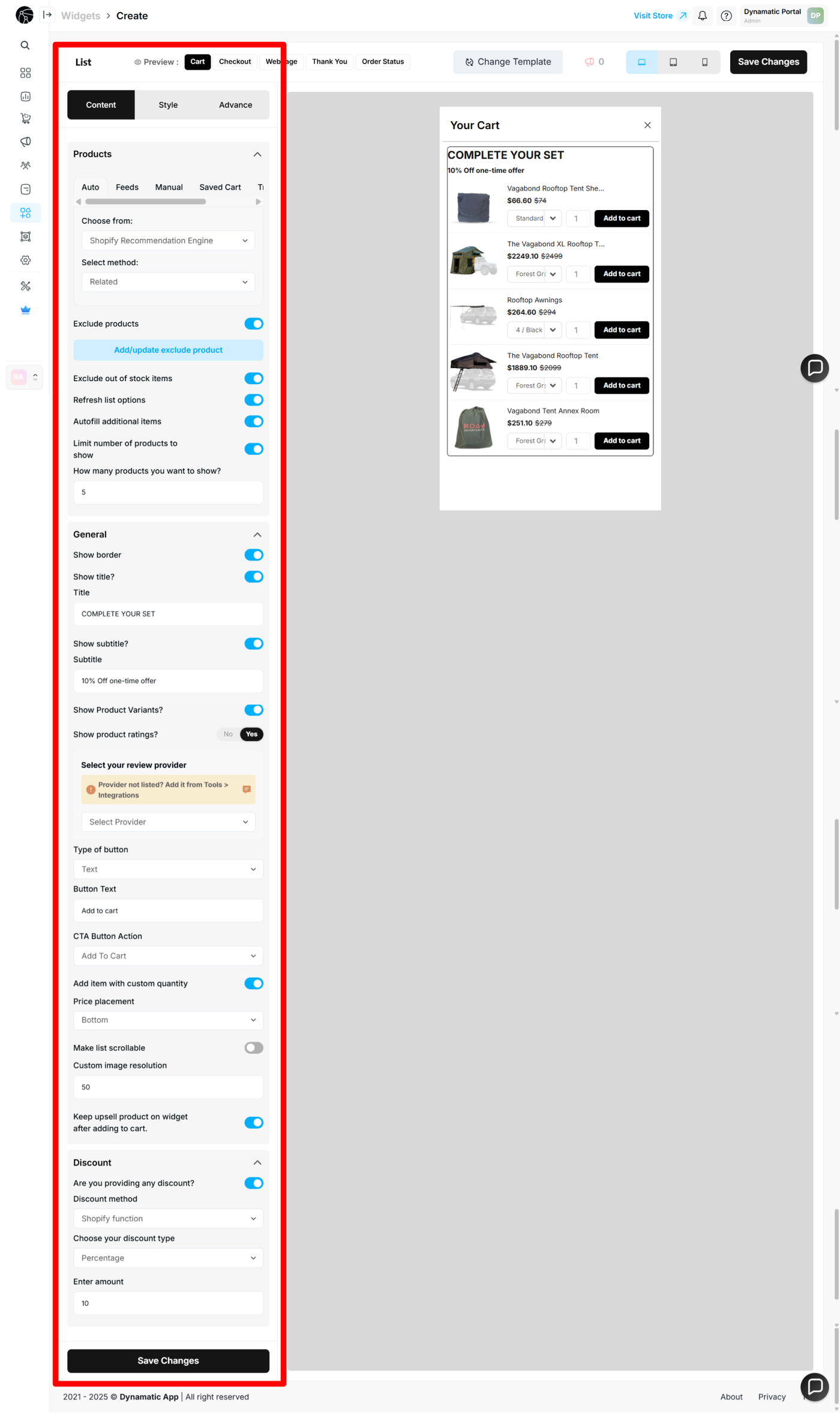
List Widget: Content Configuration
After selecting your demo widget, you will be taken to the main configuration page. Let's begin by exploring the Content options, where you will define the core functionality and items of your list.
The Content section is organized into three primary parts: Products, General, and Discount.
Products
This section is dedicated to managing the items that will appear in your list widget.
Select Method: You can choose how products are added to your list. The available methods include Manual selection, using pre-configured Feeds, or an Auto-populated list.
Exclude Products: This option allows you to prevent specific products from being displayed in your list. This is useful for excluding items that are out of stock, have low margins, or are not part of the intended promotion.
Exclude Out of Stock Items: You can enable this option to automatically hide any items that are currently out of stock.
Refresh List Option: This allows the list to refresh with a new set of products based on your criteria.
Autofill Additional Items: This feature ensures your list always meets a minimum number of products by automatically adding more if needed.
Show How Many Products: You can specify the exact number of items you want to display in the list.
General
The General section controls the basic appearance and text of your list widget.
Show Borders: You can choose to enable or disable borders for a cleaner look.
Show Title: This option allows you to display or hide the widget's title.
Subtitle: You can customize the subtitle text to provide more context for your list.
Show Product Variant: This option allows you to display or hide the product variant information within the list.
Type of Button: You can select the type of button that appears next to each item in the list.
Button Text: Customize the text that appears on your buttons.
Make Cart Scrollable: For longer lists, you can enable this option to allow the customer to scroll through all the items.
Discount
This section is for applying a discount directly to the products in your list widget.
Discount Method: You must select a discount method to apply a discount to the list items.
Discount Type: Choose the type of discount you want to offer (e.g., percentage, fixed amount).
Discount Amount: Enter the specific amount or percentage of the discount.
Once you have made all the changes, click the Save Changes button to save your configurations.
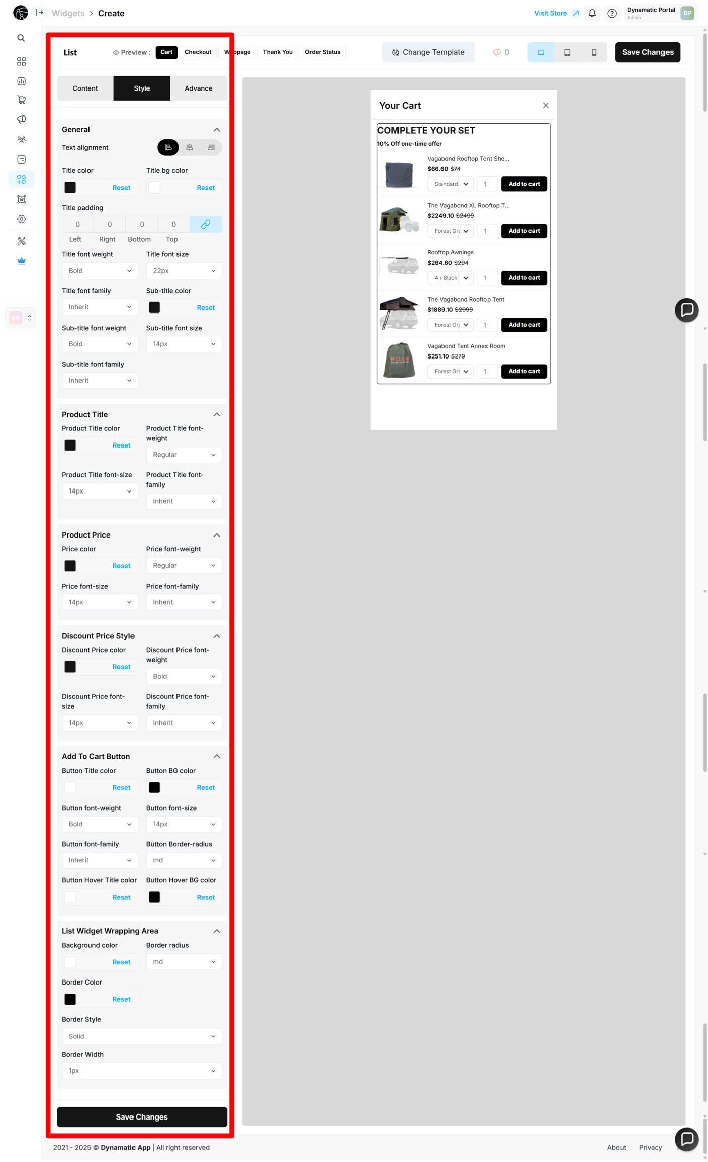
List Widget: Style Configuration
After configuring the content of your widget, you can customize its appearance to align with your store's branding and design. The Style section provides granular control over various visual elements.
General
This section controls the overall text styling for the widget's title and subtitle. You can adjust the Text alignment, Title color, Title padding, font size, and font weight. You can also set a specific font family for both the title and subtitle.
Product Information
These options give you precise control over the styling of the product details within your list.
Product Title: You can customize the color, font weight, font size, and font family of the product titles.
Product Price: This section allows you to customize the color, font weight, font size, and font family of the product price text.
Discount Product Price Style: If you are offering a discount, you can style the discounted price separately by adjusting its color, font weight, font size, and font family.
Add To Cart Button
These options control the appearance of the call-to-action button. You can adjust the Button text color, Button background color, font weight, font size, and font family. You can also set the border radius to control the shape of the button.
List Widget Wrapping Area
This section controls the styling of the widget's main container. You can set the Background color, Border color, Border style, and Border width. This allows you to integrate the widget seamlessly into your storefront's layout.
Once you have made all of the changes, click the Save Changes button. Your widget is now fully customized and ready to be used in a campaign.
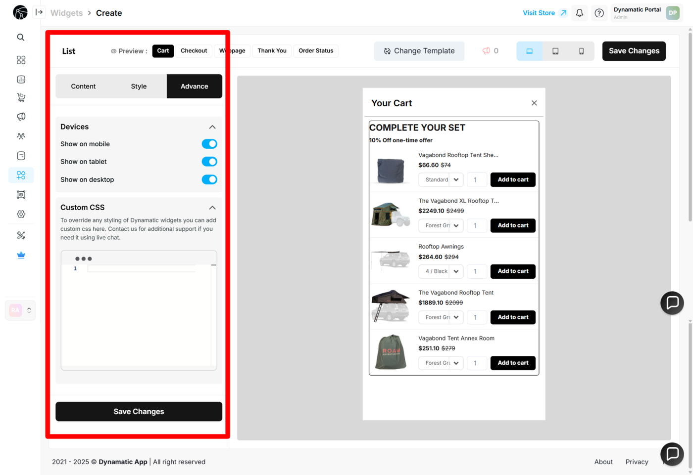
List Widget: Advanced Configuration
The Advanced tab provides fine-tuned control over your widget's display and behavior. This section is ideal for users who want to apply custom rules or unique styling that goes beyond the standard options.
Device Targeting
This section allows you to define which devices your widget will be displayed on. You can choose to show your widget on:
Desktop: For users on a desktop or laptop computer.
Tablet: For users on a tablet.
Mobile: For users on a mobile phone.
This feature ensures that your widget is optimized for the devices your customers are using.
Custom CSS
Here, you can write your own custom CSS code to apply specific styles to your widget. This provides complete control over the widget's appearance, allowing you to create unique designs that are not available through the standard style options.
By using these advanced settings, you can ensure your widget not only functions perfectly but also looks exactly as you envision.
Publishing Your Configured Widget Live
This following documentation section provides the final, detailed steps required to publish your fully configured widget and make it visible to customers on your live storefront.
01. How to successfully setup a widget
02. Understanding and Creating Audiences