
Review Slider Widget
The Review Slider Widget is an essential social proof and conversion tool. It displays a rotating carousel of compelling customer reviews and testimonials in a visually engaging format, helping to build trust and influence purchasing decisions, especially for first-time buyers looking for validation.
Playbook
Trust is the currency of e-commerce. When a new visitor lands on your site or opens their cart, their primary emotion is often hesitation. "Is this legit? Is the quality good?" The Review Slider acts as your best salesperson, answering those questions instantly. By showcasing your happiest customers at critical decision points, you leverage the "Bandwagon Effect"—proving that others have bought, loved, and vetted the product so the new customer doesn't have to worry.
The "Why" & The Metrics
Primary Metric Impact: Conversion Rate (CR) and Time on Site.
The Psychological Trigger: Social Proof & Authority. Humans look to others for guidance in uncertain situations. Seeing 5 stars and a glowing testimonial reduces the perceived risk of the transaction.
Best Fit Industries: New Brands (Building Trust), Skincare/Beauty (Results-based), High-Ticket Items (Reassurance needed).
Strategic Use Cases (The "Plays")
Play #1: The "Cart Reassurance" (Closing the Deal)
The Concept: Place a compact slider inside the Cart Drawer or Slide Cart.
The Logic: Cart abandonment often happens due to last-minute doubts. Showing reviews specifically mentioning "Fast Shipping" or "Great Customer Service" directly in the cart addresses these anxieties.
Configuration Strategy:
Zone: Cart.
Display Type: Slide (to save vertical space).
Content: Curate short reviews (under 100 characters) that focus on logistics and satisfaction.
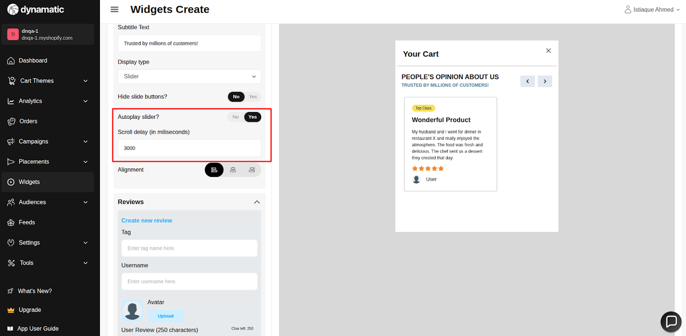
Settings: Enable Autoplay Slider with a 3-5 second delay.
Play #2: The "Influencer Wall" (Homepage Authority)
The Concept: Use the Avatar feature to highlight reviews from influencers, experts, or recognizable faces on your Homepage.
The Logic: A review from a person with a face (Avatar) is significantly more trustworthy than anonymous text.
Configuration Strategy:
Zone: Webpage (Homepage).
Content: Upload high-quality headshots in the Avatar field. Use the Username field for their handle/name.
Display Type: List (if you want to show 3 side-by-side) or Slide (for a carousel).
Play #3: The "Product Champion" (Landing Page)
The Concept: On a specific landing page, curate reviews only for that specific product.
The Logic: Relevance is key. If selling a specific bundle, show reviews that mention that bundle's benefits.
Configuration Strategy:
Zone: Webpage (Landing Page).
Review Content: Manually input the top 5 most detailed reviews for the specific product.
Ratings: Ensure you input exact ratings (e.g., 4.8) to make it look organic and authentic.
Pro-Tips & Constraints
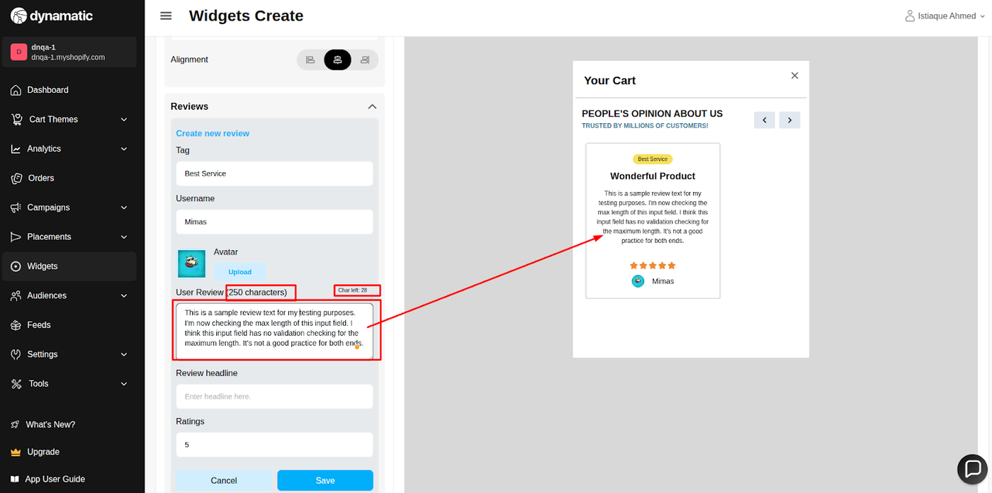
Character Count: The 250 character limit is a hard stop. Edit customer reviews for clarity and brevity before pasting them in.
Rating Rounding: Be aware of the logic: A 4.4 rating will visually display as 4 stars. You must hit 4.5 to get the half-star graphic.
Quality over Quantity: You don't need 30 reviews. 5 to 7 high-impact reviews are often better than 30 mediocre ones, especially since users rarely scroll through more than a few.
A. Overview & Purpose
Attribute | Description |
Widget Name | Review Slider Widget |
Core Purpose | Builds trust and influences conversions by showcasing customer feedback and ratings in an auto-scrolling display. |
Where It Works | Webpage (all store pages), Cart, and Checkout (Plus merchants). |
Key Features | Auto-scrolling reviews; manual navigation (arrows/dots); displays star ratings and custom reviewer names; supports text and optional image-based reviews. |
Limitations | Requires quality reviews to be effective. May increase page height or load time if not optimized, particularly on mobile. |
B. Step-by-Step Widget Creation
Click Create Widgets in your Dynamatic dashboard.
On the "Add New Widgets" page, fill in the Widget Title and a brief description, then select the appropriate template.
Click Next.
Select a visual template from the available options and click Select.
C. Content Tab: Review Sourcing and Display Logic
The Content section is where you define the reviews, control the carousel behavior, and set the display text.
Setting | Functionality | Detail |
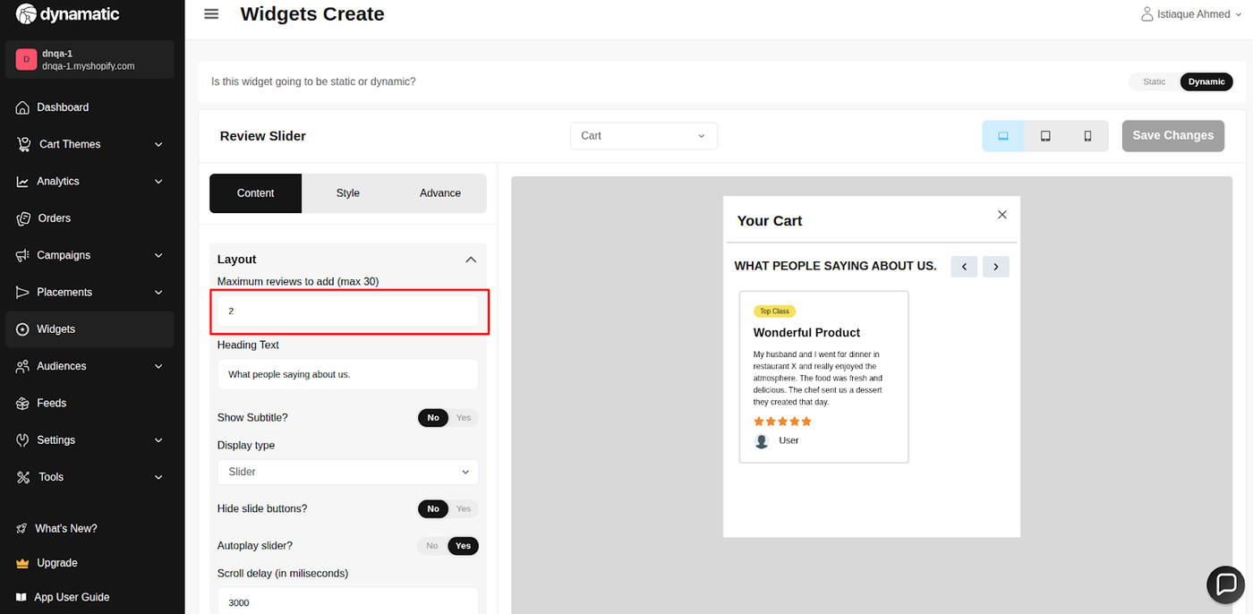
Maximum Reviews | Sets the hard limit for the number of reviews displayed in the slider. | The maximum limit is 30 reviews. |
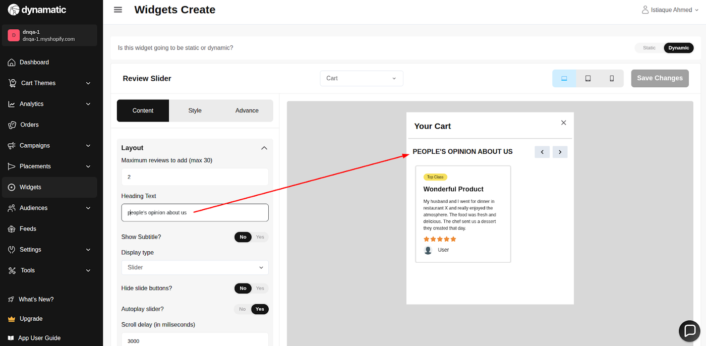
Heading Text | Customizes the main title of the review section. | The user can customize their heading text. |
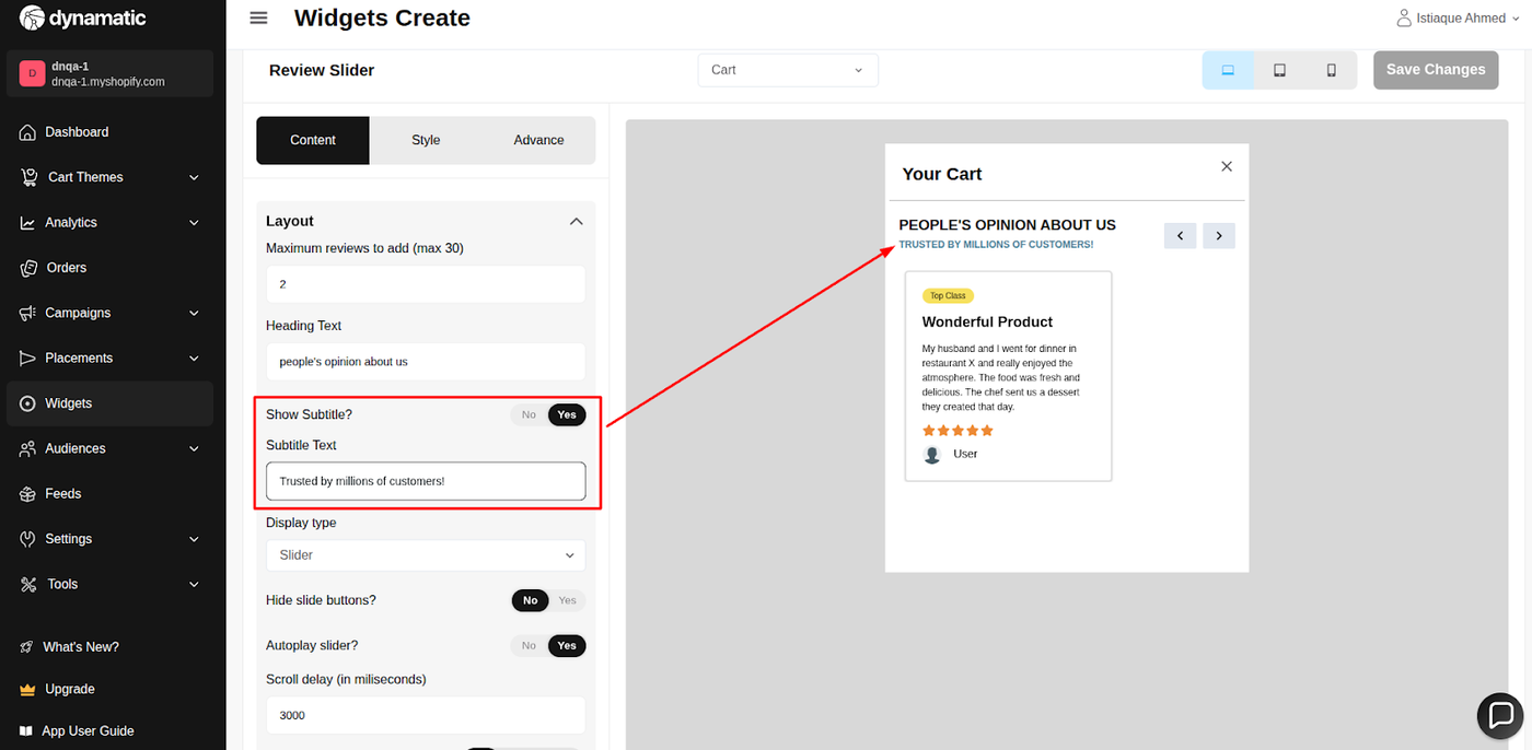
Subtitle Text | Enables or disables the optional subtitle field. | The user can turn on/off the subtitle field and edit the text. |
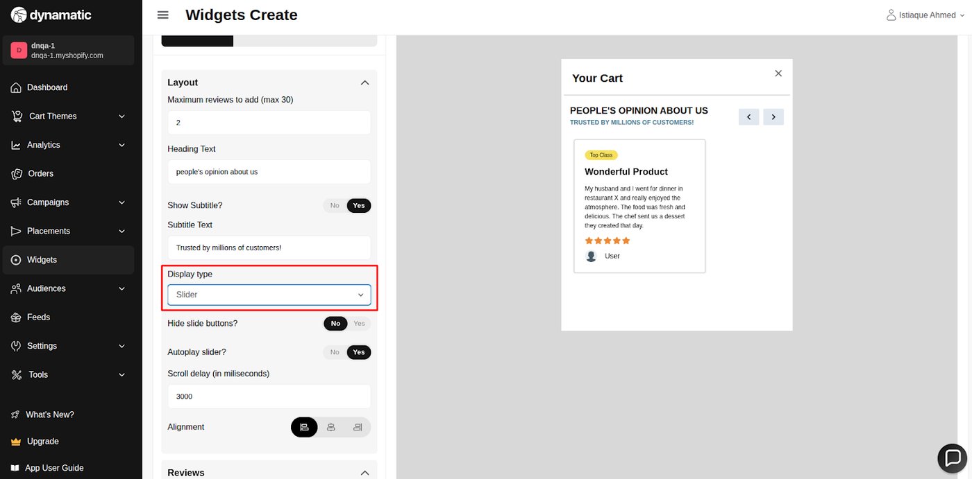
Display Type | Controls the presentation style of the reviews. | The display can be set with a Slide (carousel) or a List format. |
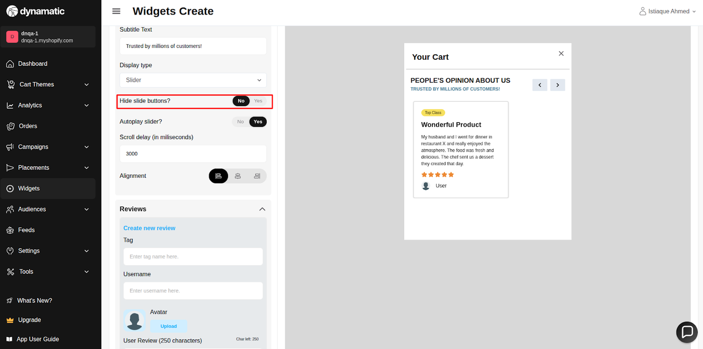
Slider Behavior | Controls automatic scrolling and navigation. | Autoplay Slider: Turns automatic scroll on/off. Scroll Delay: Sets the delay time (speed) between automatic scrolls. Hide Slide Buttons: Shows or hides the manual slider navigation buttons (arrows). |
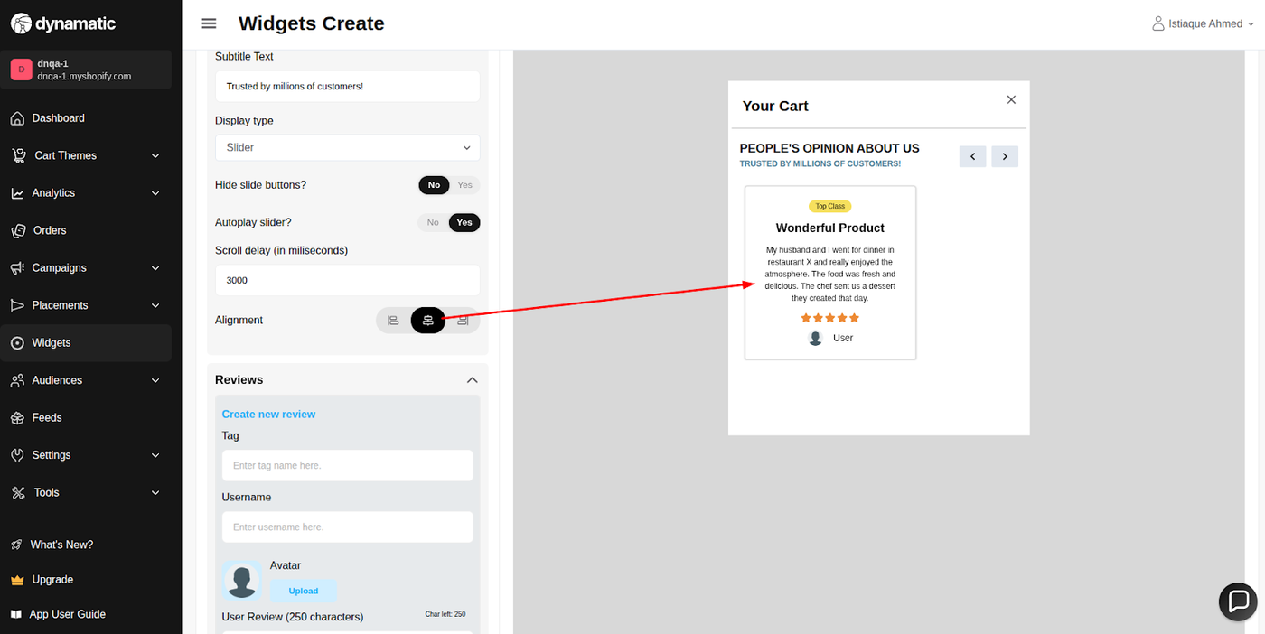
Alignment | Sets the horizontal position of the review card elements. | The user is able to set the alignment of the review card. |
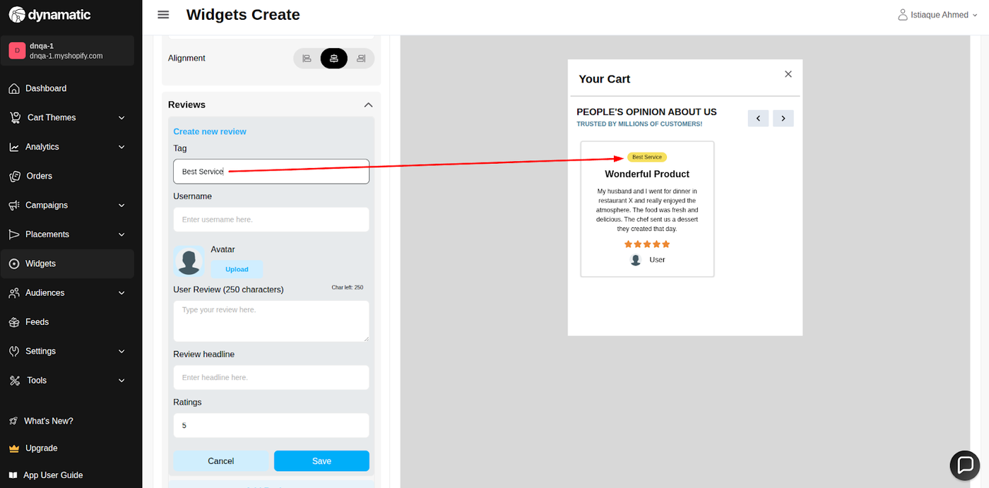
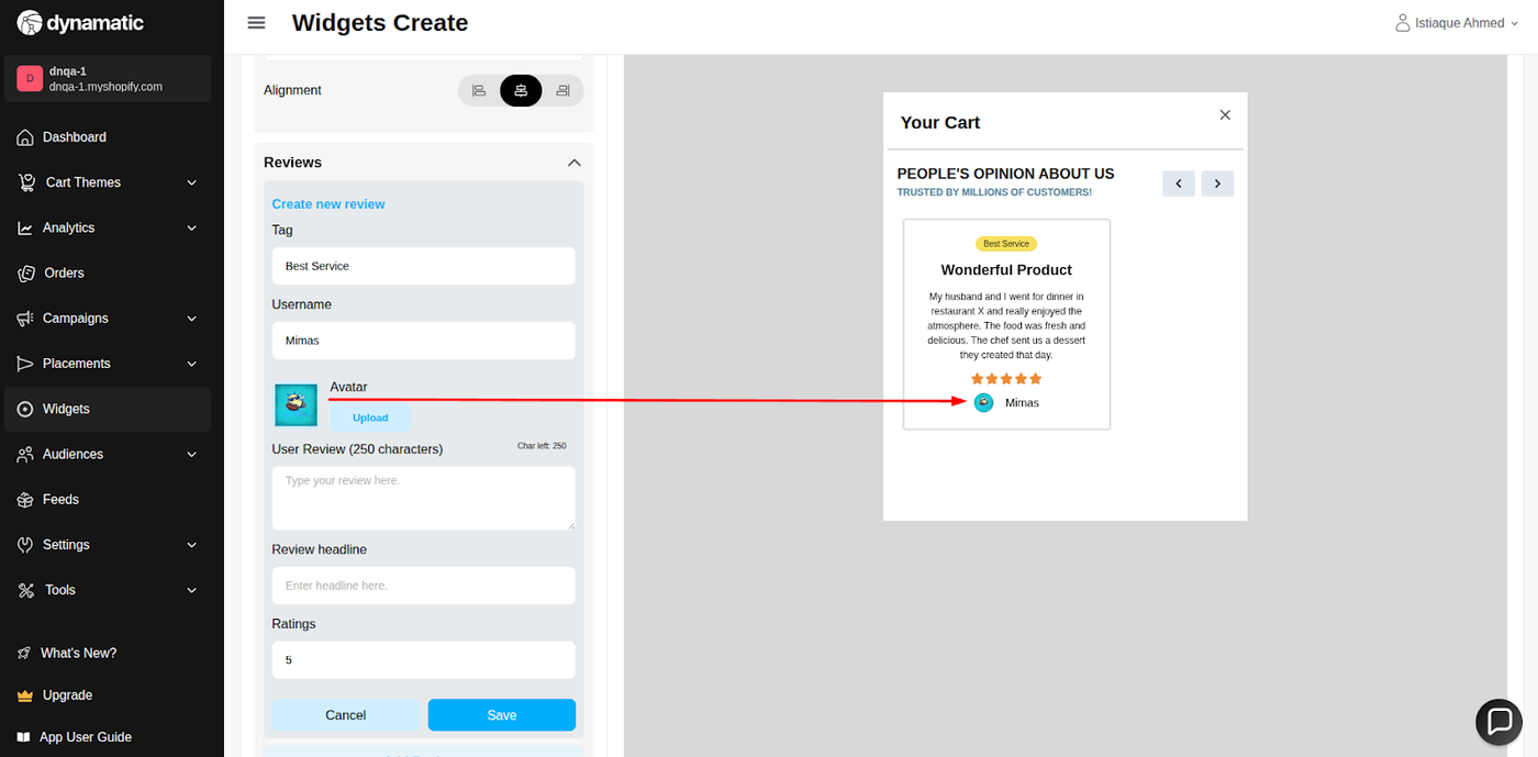
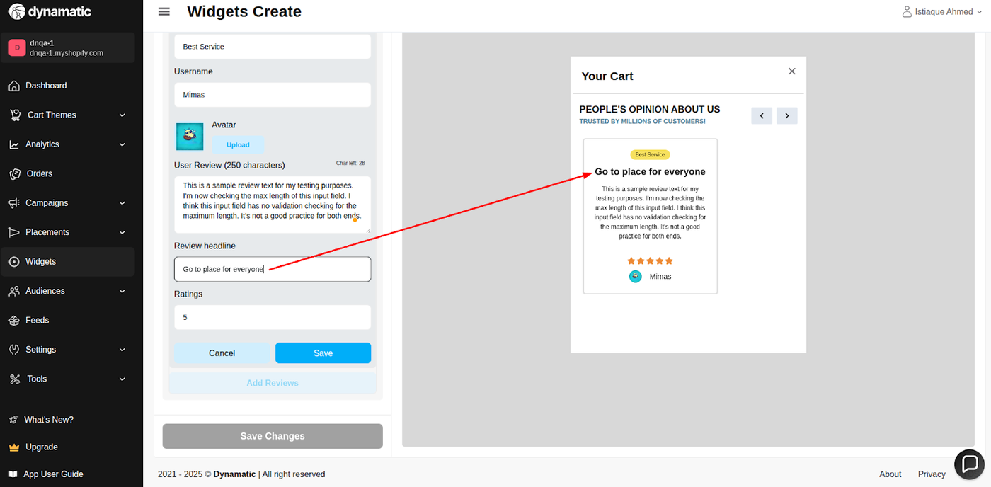
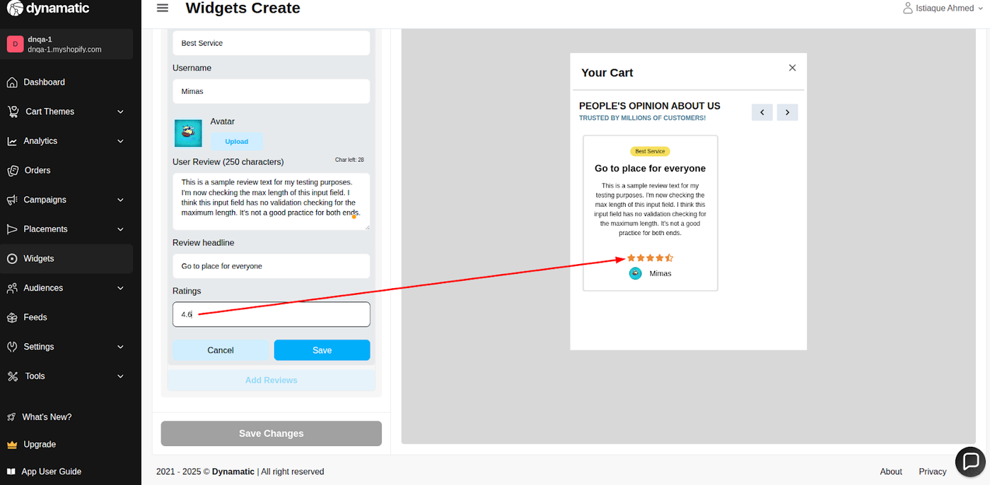
Review Content | Manually entering or configuring review details. | Username: Provide the name of the reviewer. Tag: Provide a tag for categorization/filtering. Avatar: Upload an image of the reviewer. User Review: Write the feedback text (Max 250 characters). Review Headline: Edit the review's title. |
Ratings | Configures the visual star rating. | Rating ranges from 1-5. Decimal values can be inserted (e.g., 4.3). Note: 4.5 or more displays as a half-star (e.g., 4.5 stars); values below 4.5 round down (e.g., 4.3 shows as 4 stars). |
Maximum reviews to add- The user can set the maximum number of reviews they want to display. The max limit is 30.
Heading Text- User will be able to customize their heading text.
Show Subtitle and Text- the user is able to turn on/off the subtitle field and also able to edit according to their needs.
Display type- The display can be set with Slide/list
Hide slide buttons- The user is able to show/hide he slider button
Autoplay Slider and Scroll delay- The user can turn on/off the automatic scroll option and also set the delay time.
Alignment- The user is able to set the alignment of the review cart.
Tag- The user can provide a tag according to their needs.
Username- The user can provide the name of the reviewer.
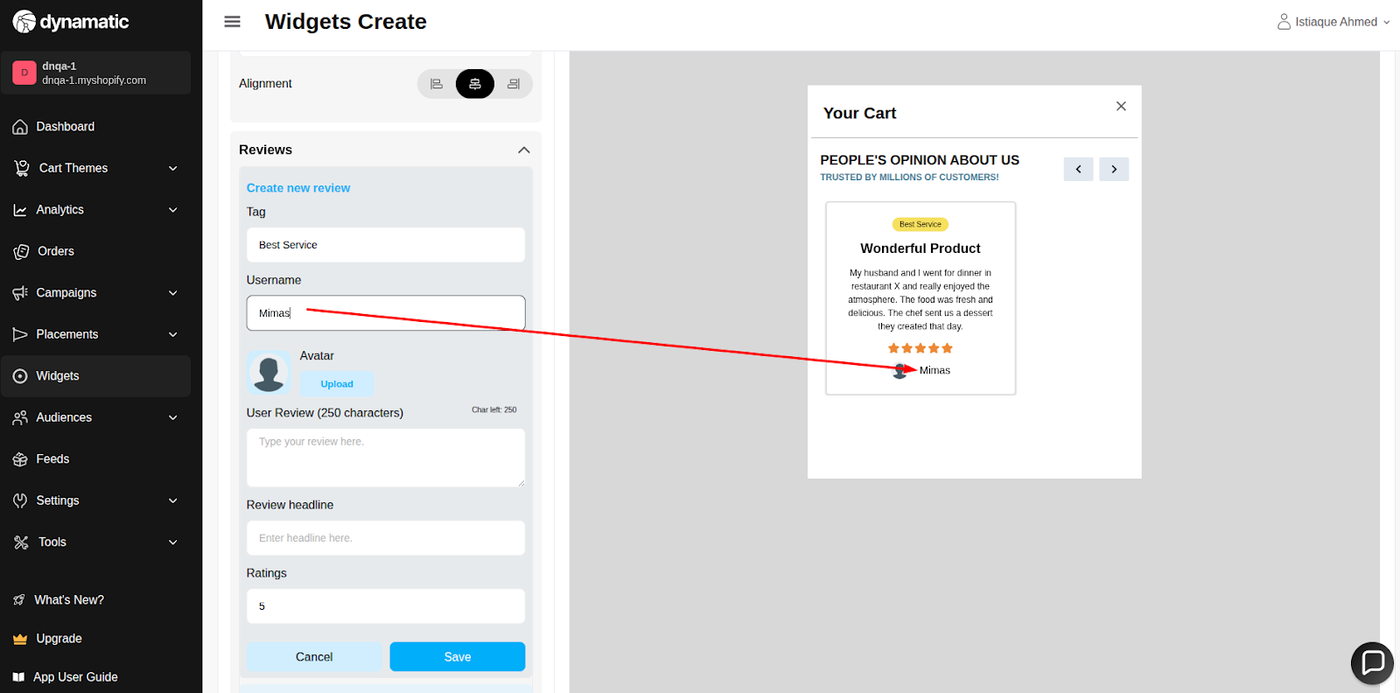
Avatar- The user can upload an image of their own.
User Review- User can write feedback text in this input field. The maximum character of this input field is 250. The user can check the remaining character count.
Review headline- The user can edit review by their own.
Ratings- The user can provide ratings. The rating will range from 1-5. The user can also insert a decimal value. Ex- if the user provides 4.3, the star design will work as 4. But if the user gives 4.5 or more, the star design will show as a 4.5-star design.
D. Style Tab (Visual Customization)
The Style section allows you to customize the widget's aesthetic elements for brand consistency:
Colors & Typography: Customize the background color, title color, font size, font family, and font weight for headings and review text.
Review Item Styling: Control colors, font family, size, and other details of the individual review items and press items.
E. Advanced Tab (Technical Refinements)
Device Setting: Select the specific devices (Desktop or Mobile) where the widget should be visible.
Custom CSS: Input custom CSS code for advanced styling not covered by the standard options.
Publishing Your Configured Widget Live
This following documentation section provides the final, detailed steps required to publish your fully configured widget and make it visible to customers on your live storefront.
01. How to successfully setup a widget
02. Understanding and Creating Audiences
03. Creating Placements and Zones
05. Displaying Your Widgets on the Storefront