
Standard Carousel
The Standard Carousel widget is a versatile tool designed to showcase multiple products or items in an engaging, horizontally scrollable format. It's perfect for drawing customer attention to key products, promotions, or recommendations without overwhelming the page. By presenting a dynamic and interactive display, this widget encourages exploration and can significantly boost cross-sells and upsells.
Playbook
Show more, clutter less. Space on your storefront is premium real estate. The Standard Carousel allows you to multiply that value by displaying 5, 10, or 20 products in the space of one. It turns passive page viewing into active browsing using swipe gestures and arrows, encouraging customers to "hunt" for the perfect item without leaving their current flow.
The "Why" & The Metrics
Primary Metric Impact: Time on Site, Pages Per Session, and Average Order Value (AOV).
The Psychological Trigger: Curiosity & Interactivity. The "swipe" or "next" action creates a micro-interaction that keeps the brain engaged. The hidden content (off-screen products) creates a "curiosity gap" that compels users to look further.
Best Fit Industries: Fashion (New Collections), Beauty (Product Lines), Retail (Best Sellers).
Strategic Use Cases (The "Plays")
Play #1: The "Visual Discovery" (Homepage/Webpage)
The Concept: Create a "New Arrivals" or "Featured Collection" showcase on your homepage.
The Logic: Visitors often bounce if they don't see something they like immediately. A carousel lets them scan multiple options quickly without scrolling down the page.
Configuration Strategy:
Zone: Webpage (Homepage).
Content: Use Manual Product Selection to hand-pick your highest-converting new items.
Behavior: Enable Auto-Slide to catch the eye, but ensure Navigation Arrows are visible for control.
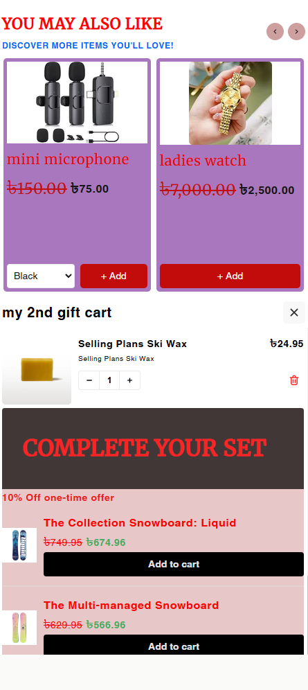
Play #2: The "Cart Stuffer" (Cross-Sell)
The Concept: Recommend low-cost accessories or complementary items inside the Cart or at Checkout.
The Logic: The customer is already buying. Showing a carousel of "small adds" (like socks, batteries, or care kits) encourages impulse buys without distracting them from the main purchase.
Configuration Strategy:
Zone: Cart or Checkout.
Content: Use Exclude Products to ensure you aren't showing items they already have or that are out of stock.
Discount: Use the Discount option to offer "5% off if you add now."
Play #3: The "Come Back Soon" (Post-Purchase)
The Concept: Display products related to what the customer just bought on the Thank You or Order Status page.
The Logic: Capitalize on the "shopping high." If they just bought a camera, show them a carousel of lenses or bags on the Order Status page while they track their shipment.
Configuration Strategy:
Zone: Thank You / Order Status.
Content: Select products that are logical follow-ups to your main best-sellers.
Pro-Tips & Constraints
Performance Note: While carousels are great, loading too many high-res images can slow down your site. Stick to 8-12 products maximum for the best balance of variety and speed.
Visibility: Remember that products "off-screen" (slides 2, 3, etc.) get viewed less. Put your highest margin items in the first 3 slots.
Content Match: This widget is designed for Products, not long text. Keep product titles concise so the layout remains uniform.
Why Merchants Need the Standard Carousel:
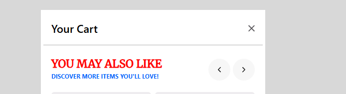
Dynamic Product Display: Transform static product listings into an interactive experience, making it easier for customers to browse and discover new items.
Optimized Space Utilization: Efficiently display a large number of products in a compact area, ideal for pages with limited screen real estate.
Enhanced Engagement: The scrollable format and visual appeal encourage users to interact with your store, leading to longer browsing sessions and increased product views.
Strategic Cross-Selling and Up-Selling: Highlight complementary products, best-sellers, or promotional items at key points in the customer journey (e.g., cart, checkout, product pages) to increase average order value.
Versatile Placement: Integrate seamlessly across various sections of your storefront, including:
Webpage: Showcase new arrivals, featured collections, or seasonal promotions on your homepage or landing pages.
Cart: Recommend "frequently bought together" items or accessories to complete a purchase.
Checkout: Offer last-minute add-ons or exclusive deals to customers before they finalize their order.
Thank You Page: Present post-purchase upsells or related products to encourage repeat business.
Order Status Page: Display relevant products or information based on their recent purchase.
Key Features:
Multi-Product Showcase: Display a collection of products with their images, names, prices, and quick "Add to Cart" actions.
Interactive Navigation: Customers can easily scroll through products using arrows or swipe gestures, ensuring a smooth user experience on all devices.
Visually Captivating: Designed to be eye-catching and integrate with your store's aesthetic, making product discovery enjoyable.
Configuration Options for Maximum Impact:
Content Control:
Manual or Dynamic Product Selection: Choose to manually add specific products to the carousel or set up rules (e.g., based on tags, collections, or purchase history) for dynamic product population.
Number of Visible Items: Determine how many products are displayed at once, balancing visual appeal with the need to showcase variety.
Behavioral Settings:
Auto-Slide vs. Manual Navigation: Enable automatic scrolling for a passive browsing experience or allow customers to control their navigation with arrows or swipes.
Styling and Design:
Customizable Appearance: Adjust image sizes, font styles, button designs, and other visual elements to match your brand's look and feel.
Considerations for Implementation:
Product Visibility: While effective, remember that not all products in the carousel are visible simultaneously, so prioritize the most impactful items for initial display.
Performance Optimization: Use optimized image sizes and consider the total number of items to ensure the widget loads quickly and doesn't negatively impact your store's performance.
Content Suitability: This widget is best for product-focused content and may not be ideal for displaying extensive text or long-form information.
By strategically implementing and customizing the Standard Carousel widget, merchants can create a more engaging and personalized shopping experience, ultimately driving higher conversions and increased average order value.
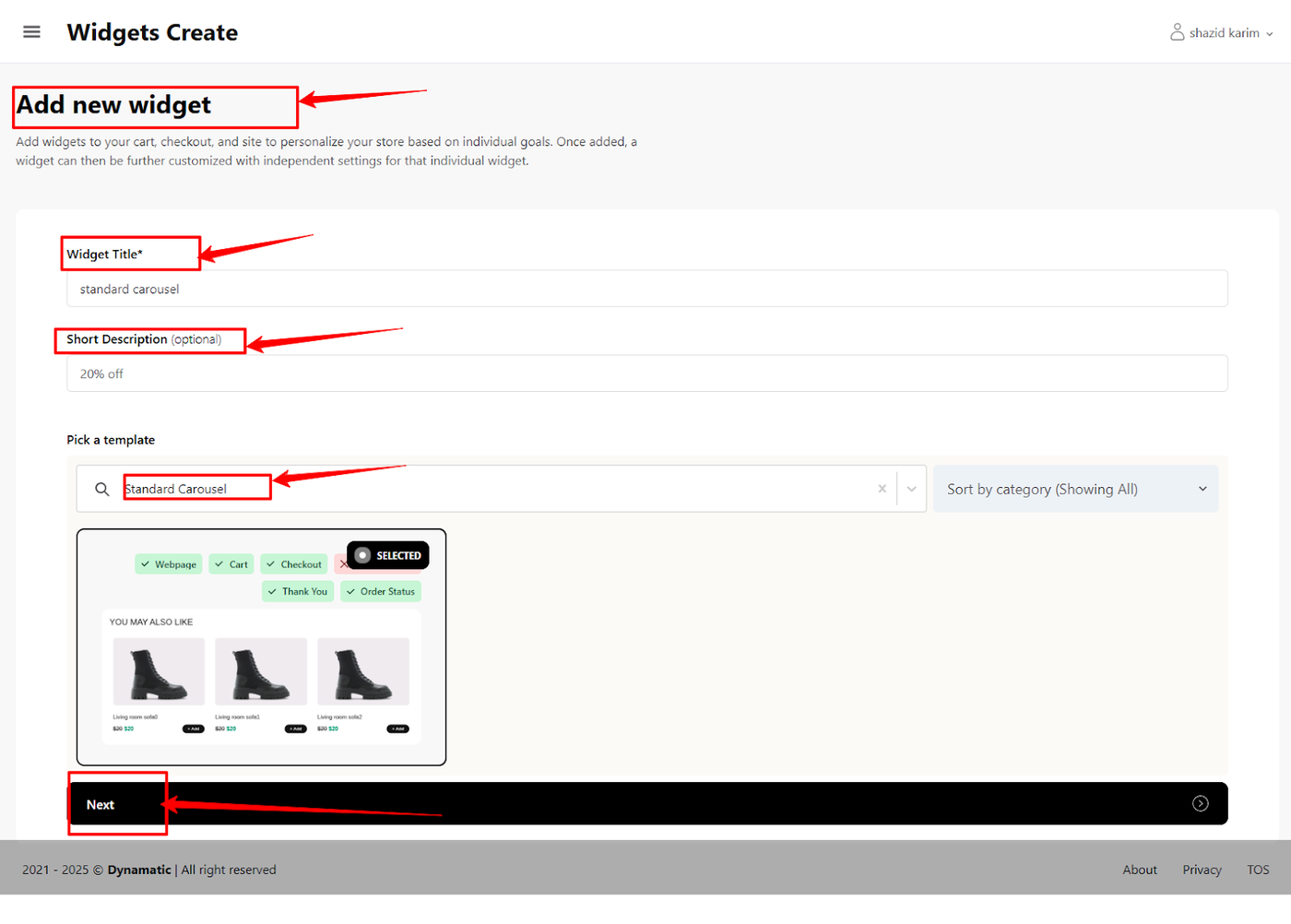
Creating a Standard Carousel Widget: Step-by-Step Guide
To begin creating your Standard Carousel widget, follow these instructions:
Initiate Widget Creation:
Navigate to the "Widgets" section within your Dynamatic Dashboard.
Click on the "Create Widgets" button. This action will open a new page titled "Add New Widget."
Define Your Widget:
On the "Add New Widget" page, you will find several fields to complete:
Widget Title: Enter a descriptive title for your Standard Carousel widget. This title will help you easily identify it later.
Short Description: (Optional, but recommended) Provide a brief overview of the widget's purpose or its intended use.
Pick a Template: Begin typing "Standard Carousel" into this field. As you type, the system will suggest matching widget templates.
Select the Standard Carousel Template:
Once "Standard Carousel" appears in the suggestions, select it. This action will load the specific configuration options for the Standard Carousel widget, allowing you to proceed with customization.
After clicking the "Next" button, you'll arrive at the Customize Your Widget page in your Dynamatic dashboard.
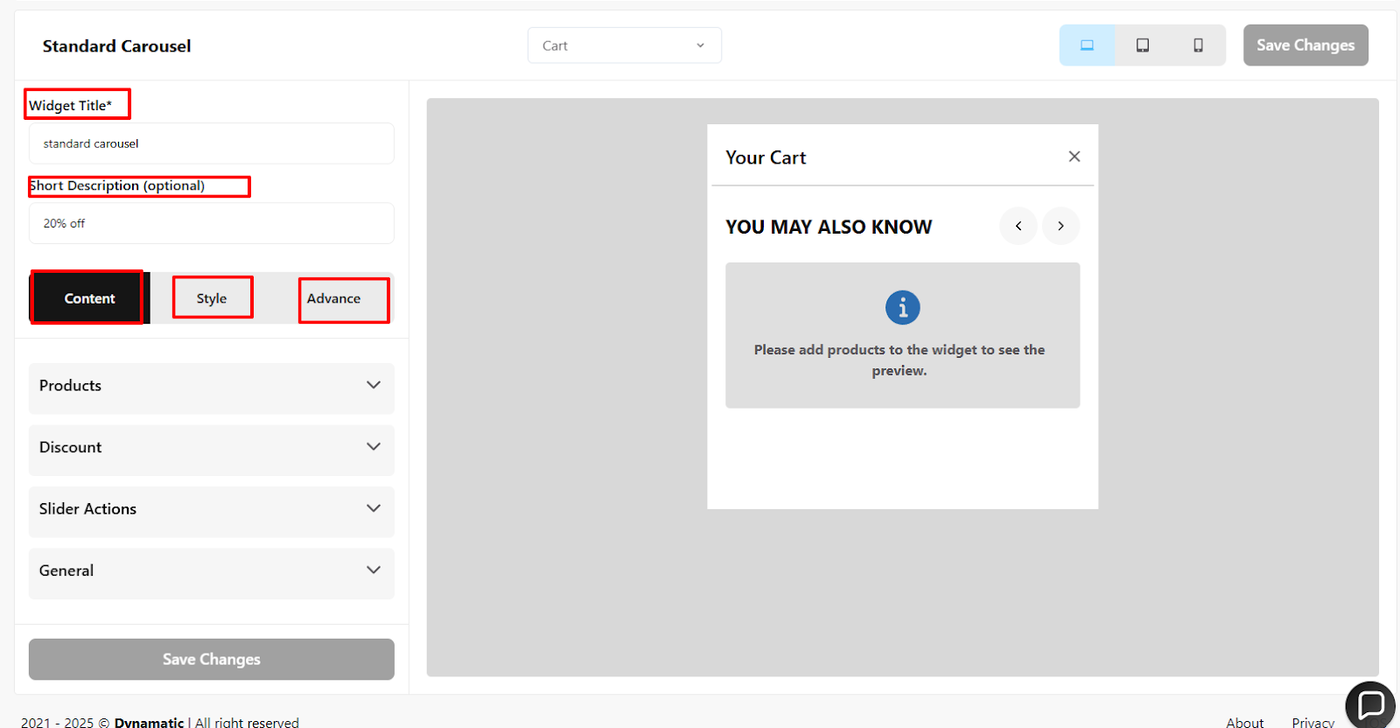
This is where you'll define how your widget looks and functions, and where you can generate ideas on how to apply them to your specific merchant case.
Setting Up Your Widget's Content Options
When creating a new widget in your Dynamatic Dashboard, the "Content" section is where you define which products will be displayed and how they're presented. Let's explore the manual option, which gives you precise control over your product selections.1. Manual Product Selection
The manual selection option allows you to handpick specific products to feature in your widget. This is ideal for showcasing best-sellers, new arrivals, or products relevant to a specific campaign.
How to Set Up:
Navigate to the "Content" section of your widget in the Dynamatic Dashboard.
Select the "Manual" option.
Use the product search bar to find and add products one by one. As you add them, they will appear in a list, similar to how you added three products in your example.
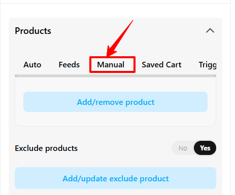
2. Excluding Products
Sometimes, you might want to display a range of products but exclude a few specific ones. This feature ensures that certain products, perhaps those out of stock or not suitable for the current promotion, don't appear in your widget.
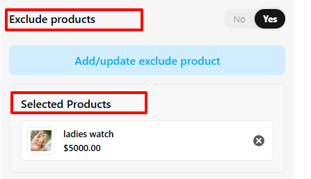
How to Set Up:
Within the "Content" section, after you've made your initial product selections (or if using an automatic content option), locate the "Exclude Products" setting.
Search for and add the products you wish to exclude from the widget. These products will not be displayed, even if they would otherwise meet the widget's criteria.
3. Applying Discounts
Dynamatic allows you to display discounts directly within your widget, making it easy to highlight special offers and encourage purchases.
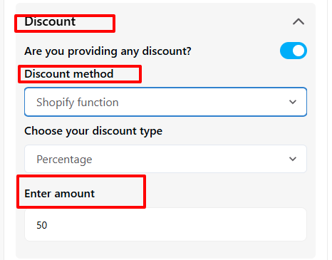
How to Set Up:
In the widget settings, locate the "Discount" option.
Adjust the settings to apply a discount to the products featured in your widget. This could be a percentage off, a fixed amount, or other promotional pricing.
4. Customizing Slider Actions
Slider actions define how customers interact with your product slider, enhancing the user experience and guiding them through your featured products.
How to Set Up:
Access the "Slider Actions" section within your widget's settings.
Customize options such as navigation arrows, auto-play settings, and the speed of the slider.
5. Configuring Slider Options
Beyond actions, "Slider Options" allow you to fine-tune the visual presentation and behavior of your product slider.
How to Set Up:
Go to the "Slider Options" section in your widget settings.
Click on "Settings" to customize elements like the number of products visible at once, spacing between items, and responsiveness across different screen sizes.
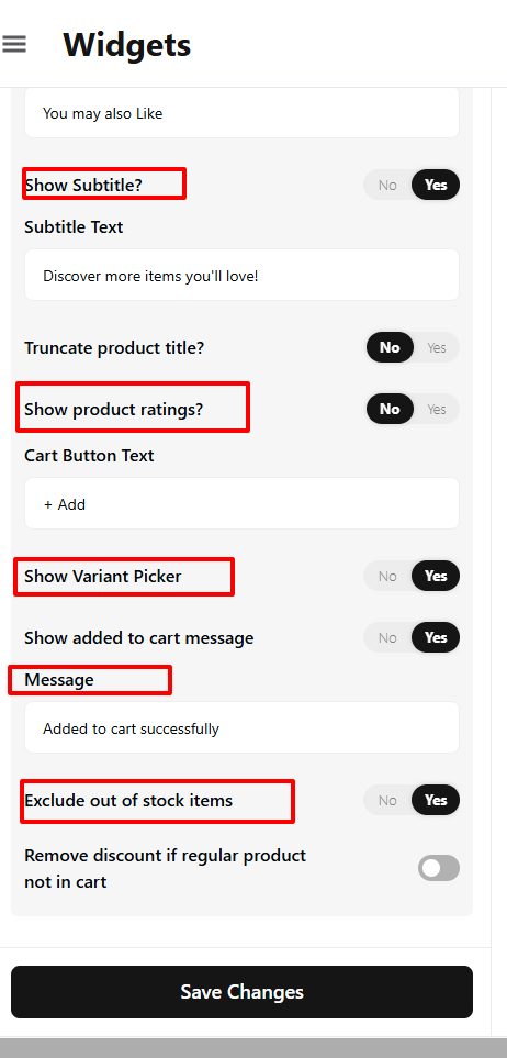
After you've configured your content and slider settings, remember to save your changes to apply them to your widget. This comprehensive approach ensures your Dynamatic widgets are not only functional but also strategically designed to boost engagement and sales.
Widget Style and Advanced Configuration
Let's move on to the Style tab, where you can customize the visual appearance of your widget to perfectly match your storefront's aesthetic.
Style Configuration
General Styling: This section controls the overall typography and look of the widget's main text elements. You can adjust the heading title color, heading font size, font family, sub-heading color, and other core elements. Customize these options and click Save.
Product Section Styling: This section provides granular control over the look of the individual product cards and containers within the widget. You can adjust the product card background color, title color, font size, font family, and font weight for the product details. Completing these options finalizes the professional appearance of your product display.
Advanced Options
The Advanced tab offers additional controls for display and deep customization:
Device Targeting: Use these options to explicitly hide or show the widget based on the user's device (Desktop, Tablet, or Mobile), ensuring optimal presentation across all screen sizes.
Custom CSS: This field allows you to input custom CSS for precise styling that goes beyond the standard configuration options.
Once all settings are complete, click Save (or Save Changes). Your widget is now fully configured and ready for use in a campaign. After integration, your standard carousel (or final widget type) will reflect all these customizations on your website.
Publishing Your Configured Widget Live
This following documentation section provides the final, detailed steps required to publish your fully configured widget and make it visible to customers on your live storefront.
01. How to successfully setup a widget
02. Understanding and Creating Audiences
03. Creating Placements and Zones
05. Displaying Your Widgets on the Storefront