
Trust Badge Widget
The Trust Badge Widget allows merchants to display visual indicators of security, payment, and shipping assurance directly within their store. By surfacing recognisable trust signals at key moments in the shopping journey, this widget helps reduce purchase hesitation and drives customer confidence at the point of decision.
Widget Core Purpose: Displays visual security, payment, and assurance badges to build customer trust and reduce cart abandonment.
Where It Works: Webpage, Cart, Checkout
Why Use the Trust Badge Widget?
Shoppers make purchase decisions based on perceived safety. Without visible trust signals, potential customers may abandon the cart due to uncertainty about payment security or product guarantees. The Trust Badge widget addresses this by:
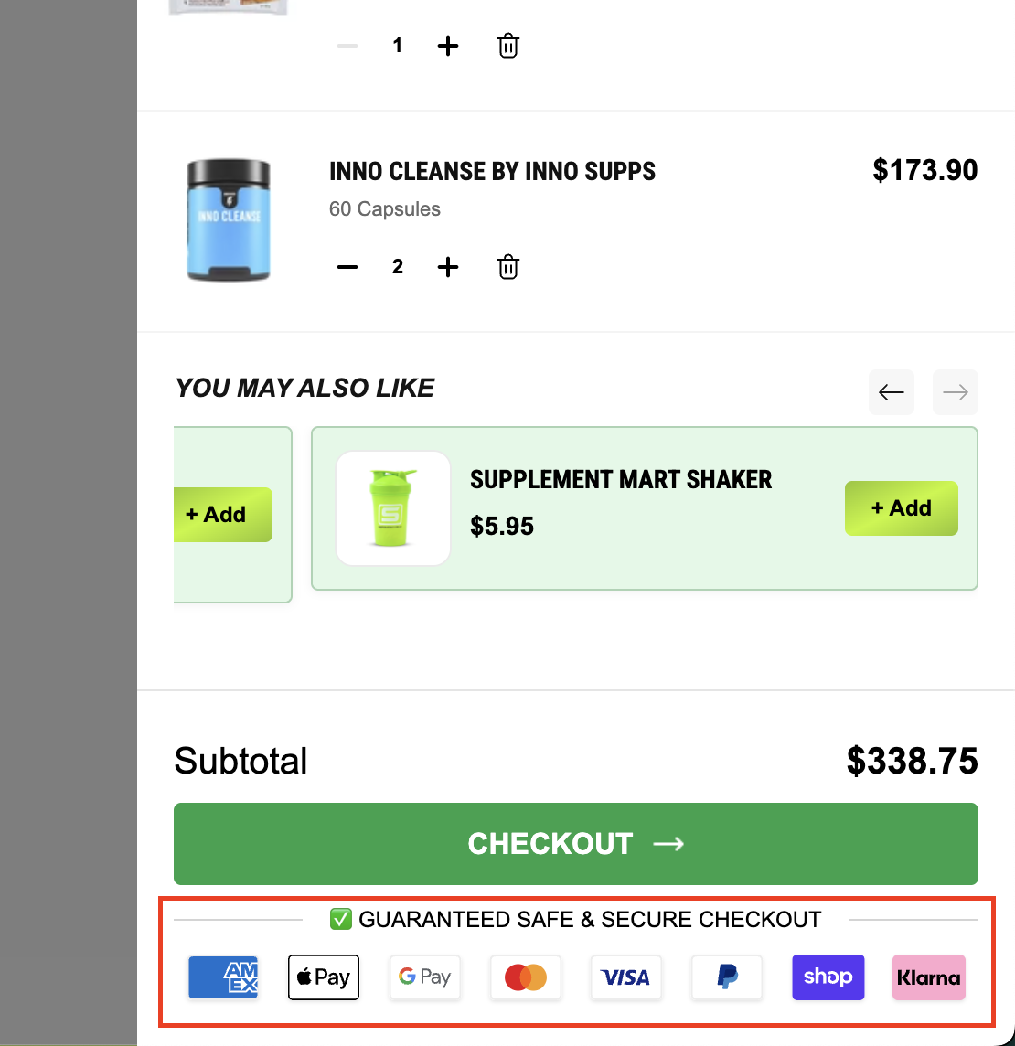
Showcasing SSL-secure, payment logo, and guarantee badges at critical touchpoints.
Supporting both default icon sets and fully custom uploaded badge images.
Reducing cart abandonment by visually reassuring buyers throughout the checkout funnel.
Increasing shopper confidence with zero disruption to the browsing experience.
Playbook Tip: Place the Trust Badge widget directly below the Add to Cart button on product pages and within the Cart drawer header. Payment logos and security badges placed near purchase CTAs measurably lift conversion rates.
Main Features
Showcases trust signals — SSL secure, payment logos, money-back guarantees, and shipping assurance icons.
Supports default badge icon sets as well as custom uploaded images for full brand alignment.
Helps reduce cart abandonment by reinforcing security at pivotal decision moments.
Increases user confidence while shopping across the Webpage, Cart, and Checkout pages.
Allows device-specific visibility control — show only on Desktop, only on Mobile, or on both.
Limitations and Best Practices
Overuse of badges can clutter the layout — stick to 3 to 6 highly recognizable icons.
Ensure badge colors and styles are visually compatible with your store theme.
Uploaded custom images should be optimized for web (PNG or SVG, under 200KB).
Test on both mobile and desktop views after configuring for the best appearance.
Setting Up the Trust Badge Widget:
Step 1 — Create a New Widget
From the Dynamatic Dashboard, click Create Widget. The Add New Widget page will appear.
Fill in the following required fields:
Widget Title — give your widget a recognizable name (e.g., "Checkout Trust Badges").
Short Description — briefly describe the widget's purpose for internal reference.
Pick a Template — browse and select a template. If any widgets match your title, they will appear as suggestions at the bottom of the screen. Select the most suitable one.
After selecting the appropriate widget template, click Next. Your customization panel will open.
Configuration Options
The Trust Badge widget is configured across three tabs: Content, Style, and Advanced. Work through each tab in order, then save your changes.
Tab 1 — Content
The Content tab is where you define what the widget displays and how badges are presented.
General Settings
Layout Alignment — Controls the horizontal alignment of badges. Options: Left, Center, Right. Transparency — Sets the background transparency of the widget. Toggle on or off, or use a slider. Title — Main heading displayed above the badge row. Example: "Secure Checkout." Subtitle — Supporting text displayed beneath the title. Example: "Your data is always protected."
Badge Configuration
Select Trust Badge Icons — choose from the built-in library of trust icons including SSL, PayPal, Visa, Mastercard, money-back guarantee, free shipping, and more.
Upload a Custom Image — upload your own badge image (PNG or SVG recommended) for a fully branded badge set.
Trust Badge Link — optionally attach a URL to any badge so customers can click through to a certification or security information page.
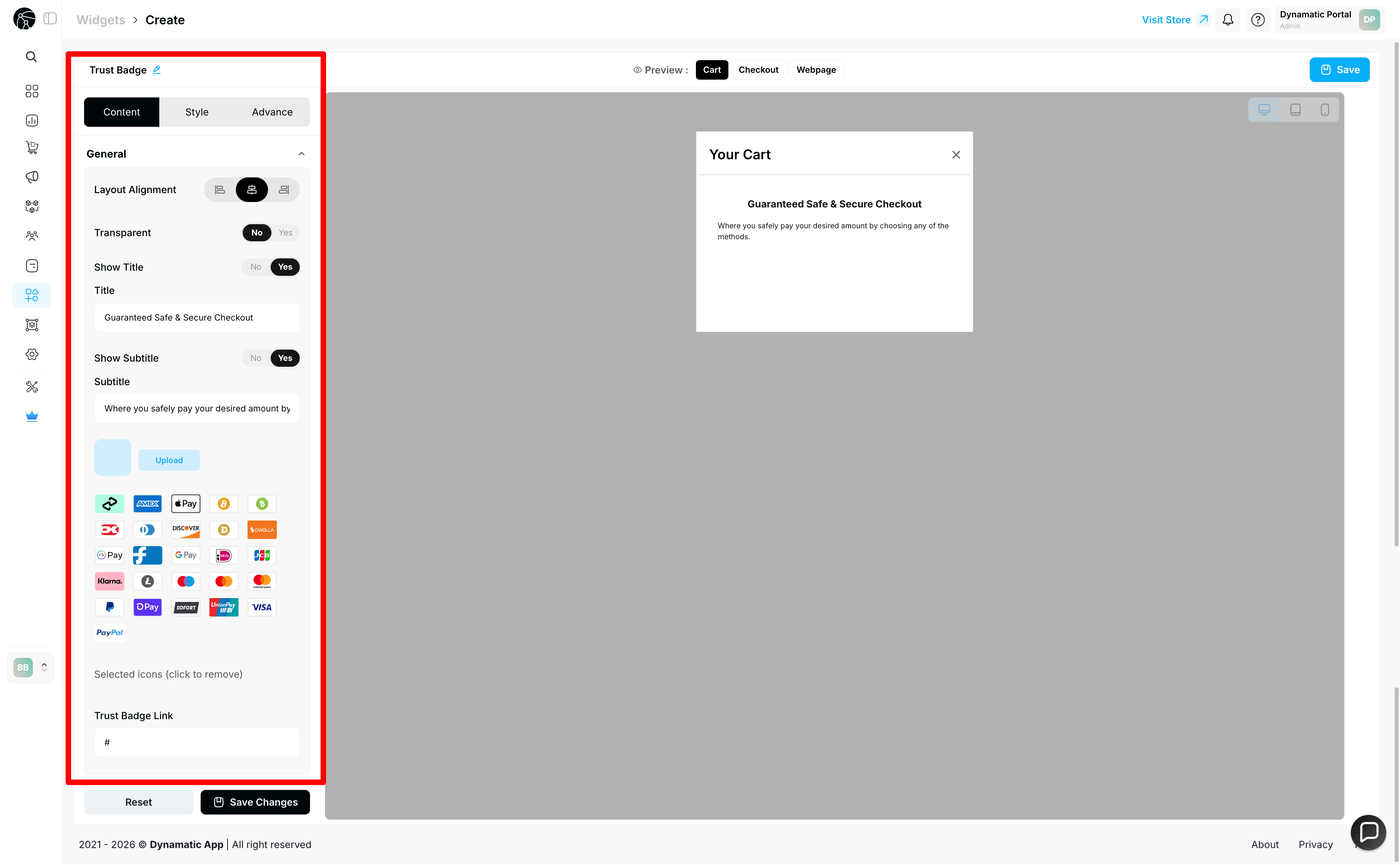
Once your badges and general settings are configured, click Save Changes before moving to the Style tab.
Tab 2 — Style
The Style tab gives you full visual control over how the Trust Badge widget renders within your store theme.
Background Color — set the widget background to match or contrast your store's color palette.
Font Size — adjust the size of the title and subtitle text.
Font Weight — control whether text appears light, regular, or bold.
Text Color — customize the color of the title, subtitle, and any labels.
Use these controls to ensure the widget blends naturally into your store design.
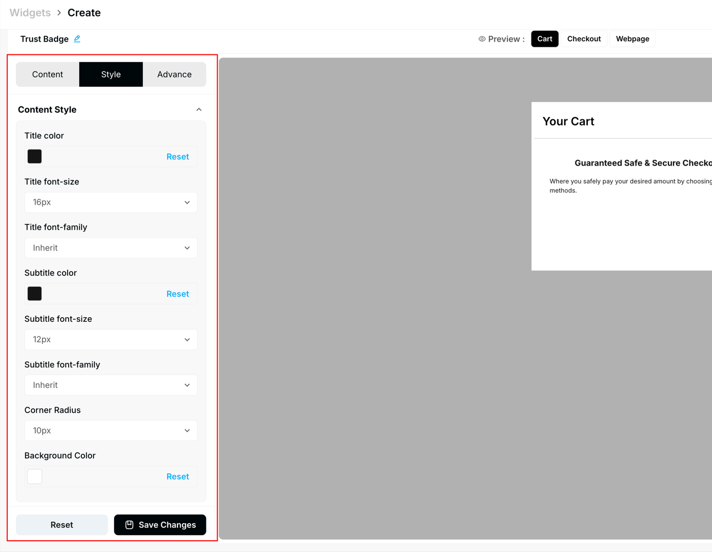
After finalizing your style settings, click Save Changes.
Tab 3 — Advanced
The Advanced tab provides technical controls for display targeting and custom styling overrides.
Device Visibility — Choose which devices the widget appears on. Options: All Devices, Desktop Only, Mobile Only. Custom CSS — Add custom CSS for advanced design adjustments beyond the standard style panel.
Custom CSS is intended for advanced users who need granular control over spacing, positioning, or visual overrides. Test your CSS thoroughly before publishing.
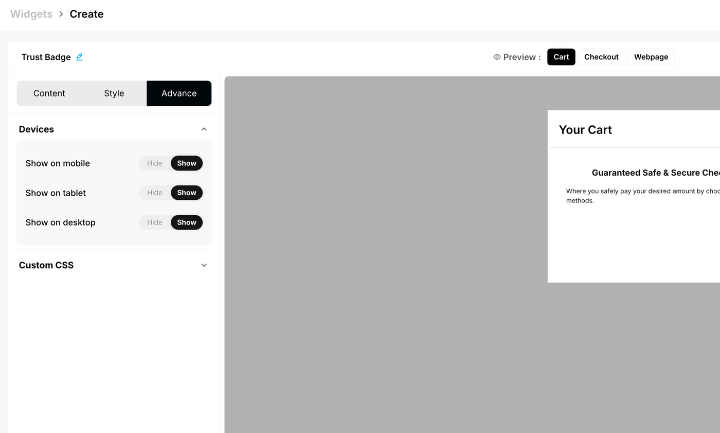
Once all three tabs are configured, click Save Changes. Your widget is now complete and ready to publish.
Publishing Your Configured Widget Live
This following documentation section provides the final, detailed steps required to publish your fully configured widget and make it visible to customers on your live storefront.
01. How to successfully setup a widget
02. Understanding and Creating Audiences
03. Creating Placements and Zones
05. Displaying Your Widgets on the Storefront
Recommended Placements for Trust Badges:
Webpage (Product Page) — Place below the Add to Cart button for maximum pre-purchase reassurance.
Cart — Display in the cart drawer or cart page header to reinforce security before checkout.
Checkout — Show on the checkout page to eliminate last-second hesitation.