
Volume Bundle Widget
The Volume Bundle Widget is an effective sales tool designed to directly encourage bulk purchasing of a single product. It boosts sales volume and Average Order Value (AOV) by clearly displaying tiered discounts based on the quantity a customer adds to their cart (e.g., "Buy 3, Get 10% Off").
Attribute | Description |
Widget Name | Volume Bundle |
Core Purpose | Increases sales volume by offering tiered pricing and visible savings for bulk purchases of the same product. |
Where It Works | Webpage (e.g., Product Pages) and Cart (Slide Cart Draw). |
Key Features | Tiered pricing logic; dynamic discount calculation; clear presentation of savings. |
Limitations | May cause discount conflicts if not properly configured alongside other promotions. Not available on Checkout or Post-Purchase pages. |
Playbook
Why sell one when you can sell three? The standard quantity selector is passive; customers default to "1" because they aren't given a reason to buy more. The Volume Bundle Widget changes the conversation from "Do you want this?" to "How many do you want to save the most money?" By clearly displaying the price-per-unit drop, you make the bulk option the smartest logical choice for the shopper.
The "Why" & The Metrics
Primary Metric Impact: Average Order Value (AOV) and Units Per Transaction (UPT).
The Psychological Trigger: Price Anchoring & Savings Perception. By showing the full price of a single unit next to the discounted price of a bundle, the single unit acts as an "anchor," making the bundle look like a steal.
Best Fit Industries: Supplements (3-month supply), Food & Bev (12-packs), Basics (Socks/Underwear), Beauty (Routine refills).
Strategic Use Cases (The "Plays")
Play #1: The "Supply Builder" (Consumables)
The Concept: Encourage customers to buy a 3-month supply of a consumable product instead of a 1-month trial.
The Logic: If they run out, they might switch brands. Locking them in for 3 months secures the LTV immediately.
Configuration Strategy:
Zone: Product Page.
Tiers:
Qty 1: Standard Price.
Qty 2: 10% Off ("Save $X").
Qty 3: 20% Off ("Best Value").
Trigger: Select your best-selling consumable product.
Play #2: The "BOGO Hybrid" (Gifting)
The Concept: Use a "Buy 2" tier to encourage gifting or "one for home, one for work."
The Logic: Perfect for holidays or highly giftable items.
Configuration Strategy:
Zone: Cart Drawer (Slide Cart).
Tiers: Set a specific tier for Quantity: 2.
Messaging: Set the header to "One for you, one for a friend?"
Timer: Enable the Timer feature in the Content tab to create urgency (e.g., "Bundle price expires in 10:00").
Play #3: The "Free Shipping Hack" (Threshold Breaker)
The Concept: Structure the bundle price to specifically hit your Free Shipping threshold.
The Logic: If Free Shipping is at $50 and your product is $20, a 2-pack ($40) doesn't work. But a 3-pack ($60) does. Use the widget to highlight that the 3-pack unlocks free shipping.
Configuration Strategy:
Bundle Creation: Set the Offer for the 3rd tier to include Free Shipping as the reward type.
Copy: Label the tier "Best Value + Free Shipping."
Pro-Tips & Constraints
Smart Constraint: This widget is designed for Single Product bundles (buying 3 of the same item). If you want customers to mix and match different products, use the "Product Bundle" or "Frequently Bought Together" widget instead.
Discount Conflicts: Be careful if you have other automatic discounts running in Shopify. Ensure your Volume Bundle settings don't conflict with site-wide sales.
Placement: While effective on the Product Page, adding a simplified version to the Cart Drawer catches customers who added a single item and nudges them to upgrade before checkout.
Configuration Options
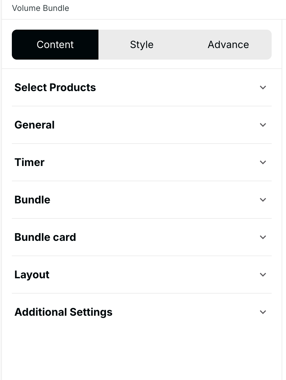
The Volume Bundle widget is configured using the standard three-tab structure: Content (logic and sourcing), Style (visuals), and Advanced (technical settings).
1. Step-by-Step Widget Creation
Click Create Widgets in your Dynamatic dashboard.
On the "Add New Widgets" page, fill in the Widget Title and a brief description.
Search for and select the Volume Bundle widget from the template list.
Click Next.
Select your preferred visual template from the available options and click Select.
2. Content Tab: Setting Tiers and Logic
Setting | Functionality |
|
Trigger Product Selection | The specific product this discount applies to. |
|
General Messaging | Sets the display text for the widget header. |
|
Bundle Creation | Defines the tiered discount thresholds. |
|
CTA Button | Customizes the Call-to-Action button text and behavior. |
|
Layout | Controls how the bundle options are presented. |
|
Timer | Applies a sense of urgency to the offer. |
|
Exclusions | Define items that should not count toward the volume tier total. |
|
The Content section is where you define the products and the tiered discount logic.
Trigger Product Selection: You must first select the trigger product—the specific item that the volume discount applies to.
Product Sourcing: While the discount applies to a single product, you can source it using Manual selection, Feeds, or other methods. For a standard volume discount, Manual is often easiest.
Bundle Creation: This is the core logic section where you define the tiers:
Set Quantity: Define the unit threshold (e.g., 2 units, 3 units, 5 units).
Set Offer: Define the corresponding reward for that tier. Offers can be:
Discount: Percentage or fixed amount off the product.
Free Shipping.
Free Gift.
Messaging: Set the widget Title and customize the CTA Button text.
Optional: Add a Timer if the volume discount is time-sensitive.
Once all tiers and products are defined, click Save Changes.
3. Style Tab: Customization
Element | Customization Example |
|
Heading | Alignment, color, font size/weight. |
|
Timer | Colors for promotional text and digits. |
|
Bundle Card | Colors and radius for the bundle options. |
|
CTA Button | Button color and hover effects. |
|
Section | Overall container appearance. |
|
The Style section allows you to customize every visual component of the widget to maintain brand consistency:
Section Styling: Customize the overall background and container appearance.
Text & Headings: Configure font size, color, and weight for the Heading, product titles, and discount text.
Bundle Container & Card: Adjust the appearance of the individual bundle cards, including background color and borders.
CTA Button: Customize the appearance of the Call-to-Action button.
Timer Styling: If a timer is used, customize its colors and fonts here.
4. Advanced Tab: Final Refinements
The Advanced tab controls final display and custom code integration:
Device Setting: Select the specific devices (Desktop or Mobile) where the widget should be visible.
Custom CSS: Use this field to input custom CSS for advanced styling not covered by the standard options.
Publishing Your Configured Widget Live
This following documentation section provides the final, detailed steps required to publish your fully configured widget and make it visible to customers on your live storefront.
01. How to successfully setup a widget
02. Understanding and Creating Audiences
03. Creating Placements and Zones
05. Displaying Your Widgets on the Storefront
Once the widget is configured, it must be connected to a Placement (Zone) via a Campaign/Experience to go live. When successfully deployed, the widget provides clear incentives directly on the product or cart page.